
The Most Inspiring Subscriptions - Our Must have Mags
A short guide to our must read magazines. The publication we pick up on a monthly, bi-monthly or bi-annually basis. Inspiring all we do and enriching our lives.

Asked recently what inspires LitterArty’s work one of my answers was research and reading. I am a huge fan of a good magazine in particular and subscribe to several. Being a strong advocate for sustainable living, some may argue paper magazines are not the way forward and rather contradict the notion. However, I beg to differ, as many magazines (at least the bulk of what I read) are actually processed with sustainability at the heart of their creation. This is done through many avenues, including the use of innovative paper types that use various recycled pulps. If handled correctly these magazines are recyclable too. So there are ways to read physical magazines guilt free!
With the majority of us spending so much of our time looking at a screen, whether computer, phone, tablet or tv, it’s so unbelievably important to have time away from that blue light. Personally I really look forward to spending a little down time kicking back and flicking through a great magazines or book, it feels quite indulgent giving myself that time, pure luxury!
So here are some of our favourite reads for you’re consideration. Any of these would be a great addition to your current reading list. And shock horror, they’re not all Interiors or design driven, but this doesn't mean they’re not equally as inspiring to our work.

Be Kind
I absolutely love this magazine, it is a great read. The articles are fantastically detailed and informative.
A publication more about articles and content than adverts and all those ‘space savers’ used in so many contemporary magazines. The content is broken into easy to navigate sections ranging from creativity, to mindfulness, environmental issues and more.
You can still find lots of great home and interior inspiration, all accompanied by lots of guidance on living sustainably in your home. So while this is a lifestyle magazine and not focused on interiors it is a great tool for living with integrity and brining harmony into your life and therefore your home.
It really is a great one and long may it continue. You’ll find a pile of them in the bathroom and downstairs WC in the LitterArty house, guest love it!
You can subscribe to the monthly editions or pick one up in your local shop.

Happy News
Now this one is a bit different, less of a magazine and more of a newspaper replacement. If you, like us, are sick of negative crappy headlines and bad news, this is your salvation. Page after page filled with nothing but happy (the title gives that away) positive news.
The stories covered shine light on positive happenings across the world, many of the stories you would be none the wiser about if you hadn't perused the pages of this lovely publication.
Each edition is broken in news from each month (you see the only shame is it is quarterly so they can save up all the great things that have happened over the last few months), the pages are crammed with great and uplifting facts and figures. There is also a section on dedications where you can nominate someone you know who has done something great. These personal shout outs are so uplifting in a time when it can be hard to believe in good, there are still lots of us out there!
It’s got a great big thumbs up from us and we look forward to the next edition landing on our doorstep. Ideally consumed accompanied by a good brew and naughty sweet treat.
Apartamento
One of my favourite interior driven magazines, pure aesthetic joy!
Published biannually, this visual delight and informative read gives insight in to people, their homes and how they live in them. A through the keyhole style approach. Often selling out in days this magazine became a real cult publication from its inception back in 2008.
Each page presents real ‘lived-in’ interiors, this honest representation is hugely influential and more to the point identifiable and achievable, especially in comparison to the often stark and overly stages interiors featured in many high end magazines across the sector.
That all said there is a definite ‘retro’ aesthetic to the interiors featured and the style of the photography used, so this style of publication may not suit all. For us it’s a spot on edition to our inspiring magazine list and a real staple.

Hole & Corner
A great design source, dedicated to the real craftsmanship and skills behind design, some of which take years or decades to master. It believes in the process and development needed to produce inspiring great design, in the doing not the talking, the pages are therefore filled with articles on such matters.
Contributors include world renowned photographers and authors, which about confirms this publication as a hard hitter in the sector. It’s as thoughtfully put together as the subject matters it covers. A real chunky coffee table style magazine that needs time to devour, which is fine as issued biannually you’ll have plenty of time to enjoy each and every article.
The content leaves you inspired and in awe of some amazing craftspeople who have dedicated their lives to the development of their skills and craft.It is therefore only fair that we dedicate some of our time to reading about it. In doing so, opening our eyes to amazing people all over the world that would otherwise go under the radar.
A really great, worthwhile read, especially if you appreciate authenticity and heritage!

91 Magazine
Independent magazines are my kryptonite and 91 doesn’t disappoint.
Focused on more affordable and attainable interiors and lifestyle (right up our street). This publication offers up a smorgasbord of beautiful visuals and accessible lifestyle tips, with a sustainable focus (double thumbs up).
Content is broken in to sections each with a theme, this runs in each magazine with each section focusing on a specific place or person, changing each edition. From news, to shopping, to restaurant and home tours. The articles cover lots of interesting aspects of lifestyle. I actually love the home tours sections in particular, they are dotted through out and feature interesting people in their (as the title would suggest) homes. The restaurant tours are also really great as they discuss the atmosphere, decor and ethos of a place rather than the style of most restaurant reviews that predominately focus on food critique. Along with these tours, there’s a cool section called 3 ways with, and each magazine features a different subject matter.
Finally, there is a very current cultural focus on social media and instagram in particular. Love it or hate it, it’s part of most of our lives and a real source of visual inspiration. They therefore feature an instagram edit showcasing chosen accounts again based on a chosen theme, i.e. Handmade or Craftsmanship.
Just an enjoyable read featuring real people for real people, with the added advantage of being visually pleasing and calming.

Oh Comely
Recently reimagined simply as Oh! this is another independent magazine with oodles of creativity and female empowerment. Already sold?…Well let me tell you a little more.
The ethos behind the magazine is about looking at the way you view the world and yourself. Jam packed with full pages of colourful images and text, featuring articles on a vast array of subject matters such as; fashion, music, food and culture.
It’s essentially offering up a different approach to a wellbeing magazine, all the articles have the end goal to encourage mindful actions and in doing so a the creation of a less stressed more balanced lifestyle.
Published bi-monthly you can subscribe or pick it up at some supermarkets. I great one for those looking for a female driven read.

Breathe
I think we all need to take time to breathe and with magazines like this you can have a helping hand. Full of great tips and articles on ways to self care, something all too many of us neglect.
This monthly mag breaks down in to healthy chunks on wellbeing, living, mindfulness, creativity and escape. Each section packed with its own content ranging from sleep tips and exercise routines, to ways to be more creative or guides on how to make something. Each article is informative without being preachy, which I love, there’s a fine line between the two as we all know.
They also do special editions and journals that enable you to doodle, list write and contemplate.
I have picked up several varieties of mindful and wellbeing magazine and this is by far my favourite. Just the way it flows and the style of the illustrations and articles. Available at most shops and supermarkets where you’ll find the magazines, go check it out!
other faves include: Disegno, Frieze, Frame and Resurgence & Ecologist.

HowTo - Spatial Plan
Our quick and handy Howto guide on spatial plan, helping you to make the most of your room and guide you with furnishing. Part of LitterArty x HowtoHome’s handy HowTo series.

It can be daunting sometimes working out how and where to fit and position furniture in any given space. While there is some level of subjectivity based on personal comfort and requirements, there are a few handy rules to help you establish suitability of furniture and not end up in a situation where things don’t fit or the space isn’t accessible.
How to ensure you have enough free space?
A general rule of thumb is to allow approximately 50cm (minimum) of space from one piece of furniture to the next. There are of course exceptions to this rule such as the distance between a console table and the back of the sofa or next to a bed. In cases where your aim is to have one support the other and be in close contact then obviously this rule does not apply.
In hallways and passing places it’s advisable to up this minimum and allow at least 80-90cm of space so that the area doesn’t feel cramped and walking past objects and items of furniture is a challenge.
Top Tips:
- Consider where fixed obstacles positioned, such as doors, windows, radiators and fireplaces. You need to allow space around and plan furnishings that will fit around these features and balance out the space.
- Think about volume and don’t over fill a space.
- Ergonomics - ensure that there is a circulation passageway through a room. This follows an easy pathway from the door to all the other main areas of activity.
- Edit your clutter, clutter brings in spaces and creates a sense of chaos. By minimising clutter you optimise your space, yes it’s common sense.
Questions to ask:
1) What, is the space used for, what are its functions?
2) Who, uses it? How many people does it need to accommodate etc.
3) How, do you want the room to feel? Spacious, airy, cosy, minimal….
4) Are there focal points? Or do you need to create focal points?
Another question we are regularly asked is; What is the optimal distance between a TV and your seating? Again, a general rule of thumb is to base this on the size of your TV, take that measurement and times it by 1.5 to 2.5 to gauge your most comfortable viewing distance. So for example, a 37 inch TV could be positioned around 6 ft from your sofa for optimal spatial planning. Obviously, this is relative and subjective to personal comfort but it’s not a bad rule to stick by.

HowTo - Measure a Room
Our quick and handy Howto guide on measuring a space. Part of LitterArty x HowtoHome’s handy HowTo series.
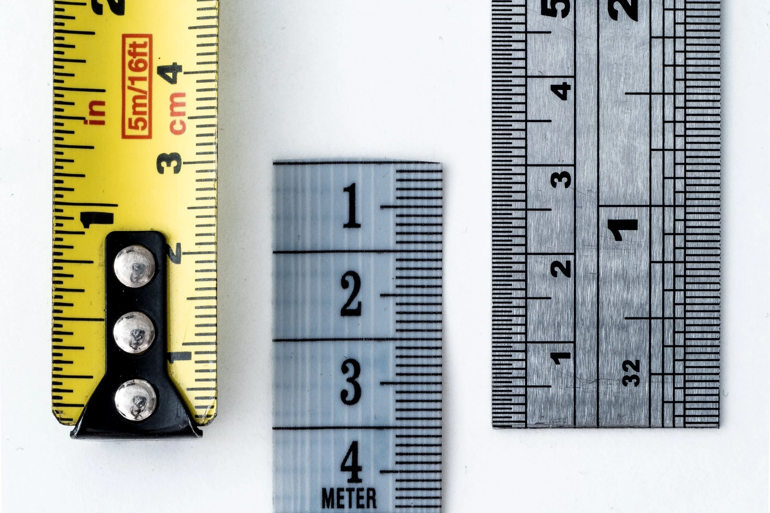
1. Make sure you have a sturdy and decent length tape measure. This simply makes life easier and means you can measure quickly.
2. Have a paper and pen to hand for notes and to quickly sketch out the outline of your room. All you need is the general shape, no need for accuracy as long as it makes sense to you.
3. Mark window and door locations.
4. Start by measuring the width at the longest point of the room, the same with the depth and then the height.
5. Then take at least the same measurements at around 5 points across the room. This helps with accuracy, as most rooms are nor 100% even. 6. Next measure all large elements such as alcoves and other nooks. Do this by following the same principle as above (width, depth and height). Note these measurements in the correct locations on your room outline.
7. Measure all the windows and doors. You want to know the width and height of the opening and then also the height of the window base from the floor. Again mark this on the outline.
8. Make notes of all utility and socket locations i.e. radiators, sockets, aerial points. To measure their exact location, measure from the nearest fixed point (i.e. edge of the wall in a corner) to the middle of the fixture. This is particularly useful for radiator location.
Tips
- When measuring the height of your room, make sure you allow for picture rail and cornice height. This is relevant for walls where you are wanting to feature wither freestanding or built in units such as shelving that require to sit within these parameters. Make notes where relevant.
- Doorway measurements are pivotal for planning furniture as well as the layout design, it’s all well and good picking great furniture but what if the space to get it in to the room is limited?! All these details help.
- Not location of any architectural features that are relevant or limit design decisions.
- Clear detail is key!

HowTo - Hang Pictures
Our quick and handy Howto guide on picture hanging. Part of LitterArty x HowtoHome’s handy HowTo series.

To get you started, here is a check list of tools and equipment you may need to hang pictures securely, safely and successfully.
- Tape Measure
- Pencil and Rubber
- Spirit Level
- Hammer
- Drill (if hanging heavy work that requires a wall plug and screw)
- Picture hooks and nails
- Wall plugs and screws (if required)
- Cord or wire for hanging.
Before you grab the hammer and start attempting to hang your picture, you need to make a few practical decisions, such as, where you want it hung and is the wall structure suitable. You also need to decide how much support you’ll need to hang your picture securely, whether single or multiple hooks etc. Once you’ve established the location and hanging equipment needed follow there are some basic steps to follow for hanging. Whether you are going for a relaxed or a traditional museum approach this is a great base point. All rooms are different and the museum approach may not be appropriate for your décor.
Step 1 – Measure
Take a width measurement of the wall you are hanging your chosen picture on.
Step 2 – Align with the centre of the wall
Find the centre point of the wall by halving the overall width and place a small pencil mark.
Step 3 – Determine the Height
Most people hang pictures too high; you should not have to strain your neck to see them. There is a bit of a science to picture hanging. That said, this is where your subjective style comes in, whether following the museum approach or not.
Relaxed approach
If you're confident with your artistic abilities, use your eye to judge where to hang your painting. This will allow you to balance your furniture, doors and windows. Just makes sure it's at a comfortable eye level. If not follow the next step:
Technical/Museum approach – a simple equation
1) Measure 145cm from the floor this is the ‘ideal’ middle point of your picture.
2) Measure your picture and half it, this is the centre point. This is A.
3) Measure the tension depth from the top edge – pull the picture cord/wire to full tension as it will be when hanging. This is B.
4) Find the height by doing this simple equation – 145 + A – B = Height to position your nail.
Handy tips
- A lot of plastered walls, particularly in older properties can crumble when a nail is hammered in. To protect your surface from damage or marks place a small piece of masking tape over the point for hanging. This will help to protect the nail point from causing damage.
- If your frame is heavy or slightly rough on the reverse place some small sticky felt pads on the reverse bottom two corners just away from the edge. This will pad and protect from rubbing or movement works on the wall.
- Use a spirit level to double check how level your picture is by placing it on the top and then the bottom of the frame, adjust accordingly.
- 5-7cm between frames is a great rule to apply.
Hanging a Picture Wall or Cluster
Follow the same three steps, measure, find the middle width and determine height, then add the following step:
Additional Step 1 – Line up the centre, making the centre of the cluster/picture wall sit along the 145cm centralised mark.
Hanging Pictures on the Stairs
Dependant on your desired overall look, you can plan this intuitively or structured. If going down the structured route add the following step:
Additional Step 1 – measure 145cm from the floor, this should be the centre of your first picture.
Additional Step 2 – measure 145cm from every second to third step to form a diagonal line. This line should be the centre of each picture and then use the size of your frames to position each picture at an equal distance to space out most effectively.
Hanging a Scattered Display
Choose a piece as a central focal point. This will form the middle of your cluster. Then follow these steps:
Step 1 – Measure up your 145cm point to find the middle point of your central picture.
Step 2 – Build your gallery from the middle out, making sure you balance your pictures as you go. Always ensuring the central line stays at 145cm.
This process is very subjective to what you see as ‘balanced’ so go with what suits you and suits the pictures and artwork you love and are wanting to hang.
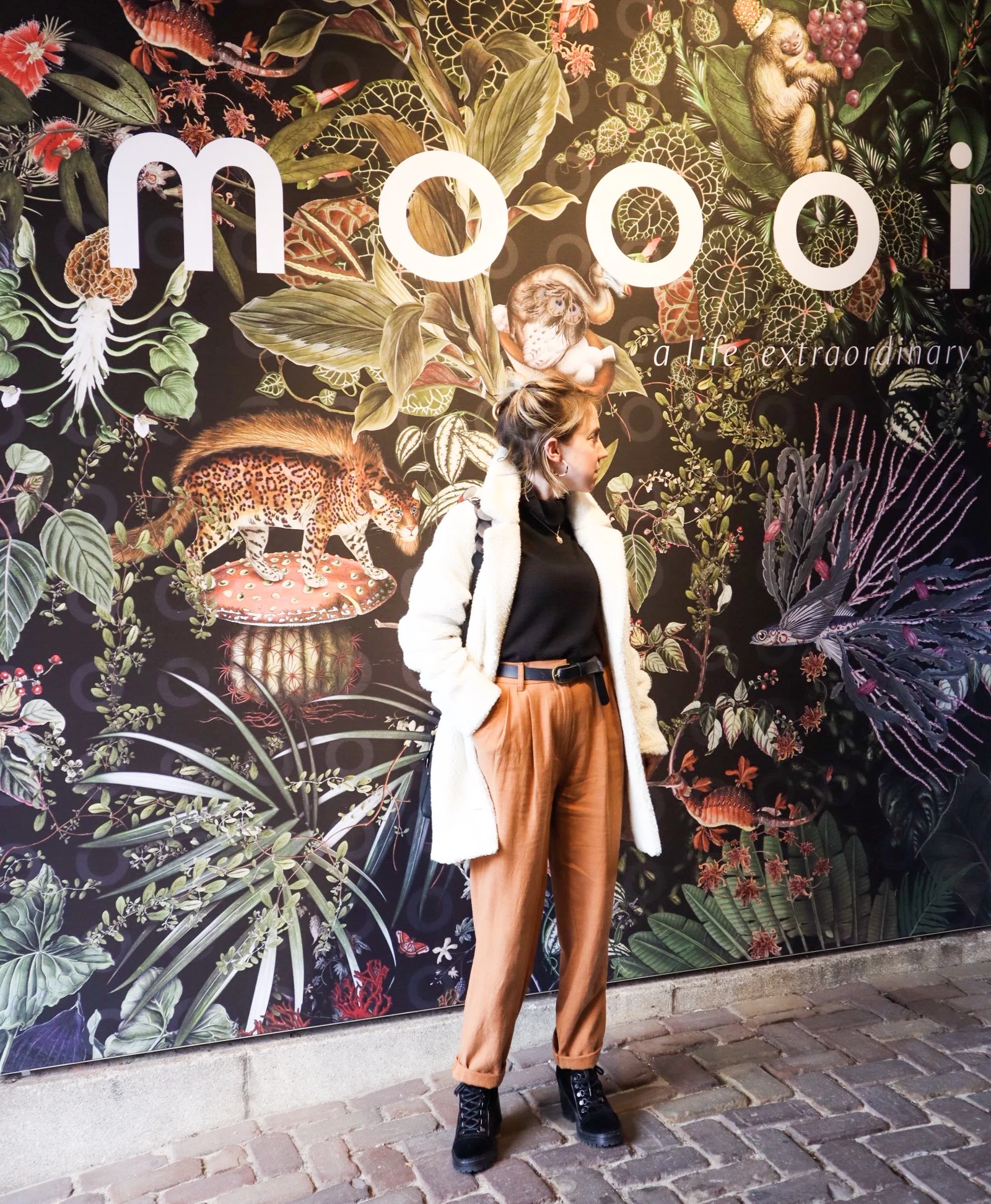
Moooi
A designer spotlight on Dutch furnishings brand Moooi and their flagship Amsterdam showroom.

Luxury design making playful statements!
So let us start with the basic brand bio to get some background….
Dutch luxury brand Moooi was founded in 2001 by Marcel Wanders & Casper Vissers. The name itself derives from the dutch word for beauty, with extra ‘o’ for uniqueness!
Since it’s original incarnation there have been many management and ownership structures but Marcel Wanders has remained in charge and chief designer all along.
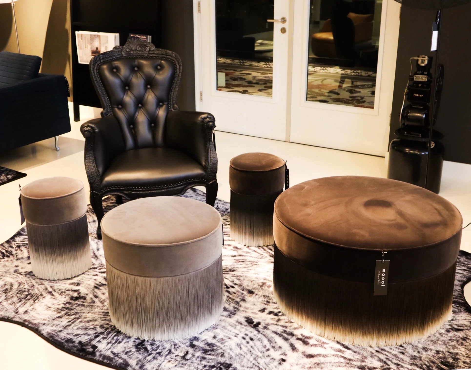
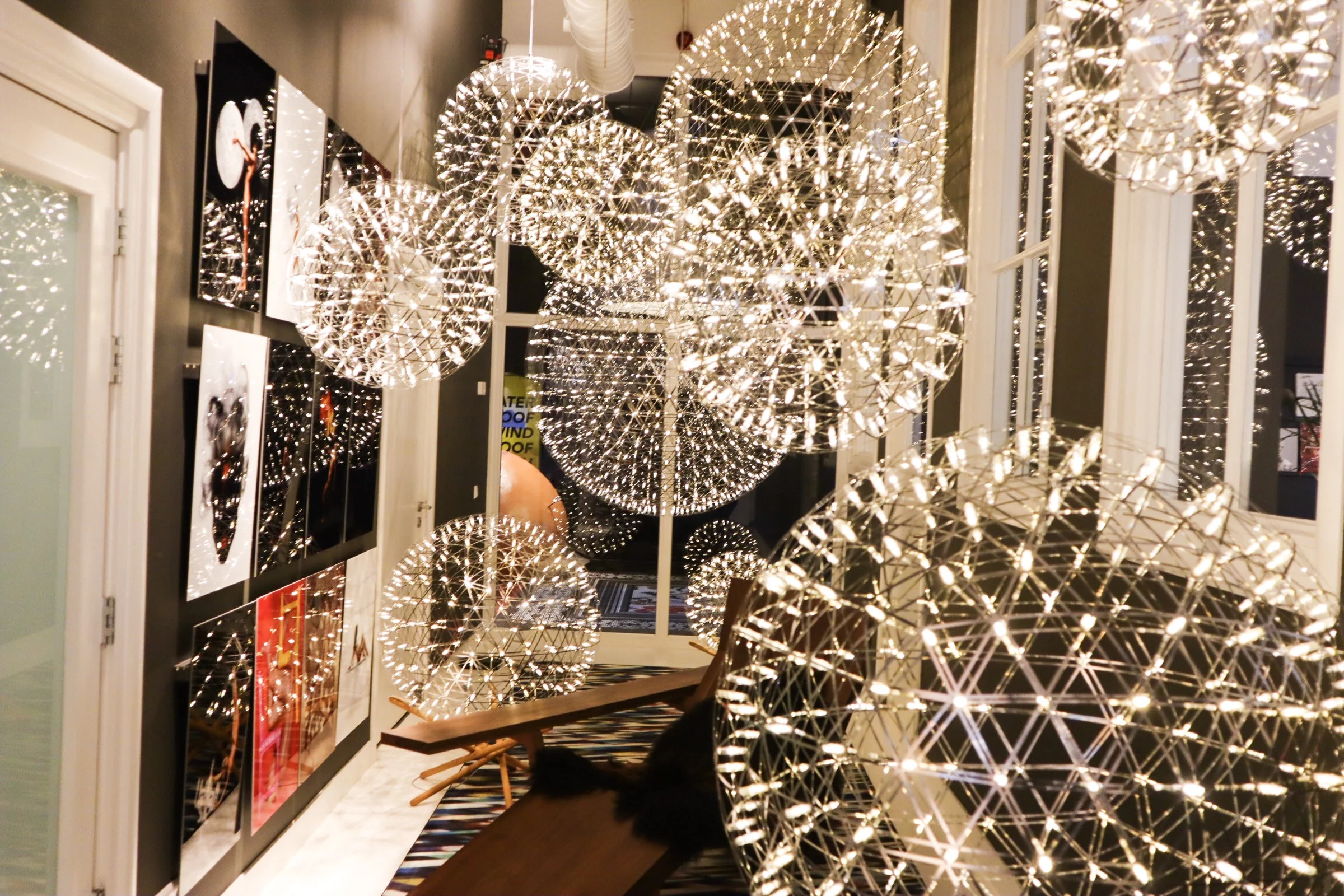
Along with their own unique blend of luxury they showcase pieces by other well established, and equally playful, designers such as Studio Job and Umut Yamac (got to love his Perch lights, seen dotted all over the Moooi showroom).

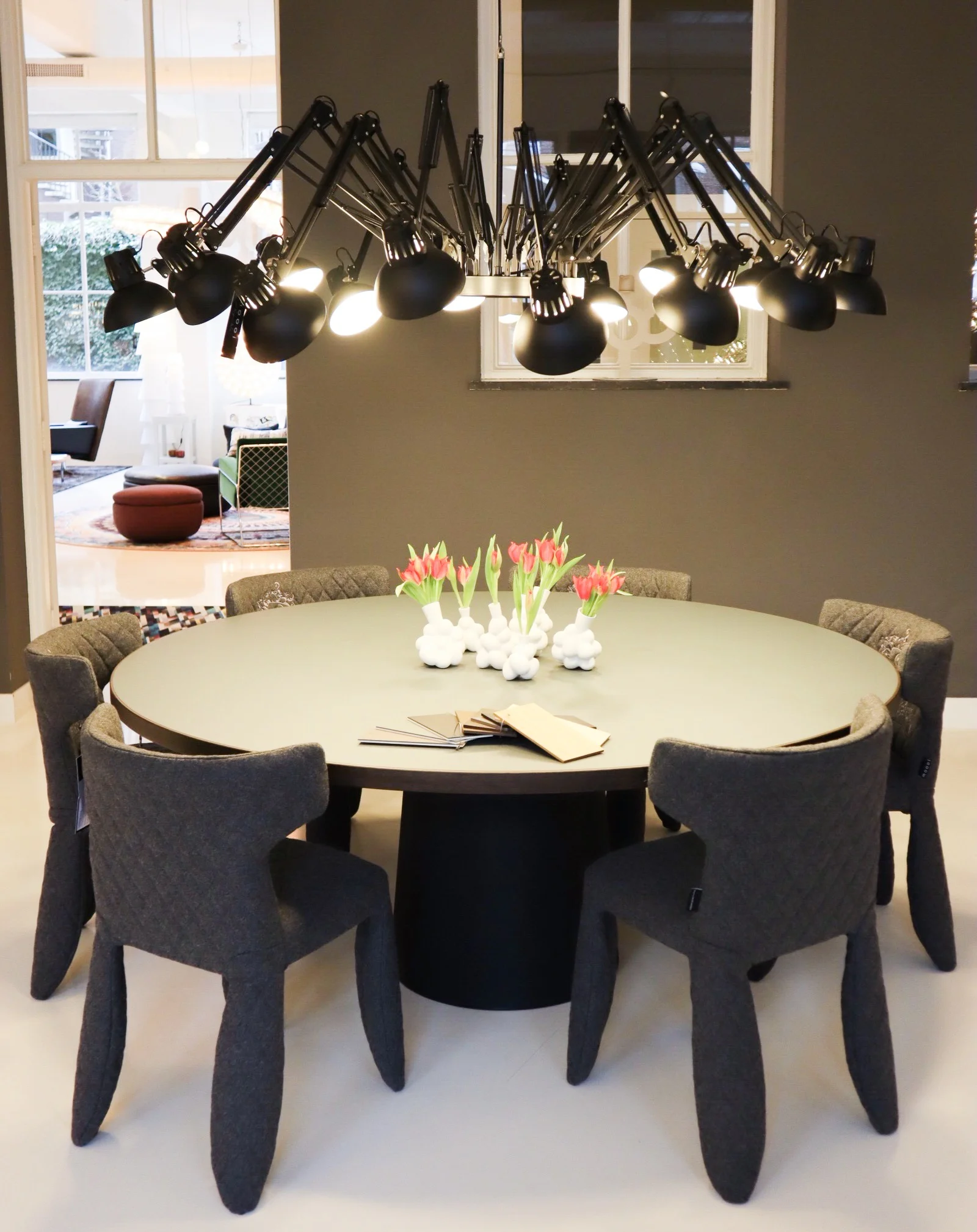
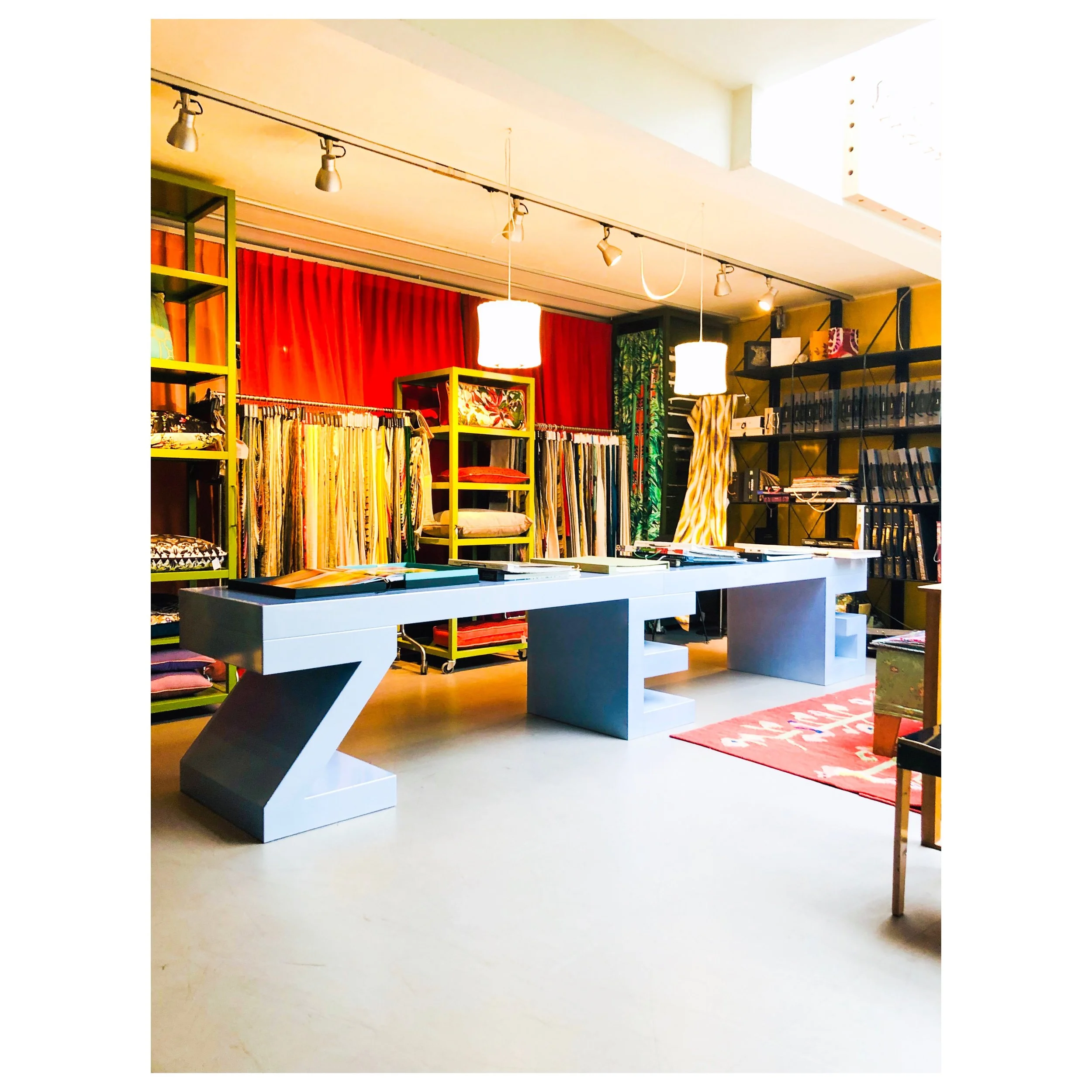
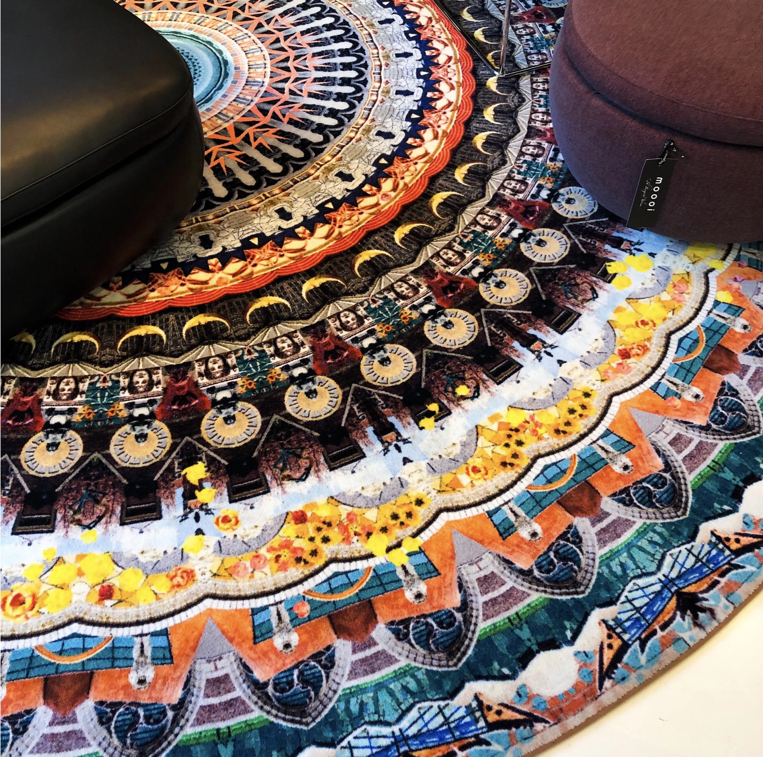
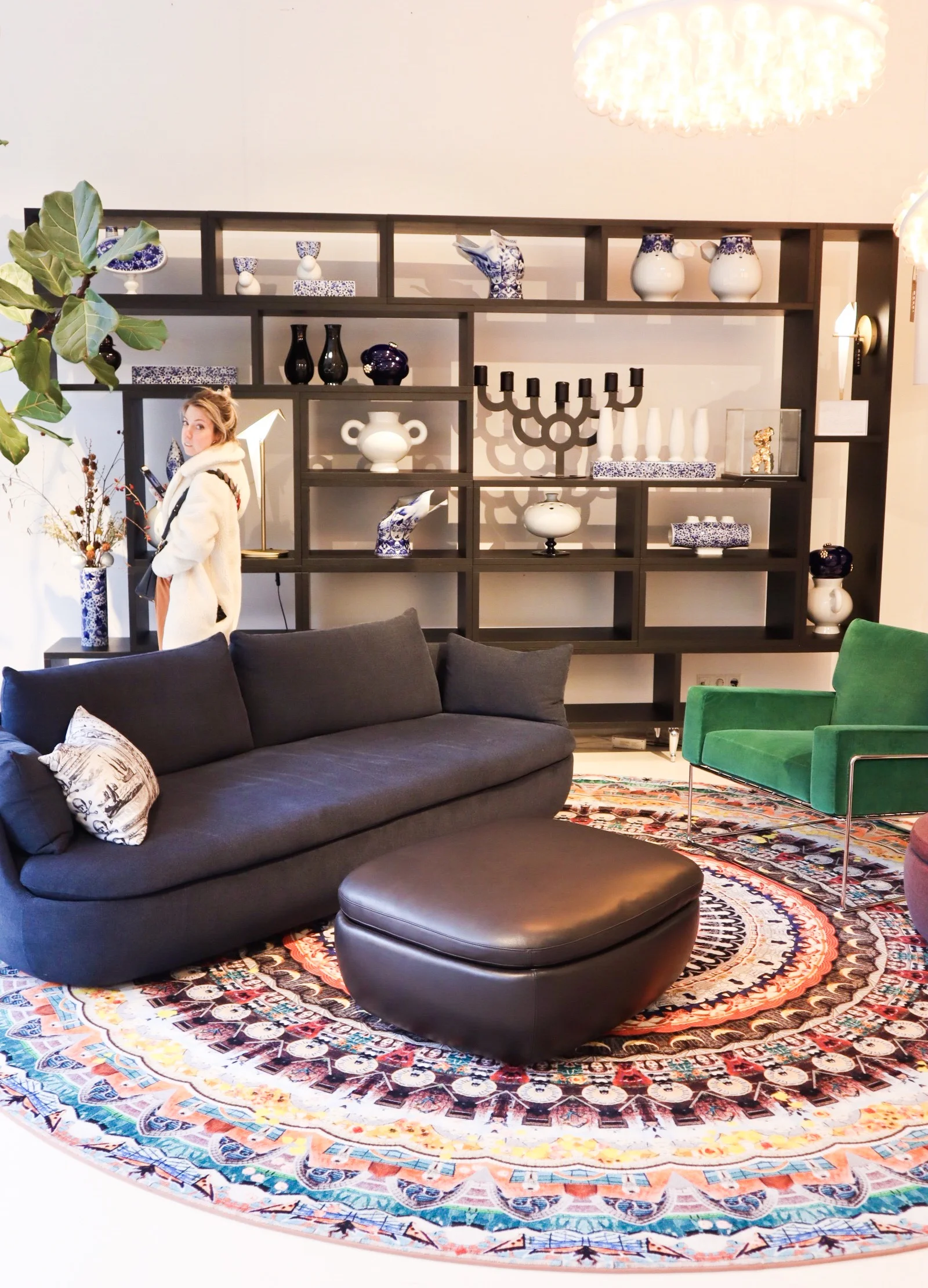
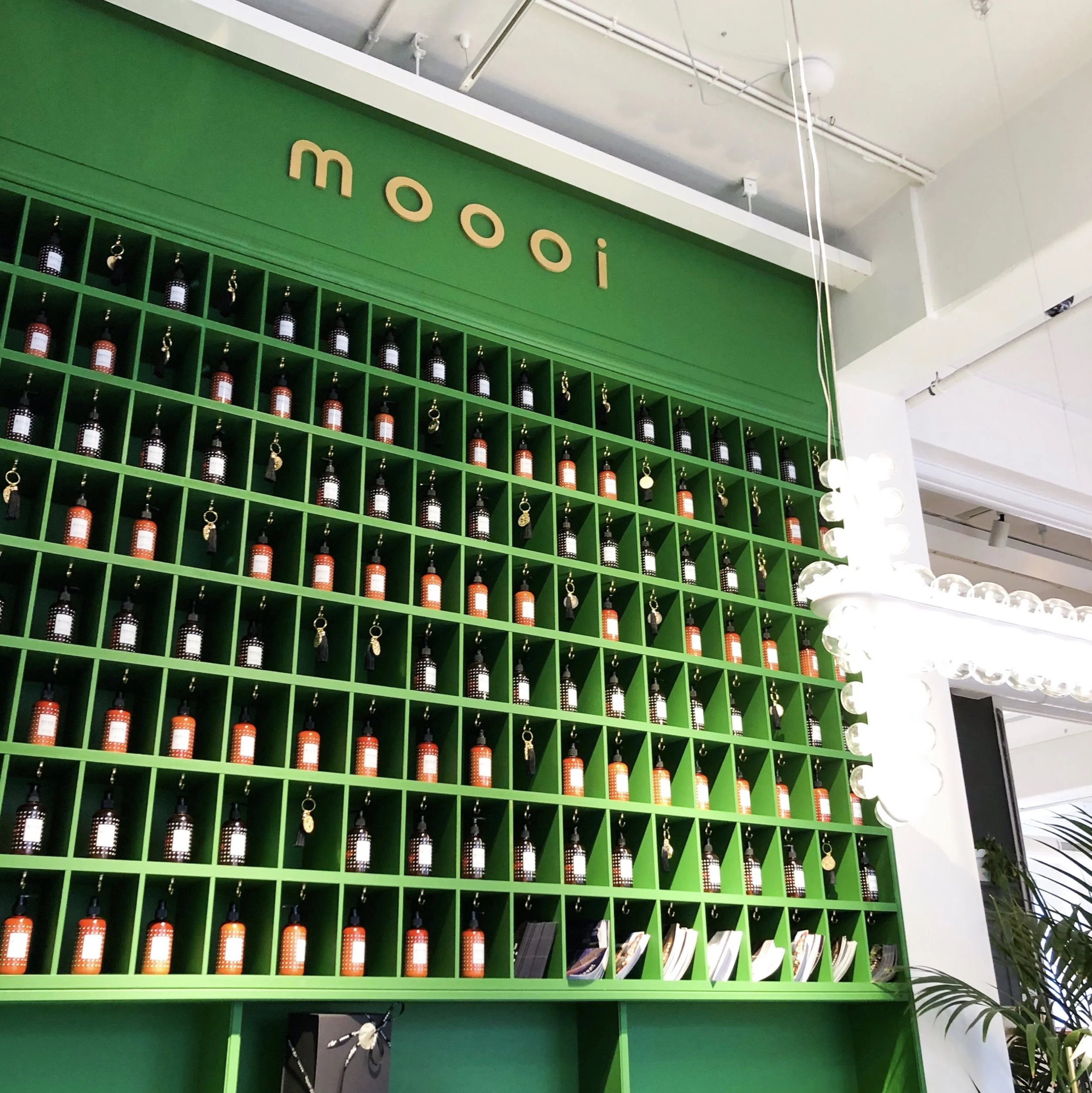
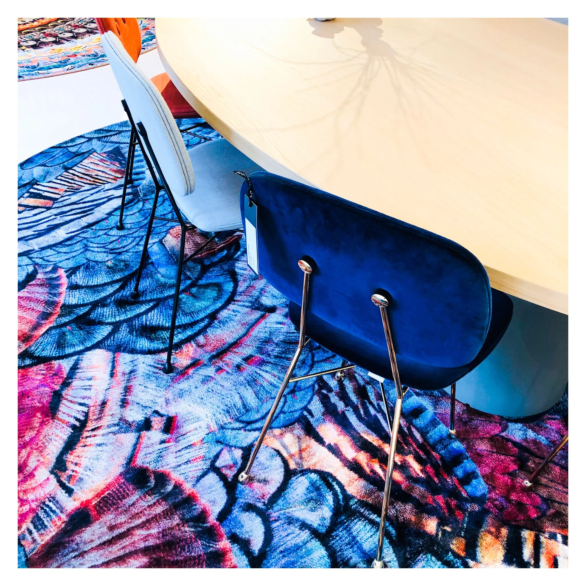
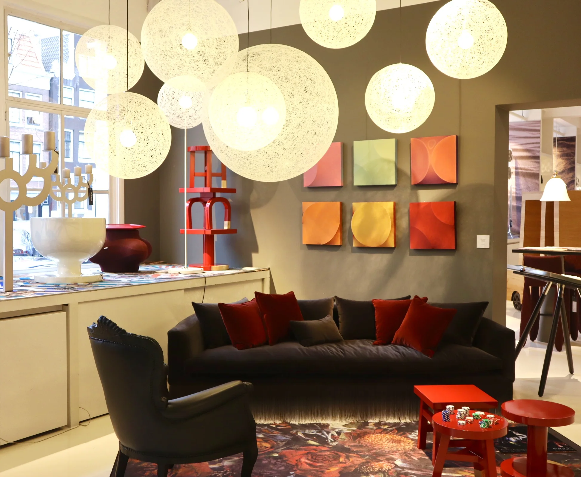
Now let’s talk about how amazing the 700sqft flagship showroom is in Joordan, Amsterdam. It’s a visual grenade from the second you walk in. Even just the carpet that runs from the entrance, leading you in is an explosion of detailed print and bright colour. A common thread that runs throughout the whole showroom, with each intricately staged area featuring some form of bold explosion in the form of a fab rug or carpeted area. I love walking around showrooms like this, they are not only great when you are sourcing for a project but also just for inspiring. It’s so important to keep visually stimulated and to put yourself in to spaces like this as a designer as often as possible. It is so easy to fall into the ‘work’ aspect of the job and get bogged down by specs and the technical areas of a project.

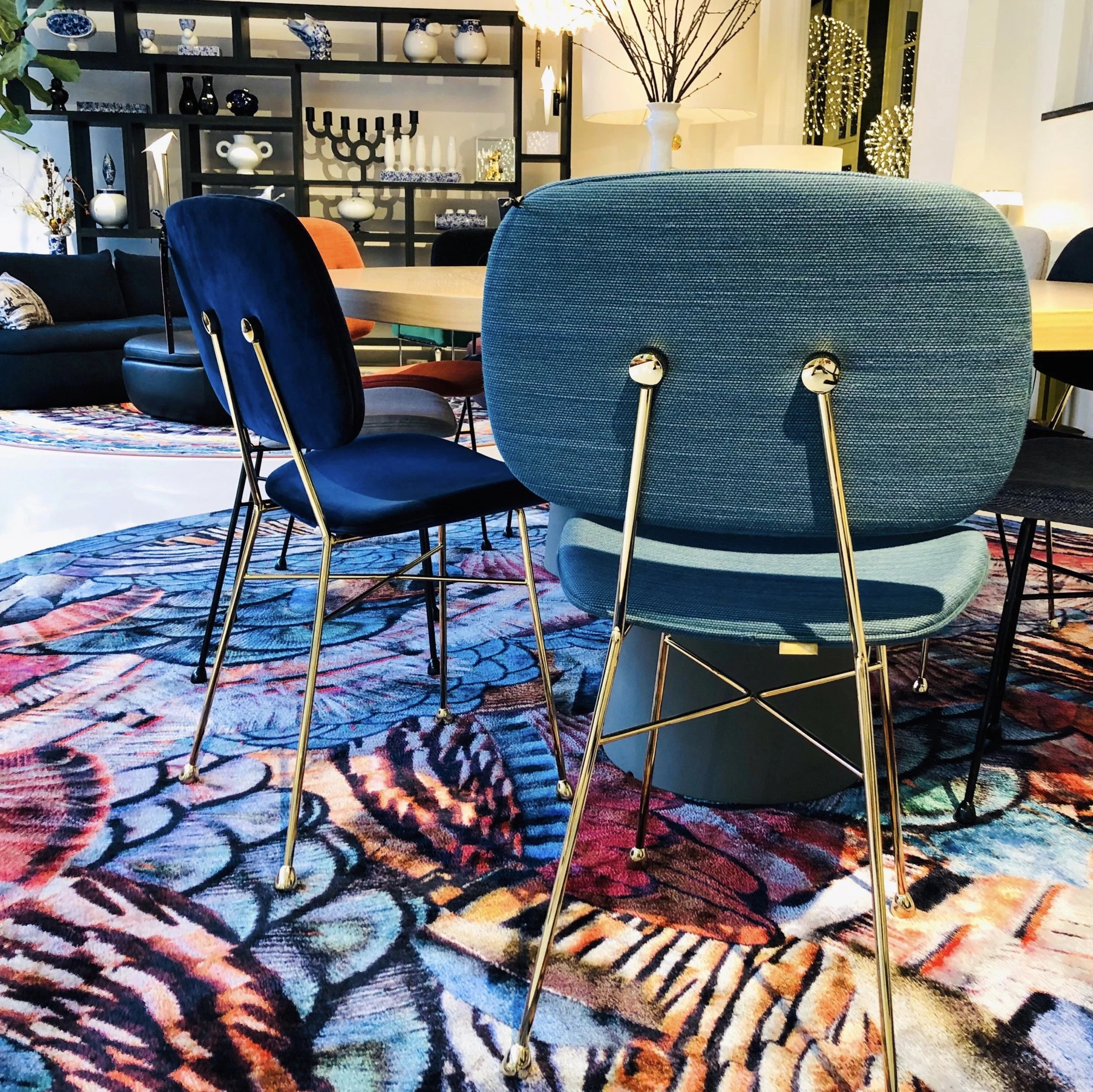
So back to Moooi… the brand is known for quite a few modern iconic pieces. One notable is the Container table with its cylindric pedestal base and simple solid table top. It’s form is simple and modern yet timeless and therefore represents the Moooi ethos perfectly. It comes in an array of sizes and variations on the plain style, such as the New Antiques range that features more curve details reminiscent of old traditional turned table legs. The basic style remains a favourite of mine as it serves as a solid base to allow the accompanying chairs and all other items that occupy the space to shine.

Seen here: a version of the iconic Container table.
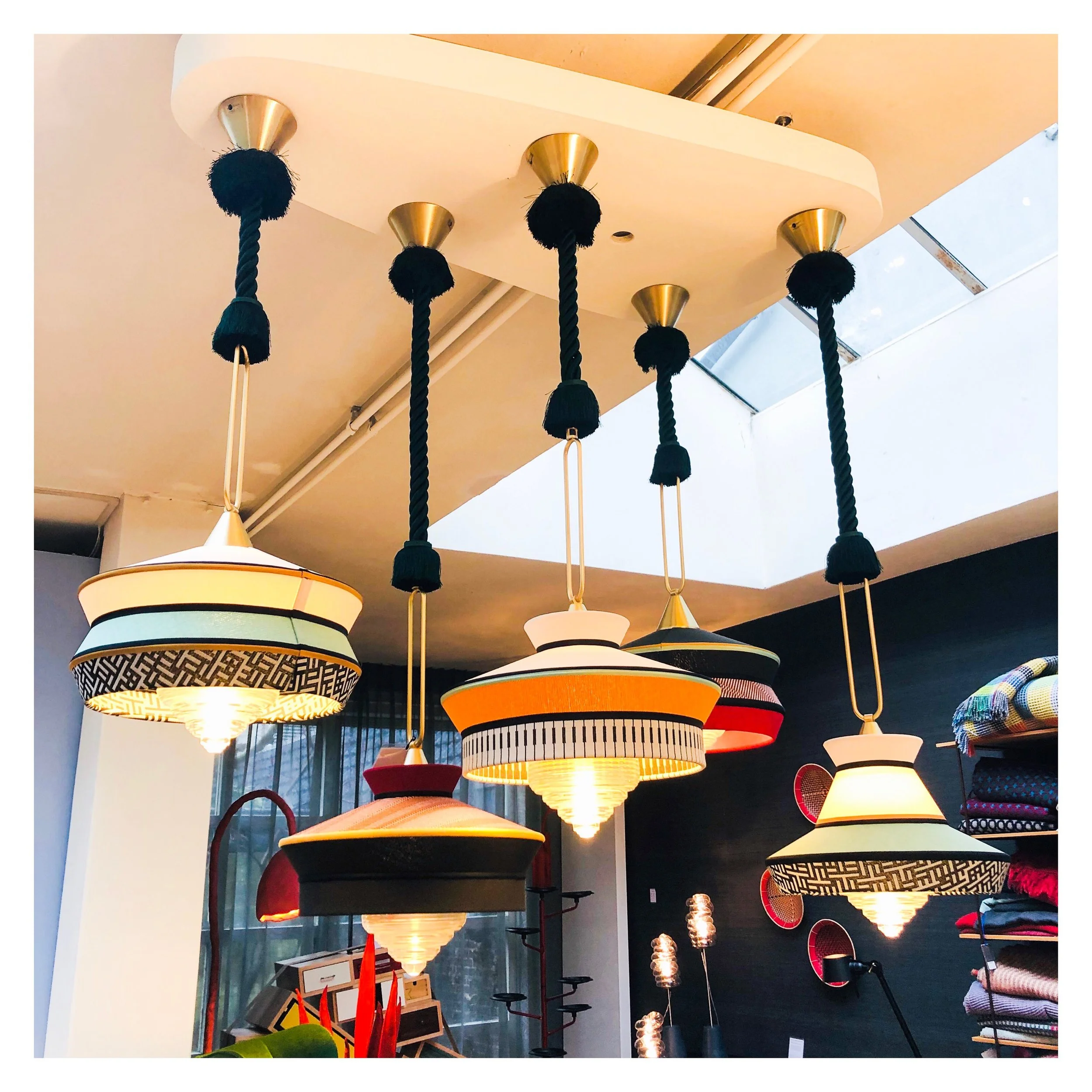
Moooi are also synonymous with bold feature light fittings. One of the most iconic are the strong and dominating Paper Chandelier, a modern twist on the classic metal structured chandelier, this is actually created (as the name would suggest) out of paper. Well, the main structure is actually created out of cardboard and wood that is then wrapped in a lacquered paper shell. I would say this is the most iconic light fitting in that most people will have seen one in a quirky commercial setting somewhere or another. It, like many iconic designs, has been copied (or versions/variations attempted) by other high street brands over time too.
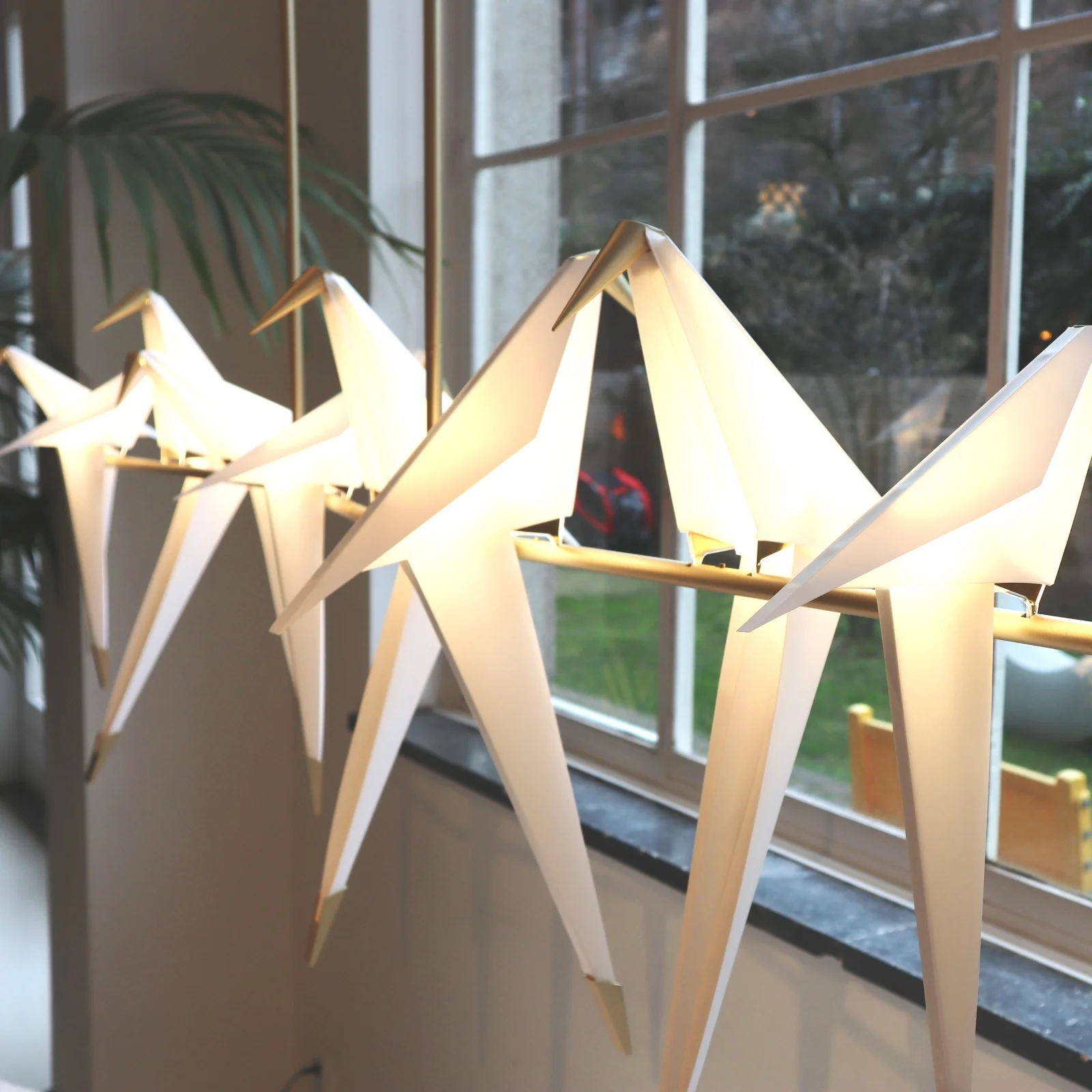
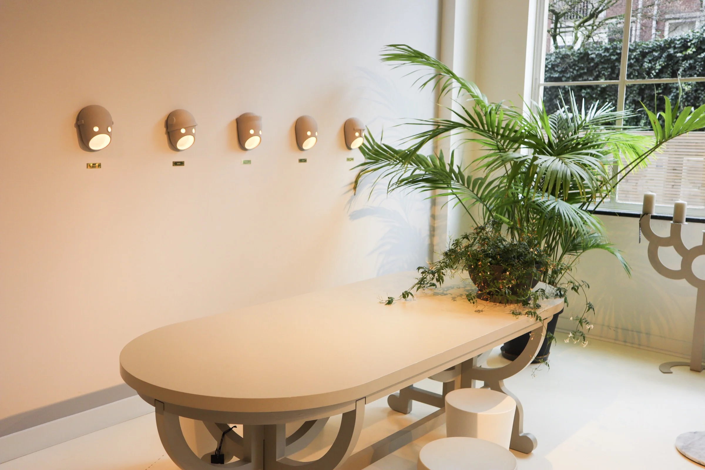
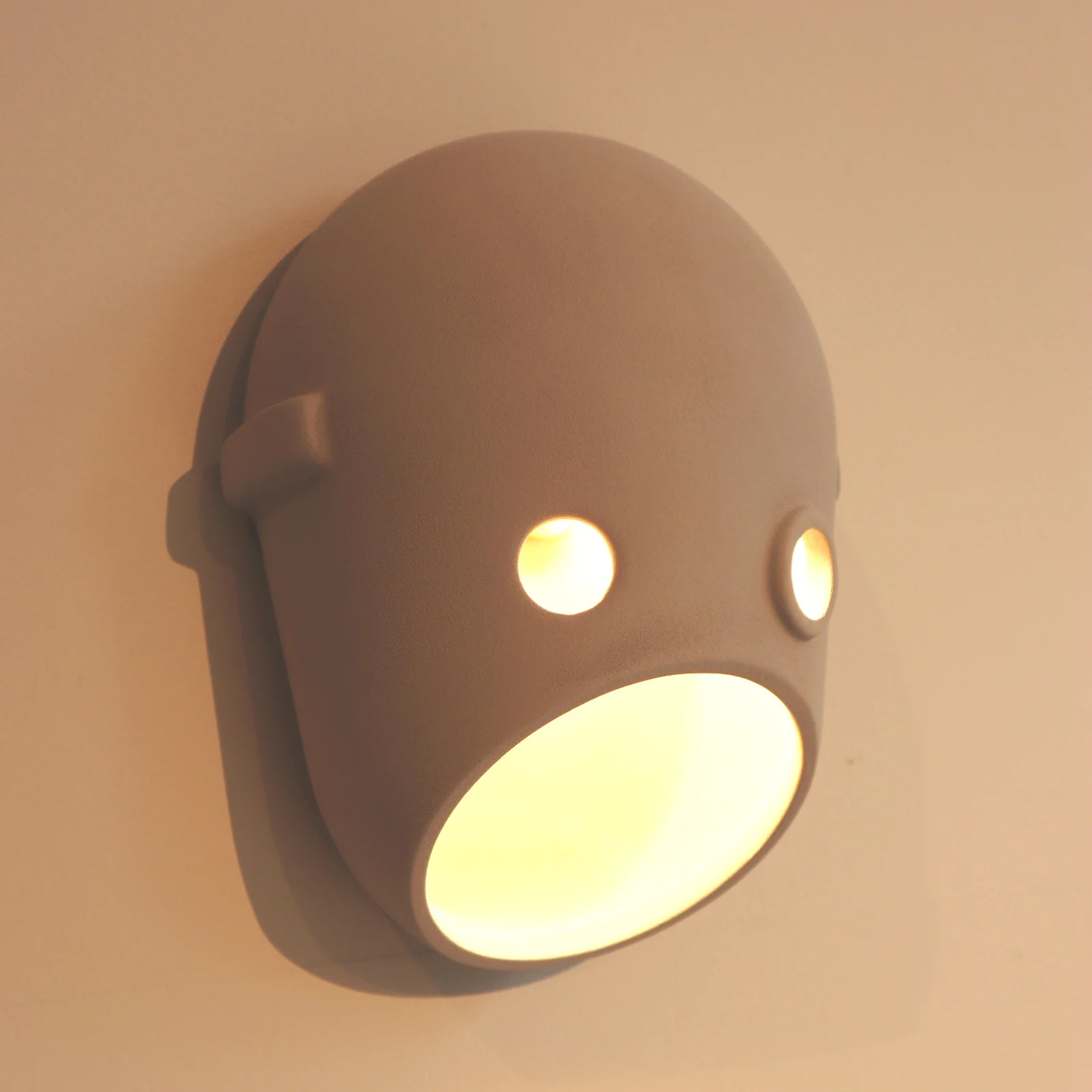
The Paper chandelier is low however on my favourites list when it comes to light fittings at Moooi. The likes of the super cool Meshmatics chandelier with its steel mesh structure edged in brass detail, for a nod to more refined luxe, is right up there. Like I mentioned at the start of this post, you can’t not love the Perch lights by Umut Yamac, seen dotted all over the showroom. But another range that I love, for the sheer fun of it, is the Party. A range of casted ceramic fittings shaped to represent faces. There are a clan of 5 ‘characters’ designed to represent different captivating personalities. The designers say this work is to represent our fascination with secrets, family dynamics and intrigue. The long strip pendant featuring all 5 faces back to back would bring character to any dinner table that’s for sure!
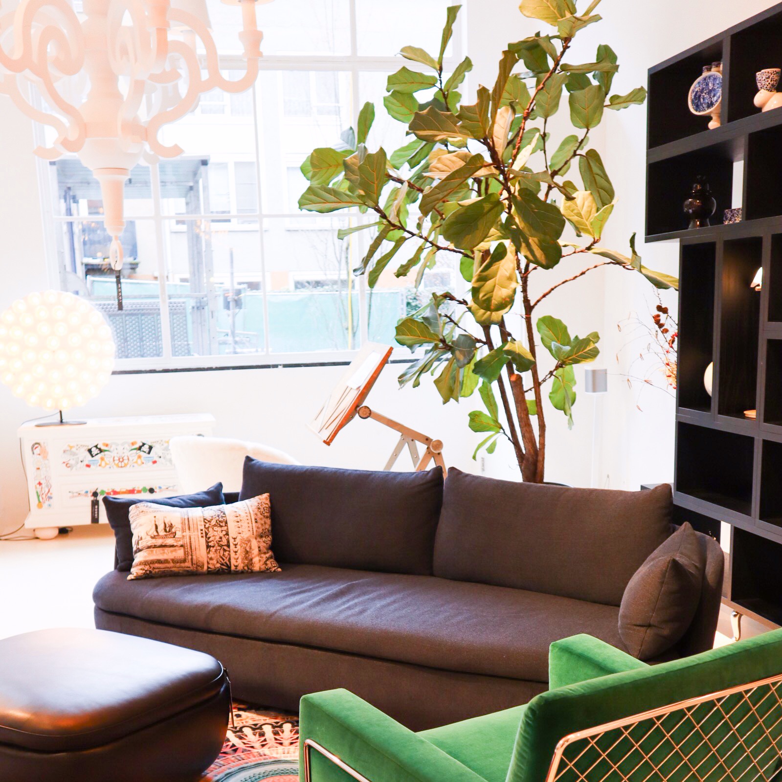
Back to colour and textiles, the various chair styles that dot about the showroom also showcase the continued use of (often) bold colour and with different fabric finishes. The Charles chair a Marcel Wanders design with it’s simple frame base structure is most definitely an iconic piece. It can look strikingly different by the simple change of colour and finish. You will have seen many chairs in companies such as Made.com that have cost definitely been derived from this design. Similar in it’s simplicity is the Golden chair, a simple design based on and reminiscent of a simple school chair but with a fine frame and fab array of finishes. I really love these!!
Area set up - featuring among others - the Charles Chair (in emerald green to the far right), Perch table lamp (on shelving).
They want to be daring but yet timeless, this can perhaps be seen in the most obvious way in pieces like the grandfather clock designed by StudioJob.

Studio Job design Clock.
The whole feel of the showroom is exclusive but without the austerity that that can also harbour. With lots of pattern and colour the space becomes playful and almost poetic, far more inviting than some uber modern show spaces. The brand dictates itself as being position ‘on the edge of commercial reality and cultural interest’ and I think that is about spot on and evident here. Being at the higher end of a retail price point they offer up furnishings that are coveted, yet identifiable at the same time.
In a nutshell, the Moooi style is old meets new in the most modern way, if that doesn’t contradict itself too much?

24hrs in Amsterdam - a design trail
A quick guide of how we spent our first 24 hours in Amsterdam, the design hotspots, food, shops and sights.
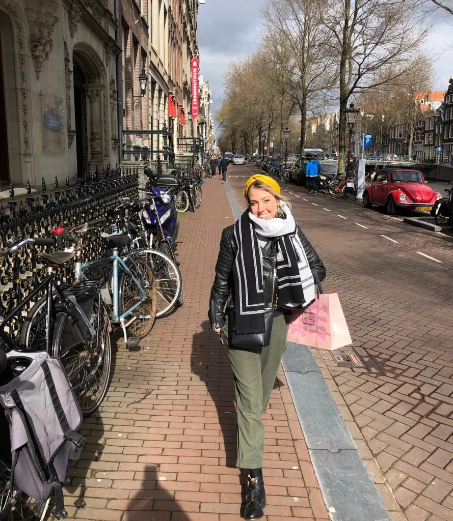
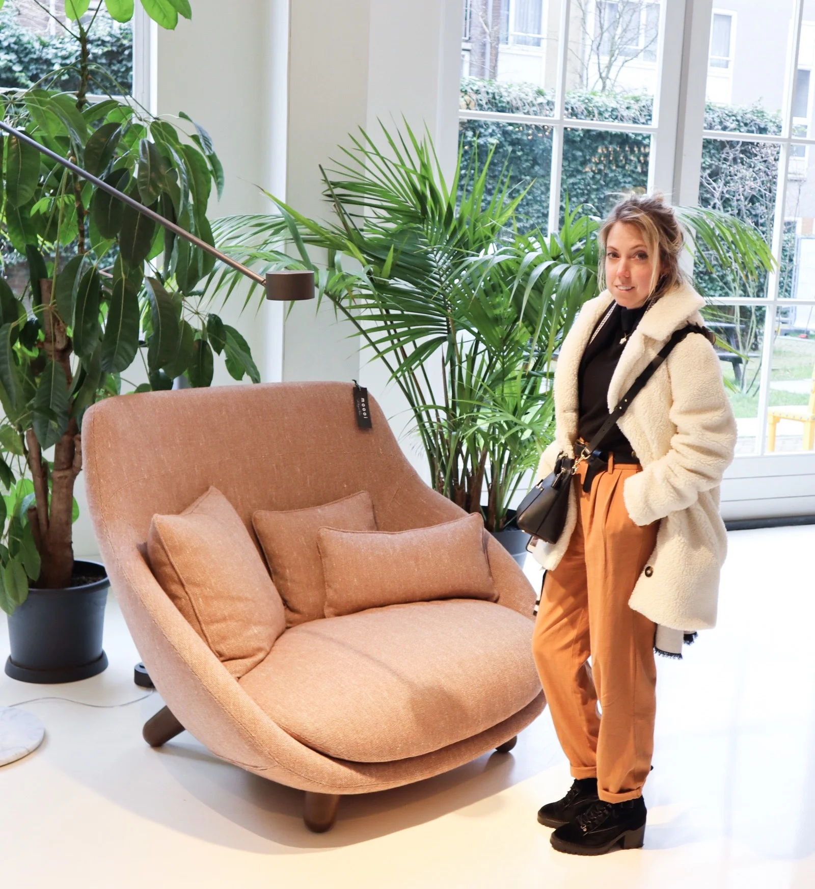
We recently took a quick trip to Amsterdam to attempt to get a bit of a break!
This did however, much to the husband’s dismay, turn in to the usual mission to discover some of the best design spots in the city. Luckily he does enjoy it (just perhaps not as much as me), let’s say he’s an enthusiast whereas I’m borderline obsessive.
We were also there for more like 48hrs than 24hr but we thought it might be great to piece together an ideal day for those of you who love design, don’t mind a good wander and want to know where to hit.
We started our day getting some all important breakfast to keep us going, for this we hit Lottie’s at The Hoxton in the fab Nine Streets district, where you will not only get some great grub but you can soak in the chilled out (typical Hoxton style) decor and atmosphere before hitting the streets. We actually stayed at The Hoxton (we can highly recommend it, great staff, location and rooms), and so this obviously worked well for us, but I would hit it up at some point whether you’re based there or not.
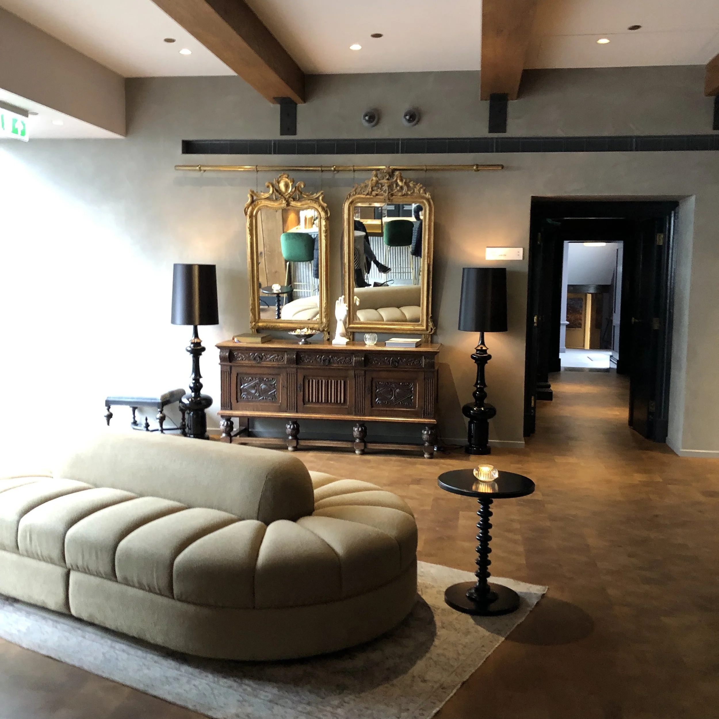
From here head straight up through the pretty independent shop laden streets into the Joordan, considered the ‘hip’ neighbourhood. Here you’ll find the fabulous Moooi showroom where the brands furniture, lighting and rugs can be perused to your hearts content, just soak it in.

When you’re ready to head off, wander back down into the Nine Streets area taking in as many little design shops as you want along the way.
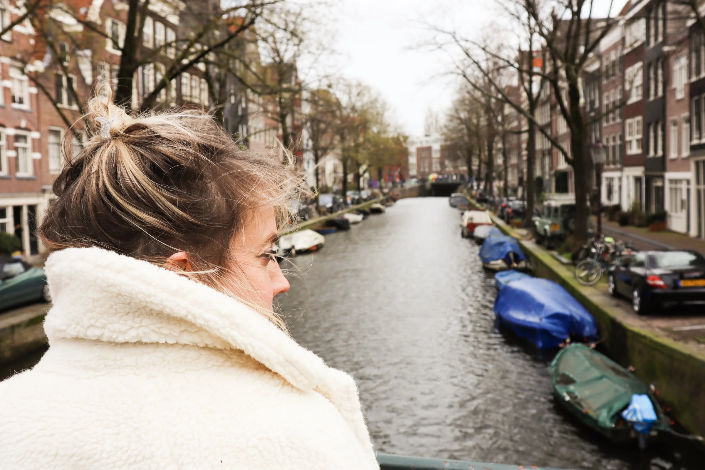
It’s obvious from the outset that Amsterdam is a very design driven city, you don’t have to be on the hunt for it, you’ll be absorbing in design and the relaxed style that simply engulfs the whole place.
As you wander try to include spots such as Property of (bespoke products and cool unisex bags/accessories), Concrete Matter (cool menswear), and Hutspot (relaxed concept store).
On your way around this great area you’ll need a coffee break, head to Pluk, a cool little cafe with an array of fresh cakes and breads, along with an impressive and colourful display of fruit and veg for juices and smoothies alike. You can grab something to go or take the time to sit in on the small mezzanine level, although be prepared to wait at busy times as this place gets very busy.

Once you’re refuelled head along to X bank, housed in the sprawling, deco inspired W Hotel. A glitzy concept store focusing on everything from prints to accessories and clothing. You’ll also find the likes of Soho House and Cerconni’s in this area…if that floats your boat!
Now you’ll really needed some lunch so get yourself along to Nooch a fantastic asian fusion restaurant smack bang in the centre of the nine streets. We fuelled up on a light selection of dim sum, sushi and a cheeky G&T…well we were on holiday.
Once full and reenergised, head down to perhaps our favourite (design mecca of sorts) store, The Frozen Fountain. Well worth a visit if you love bright, unique, and colourful furnishings. A two floor showroom of weird and wonderful decor, the second floor housing a fantastic fabric and wallpaper library with some of the best sample books I’ve seen.

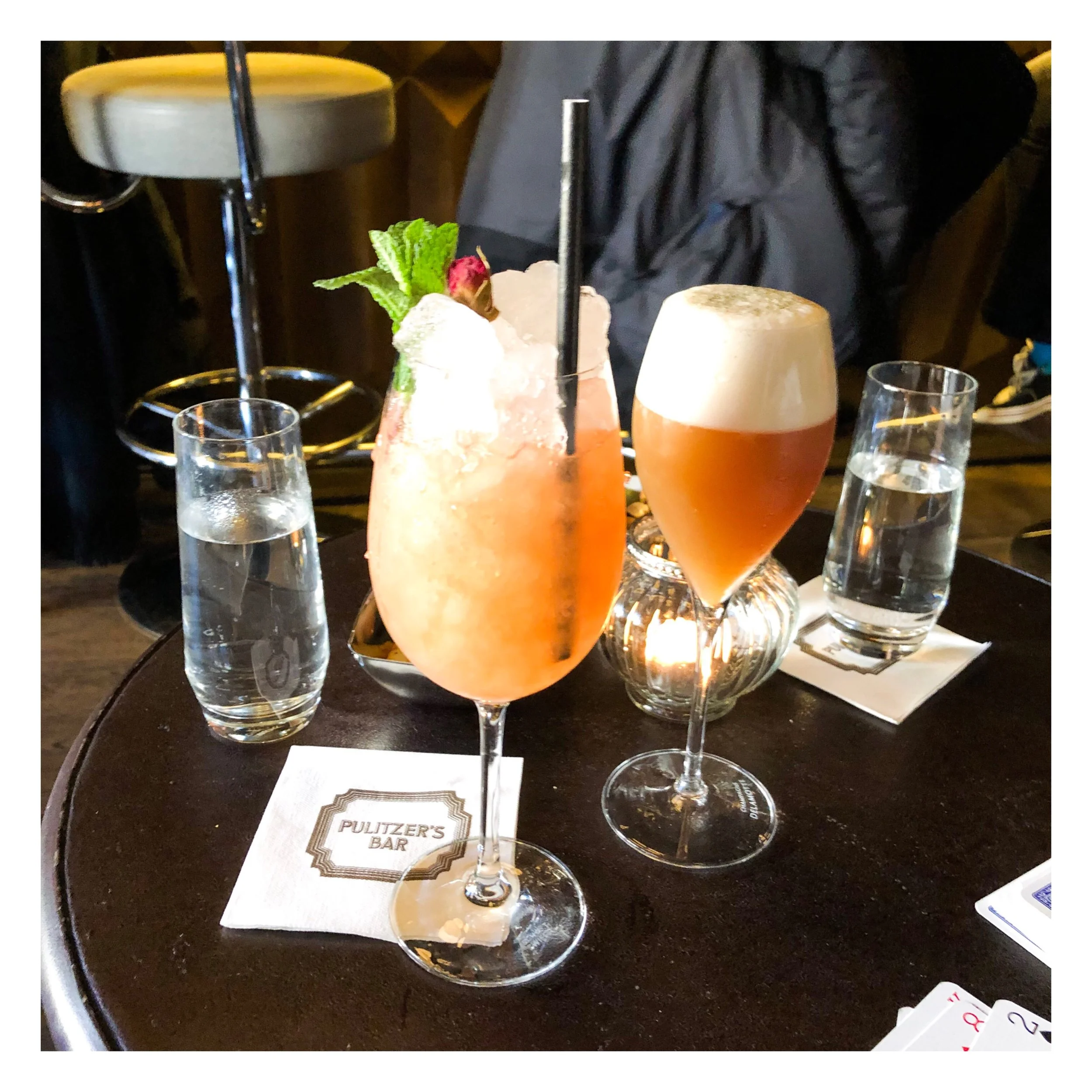
After this eye-catching array of goodies has been explored hit the streets again and go on a mission for, a much deserved, cocktail (or two). We headed to the Pulitzer’s bijou bar with its dark and moody decor, and Hemingway inspired drinks menu. The staff here are so helpful and friendly it makes the atmosphere more relaxed and informal than you might expect from the outset. We had the best version of a Cuba Libra that we’ve ever come across in this bar (a barman recommendation).
Following a few drinks and a few card games, head back to your hotel (if you can) for a quick freshen up before another wander out to get some dinner. For this get yourself to Pesca…they’re not joking when they say it’s the ‘theatre of fish’, what an experience and amazing food to boot. The whole experience from start to finish was fun and enjoyable, a laid back atmosphere where you pick your own fish and wine before heading through to the communal dining area to be seated with your handy numbered buzzer. When the buzzer goes off take yourself up to the pass and collect the most delicious fresh seafood dishes that you chose, ready as and when. It’s pure perfection.

If you don’t like fish this isn’t the place for you, we suggest trying Cafe Sous for some sharing plates or Bussia for a great Italian, all in the same sort of area.
Finish the day with a walk back to your hotel, maybe stop for a night cap either along the way or in your hotel bar before hitting the sack! With the amount of walking and exploring you’ll have done you will definitely be ready for it.
A few extra tips:
Rent a bike if you want to get more done and cover more ground.
The dutch bikes don't use gears and don’t often have bells, always be aware of your surroundings, they won’t slow down so if you’re not looking you might get taken out!! (I speak from, near, experience).
Take an umbrella, just incase, it rains on average 217 days a year in Amsterdam so be prepared.
If you can fit it in or have longer definitely visit: MOCO Museum (Modern, Contemporary Art), the current exhibition is fantastic, also the Haus Marseille and Foam, both photographic galleries are worth visiting.
Finally, if you can do a boat trip do it, it’s a great way to see the different districts, there are architectural ones and for a bit of fun try Those Dam Boat Guys (a smaller BYOB style boat trip).
Get yourself to Amsterdam, in a nutshell, it’s a design paradise and a total blast!