
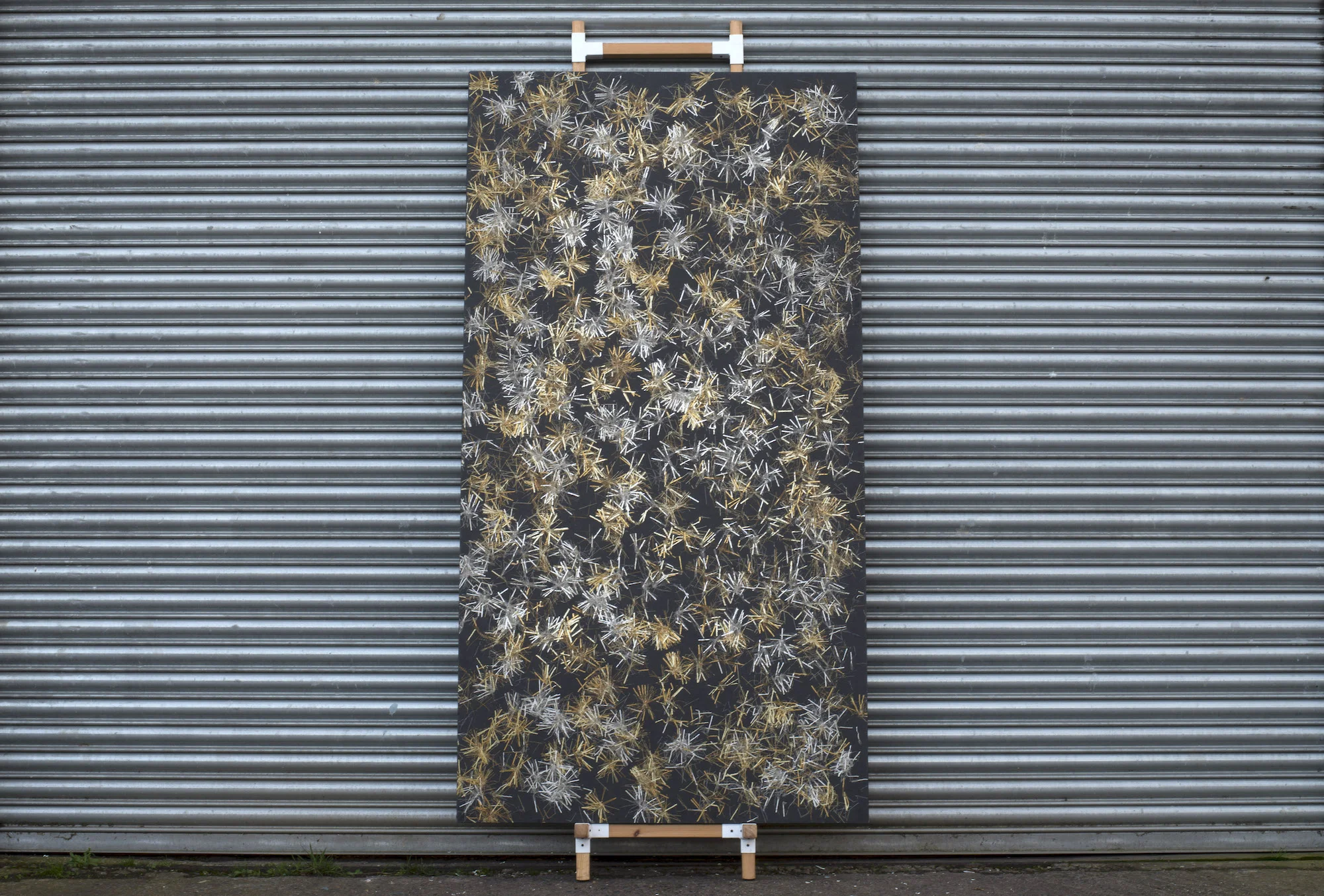
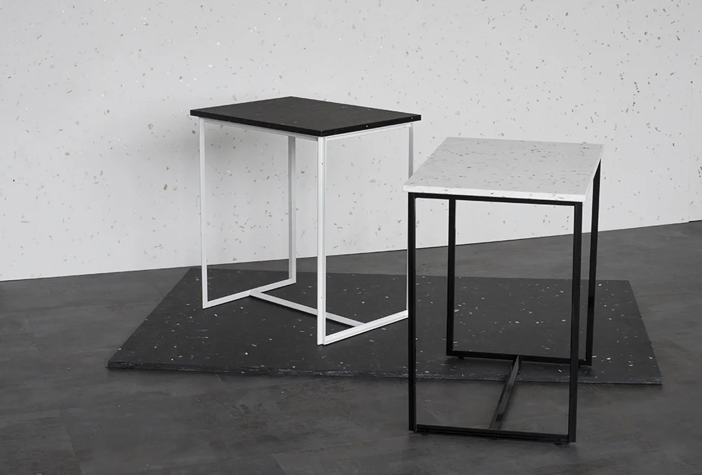
Smile Plastics
Smile Plastics produce the most amazing recycled plastic surfaces.

Image courtesy if SmilePlastics.com
Founded by Rosalie McMillan and Adam Fairweather, Smile Plastics mission is to create beautiful and useful surfaces out of waste materials.
Born out of the clever combining of design expertise, across jewellery and industrial sectors. With Adam having over a decade of developing handcrafted panels out of various waste materials and Rosalie having received great accolade in the Ethical design sector for her work creating jewellery out of sustainable materials.
The results are stunning, and from first spying some of the beautiful surfaces at a LDF trade show way back, to following their developments since, we are big fans at LA!
The more I looked in to their design process in detail and discovered the vast array of waste materials they use the more intrigued I have become. From medical waste to coffee grounds, each panel is made by hand with each piece carefully placed before pressing, making every panel unique.
So apart from the fact that 100% of the materials used are recycled, which makes them a very sustainable options, what are the benefits of these surfaces? Well as we said they’re beautiful and all unique, but they are also VOC free, totally waterproof, easy to look after and incredibly hard wearing. What more could you want?
While a lot of their work being commissions, both private and commercial, there is also Studio Smile, a capsule collection of lifestyle pieces. Kept simple to let the beauty of the material shine.
Commissions of note, to date they have worked with an impressive array of consumer brands including Jigsaw in Covent Garden and Selfridges (on many departments). In these projects they create bespoke surfaces for display tables and shelving, sometimes even feature wall panels.
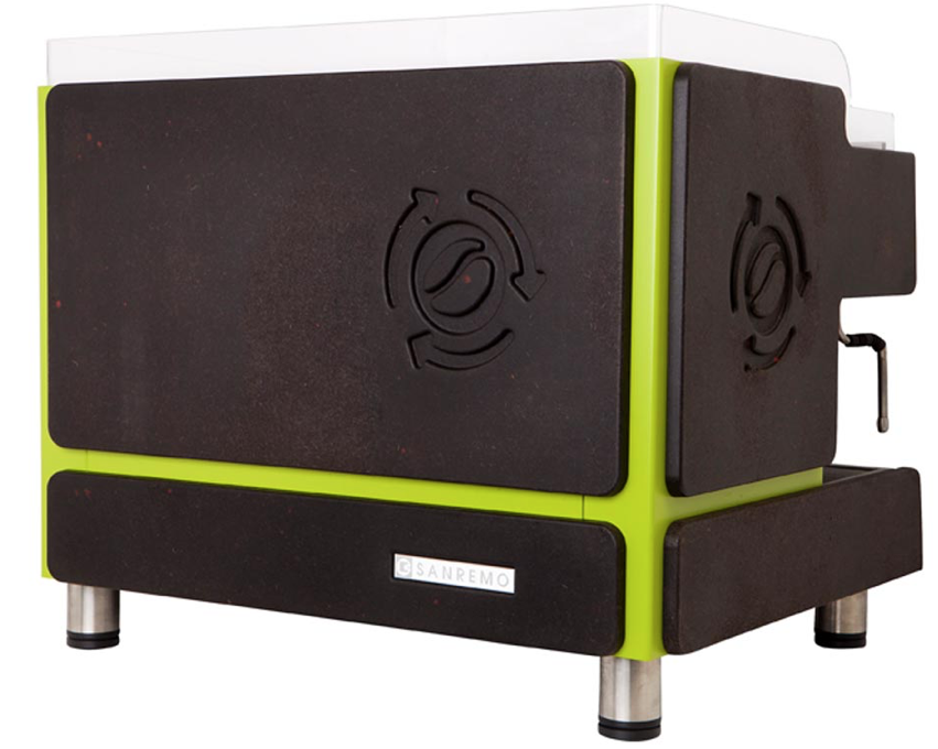
One of our favourites is their work creating panels for Sanremo’s Verde coffee machine out of old coffee grounds. Very apt and the finish is spot on!

Another fab project is Smile’s collab with Hej coffee, creating a coffee pod using recycled coffee panels and plastic bottles at the Societe Generale offices. In this case the result is a bright multi coloured surface that adds a playful edge to an otherwise paired back area. They also created a series of modular panels that for a pop-up coffee pod for external events.


Their clever use of recycled materials and the quality of the finished article is fantastic, the fact you can choose so many bespoke options and really create something truly unique to you is a further bonus in our eyes. With our eye firmly on sustainable designers, we look forward to seeing what else Smile creates in the future and to hopefully working on many projects with them in the future!
Go check them out at www.smile-plastics.com

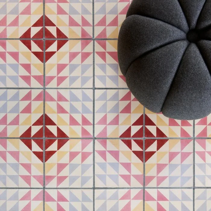
Bert and May
A designer spotlight on the brilliantly stylish Bert&May brand. The UK’s finest encaustic tile supplier and creator of all that is raw yet refined, from sinks to fitted kitchens.

Brand Background
Bert & May, first established officially in September 2013 as the brand we now know (and love). The synonymous style of the brand is one of natural materials and a raw quality. The designs bring the often muted colour palette in to a more sleek and contemporary sphere.
However, the original incarnation by founder Lee Thornley came about in day back in 2004 when he moved from London to Andalusia (now why would anyone do that….hmmm I wonder! Joking), to start up a reclaimed tile company.
It wasn’t actually until 2010 when Thornley met Juanma, the owner of a small artisan tile business that what was to become Bert & May was formed. Juanma’s small family business had created encaustic tiles using the traditional techniques and this collaboration was the ideal meeting of minds and skills. Together they worked to take the business business further. So what had started as an online venture for Thornley soon became a multifaceted brand.
Going back a step or two, while in Andalusia Thornley had designed and opened the stylish boutique hotel Casa la Siesta in Cadiz. It was during the development of this careful restoration that he uncovered his true love of sourcing not only tiles but other fixtures and fittings. He clearly had a an eye for finding rare antiques and fabulous reclaimed items. This is a skill that was to be drawn upon in the development of Bert & May from a tile company, to creating and sourcing an array of fantastic designs from stone sinks, to bathroom fittings, to engineered wood flooring and so much more.


In fact, as of late they have just launched a natural pigment paint range, consisting of sumptuously rich natural tones, we just love it and look forward to trying out many of the fab colours available.
The paint range has developed from a desire to create a range of paints that continue the raw palette of the tiles that they have become so known for.
Prior to this they also launched a bespoke capsule kitchen range, and there’s probably plenty more to come, watch this space I guess.
As for the kitchens, the high end range, much like the rest of Bert & May’s designs, feature a combination of traditional craftsmanship and contemporary practice. Consisting of 4 iconic styles; Library (our fave), Forge, Warehouse and Yard. Each one seems to represent the different edges to what the brand presents, from reclaimed and raw to clean and contemporary, all styles can be found.

The raw meets refined aesthetic can be seen no more than through the range of sinks and fittings that they design. With a range of contemporary and traditional styles, our favourite is the Elm basin (seen blow in crimson, swoon!). A contemporary take on the utilitarian bucket sink with its use of concrete material and the tactile addition of pin stripe textured pattern highlighting the vertical curved design.
The look can be further completed with the addition of the industrial inspired brassware fittings all manufactured in the UK and available in a range of super cool finished such as satin brass and black. If a sink and it’s fittings could be something covetable…this is it!


They’ve had their fair share of chic collaborations too, perhaps our fave is that with super cool brand Darkroom with whom they created a range of tiles and fabrics. The designs celebrate the graphic aesthetic using bold lines and colours.

Other collaborations include; Soho House and Anthropologie. Whether you know it or not, if you are a fan of fantastic design you’ll have seen some of Bert & May’s tiles, as they adorned many a cool bar, cafe and restaurant.
With a real drive towards the importance of wellbeing as a pivotal factor in design and interior practice, this brand sits very well with us and is definitely one to continue to watch. We for one can’t wait to see what they create next!
Images courtesy of Bertandmay.com
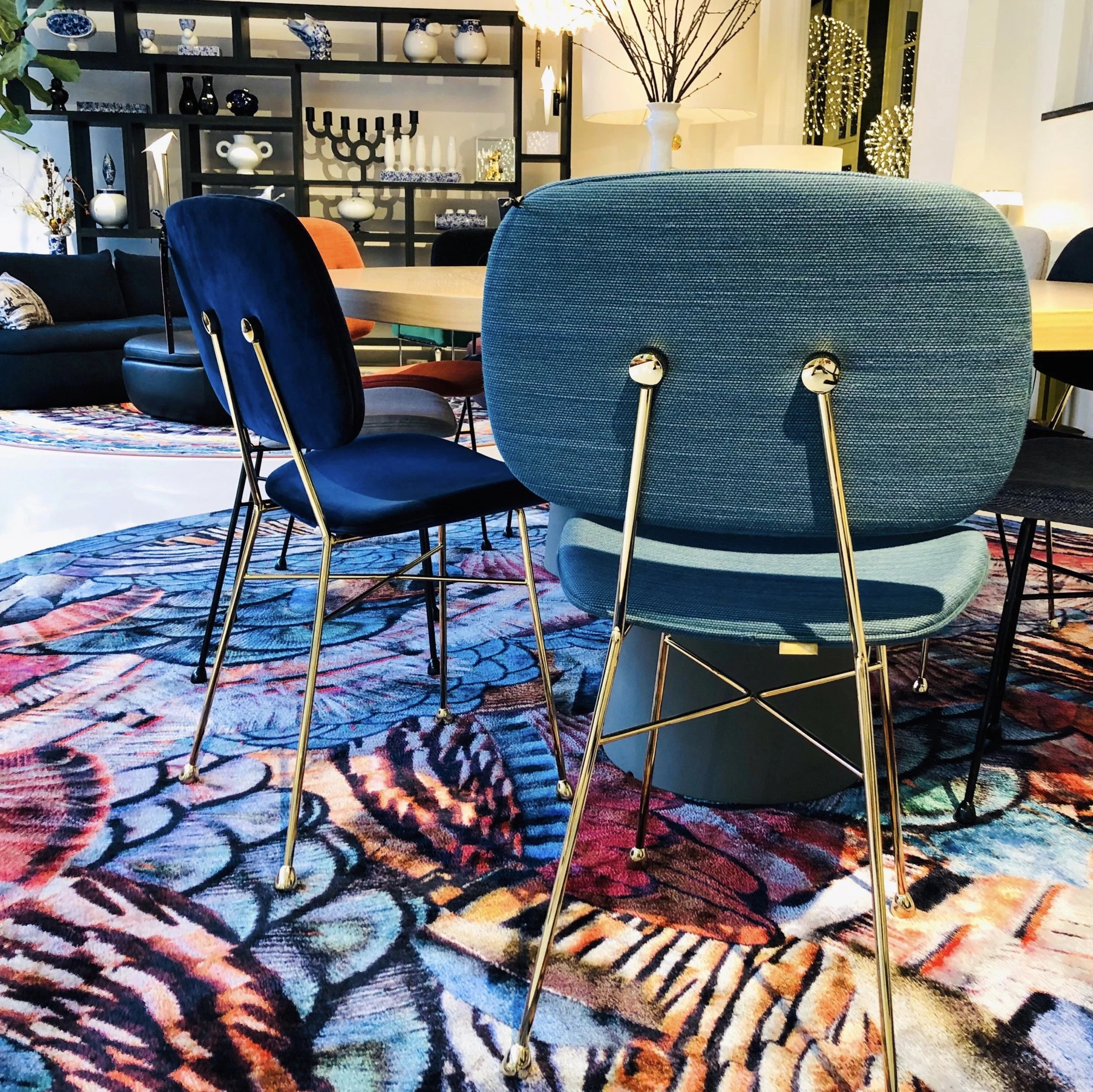
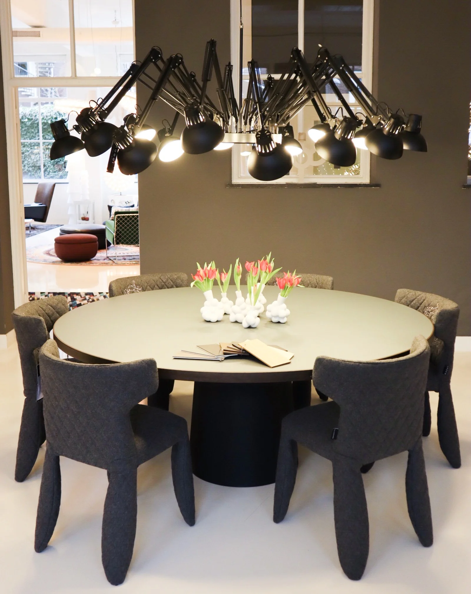
Moooi
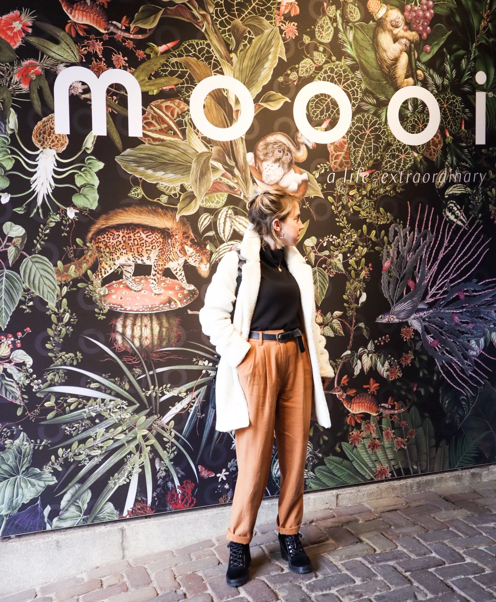
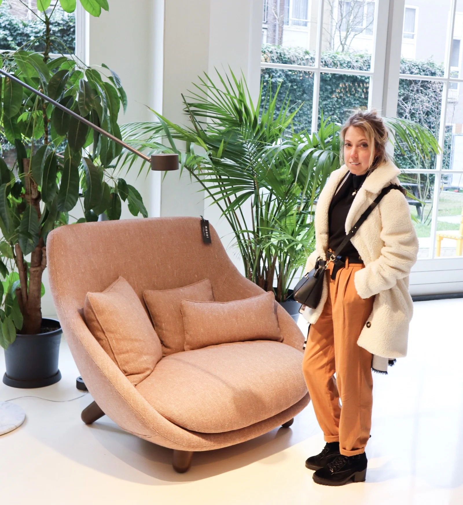
A designer spotlight on Dutch furnishings brand Moooi and their flagship Amsterdam showroom.

Luxury design making playful statements!
So let us start with the basic brand bio to get some background….
Dutch luxury brand Moooi was founded in 2001 by Marcel Wanders & Casper Vissers. The name itself derives from the dutch word for beauty, with extra ‘o’ for uniqueness!
Since it’s original incarnation there have been many management and ownership structures but Marcel Wanders has remained in charge and chief designer all along.
Along with their own unique blend of luxury they showcase pieces by other well established, and equally playful, designers such as Studio Job and Umut Yamac (got to love his Perch lights, seen dotted all over the Moooi showroom).

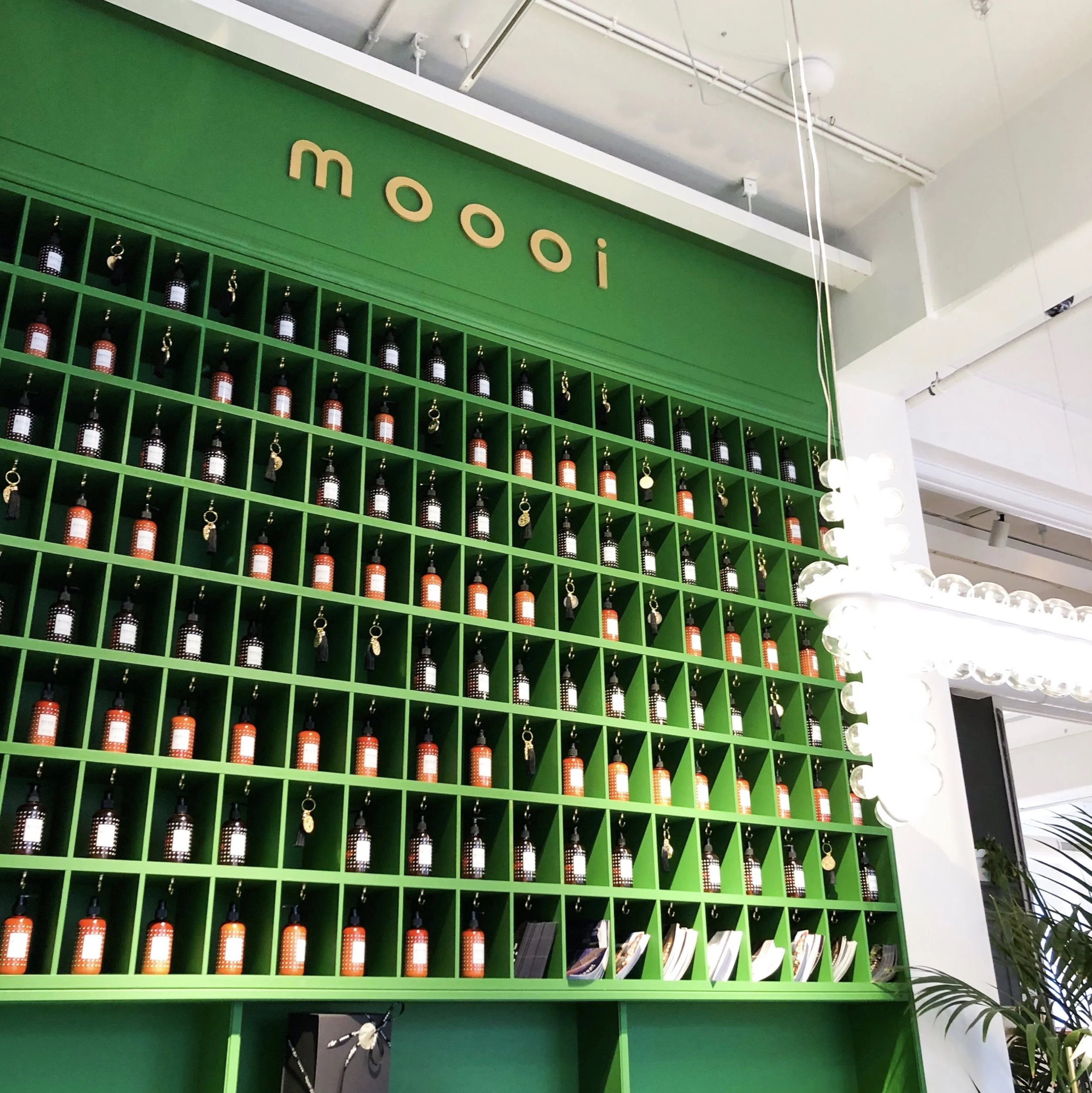
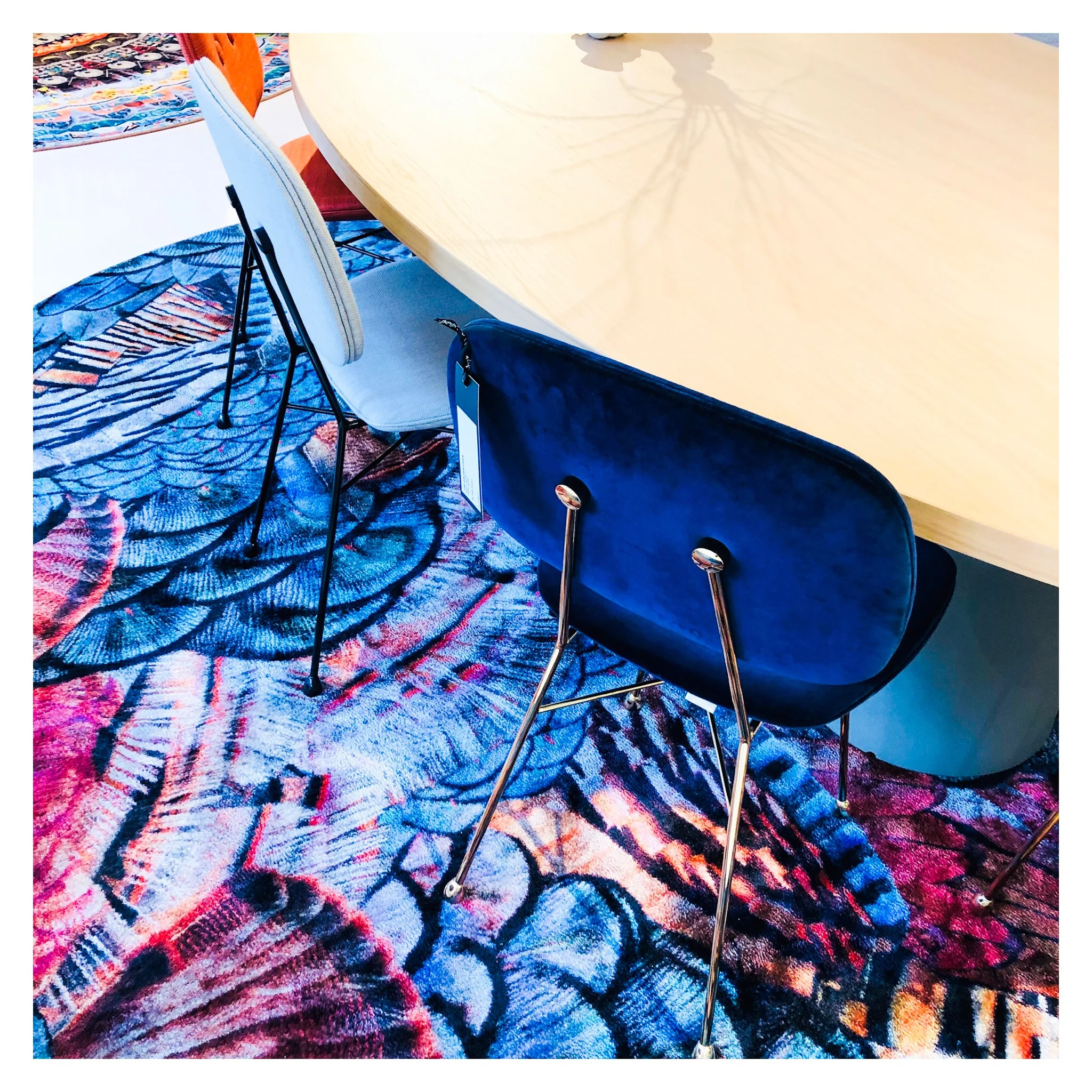
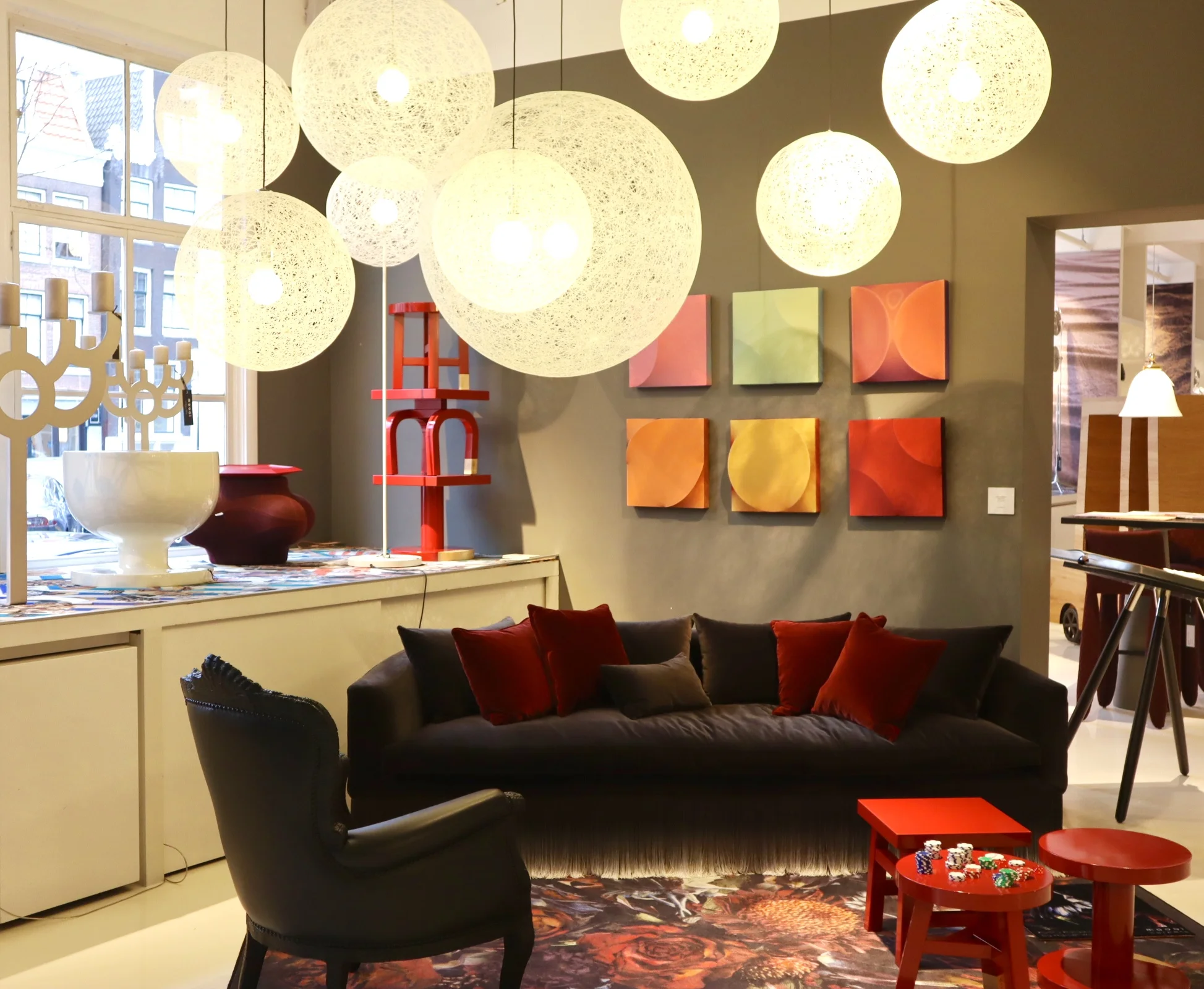
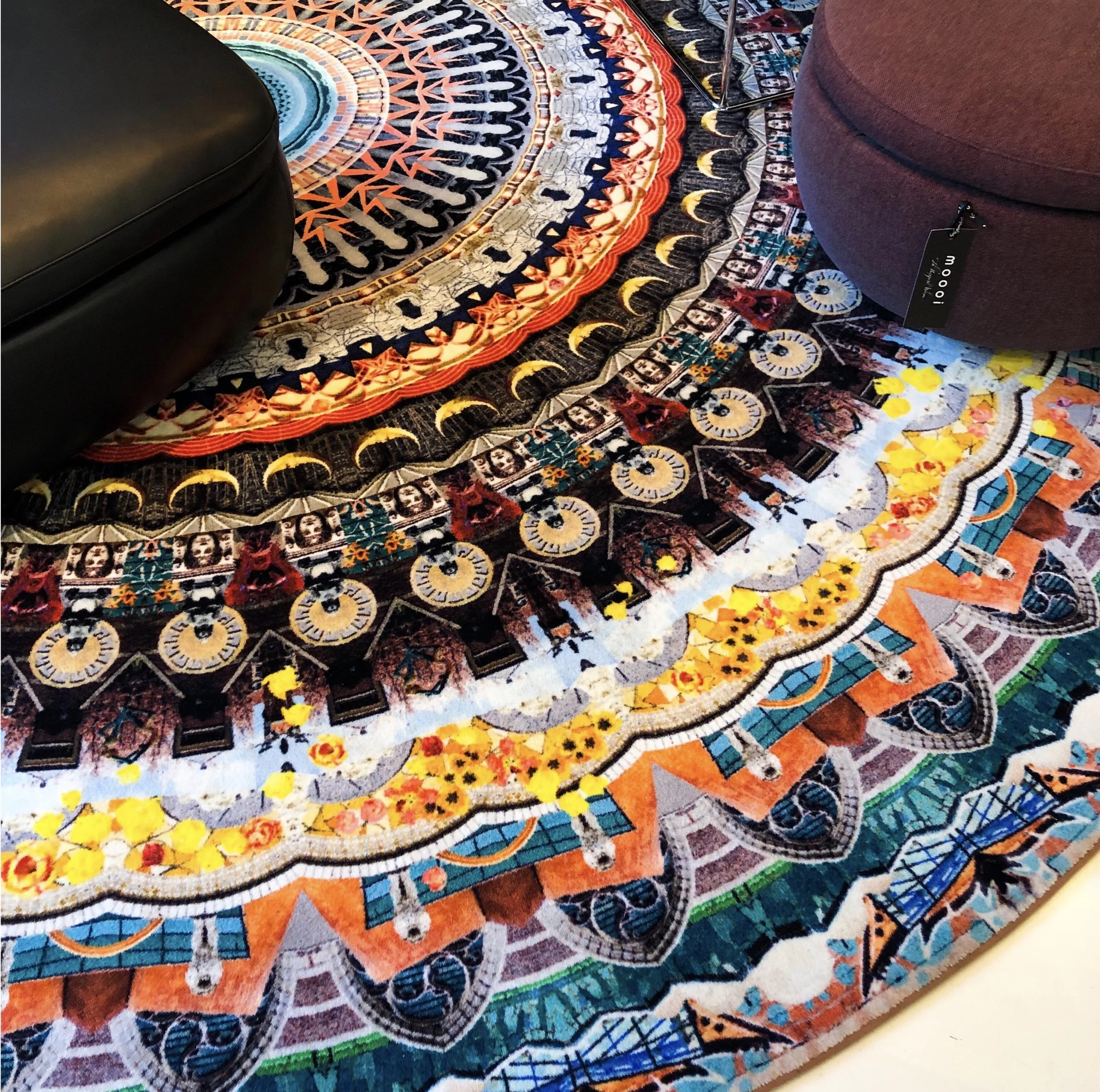
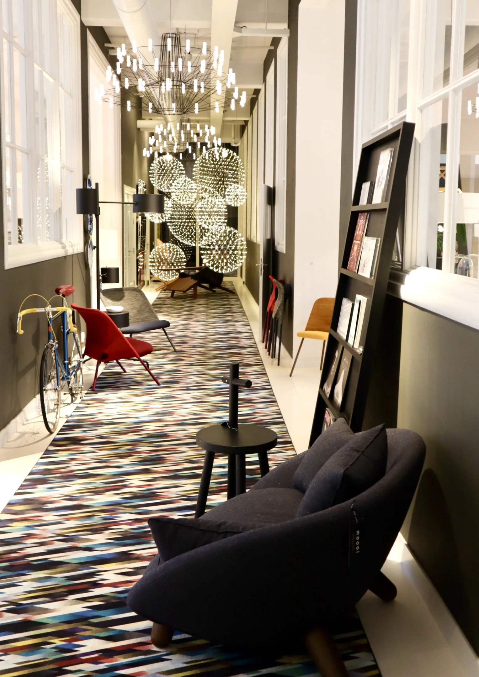
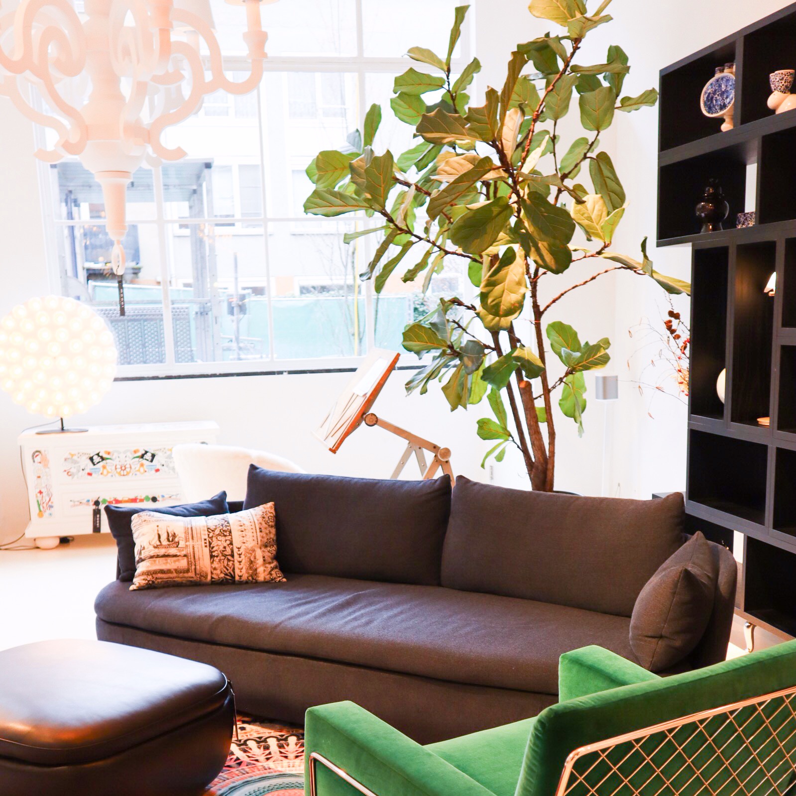
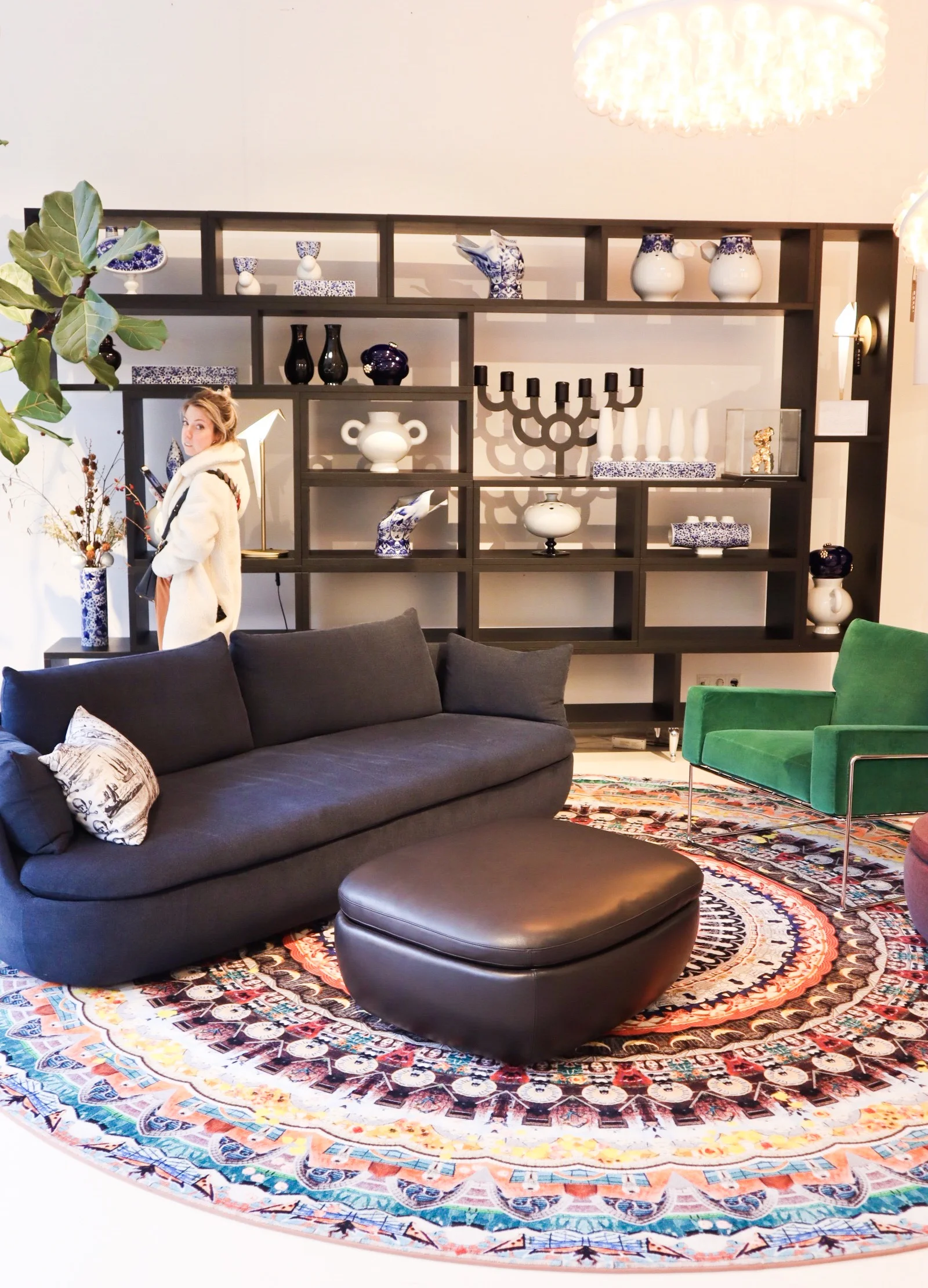
Now let’s talk about how amazing the 700sqft flagship showroom is in Joordan, Amsterdam. It’s a visual grenade from the second you walk in. Even just the carpet that runs from the entrance, leading you in is an explosion of detailed print and bright colour. A common thread that runs throughout the whole showroom, with each intricately staged area featuring some form of bold explosion in the form of a fab rug or carpeted area. I love walking around showrooms like this, they are not only great when you are sourcing for a project but also just for inspiring. It’s so important to keep visually stimulated and to put yourself in to spaces like this as a designer as often as possible. It is so easy to fall into the ‘work’ aspect of the job and get bogged down by specs and the technical areas of a project.
So back to Moooi… the brand is known for quite a few modern iconic pieces. One notable is the Container table with its cylindric pedestal base and simple solid table top. It’s form is simple and modern yet timeless and therefore represents the Moooi ethos perfectly. It comes in an array of sizes and variations on the plain style, such as the New Antiques range that features more curve details reminiscent of old traditional turned table legs. The basic style remains a favourite of mine as it serves as a solid base to allow the accompanying chairs and all other items that occupy the space to shine.

Seen here: a version of the iconic Container table.
Moooi are also synonymous with bold feature light fittings. One of the most iconic are the strong and dominating Paper Chandelier, a modern twist on the classic metal structured chandelier, this is actually created (as the name would suggest) out of paper. Well, the main structure is actually created out of cardboard and wood that is then wrapped in a lacquered paper shell. I would say this is the most iconic light fitting in that most people will have seen one in a quirky commercial setting somewhere or another. It, like many iconic designs, has been copied (or versions/variations attempted) by other high street brands over time too.
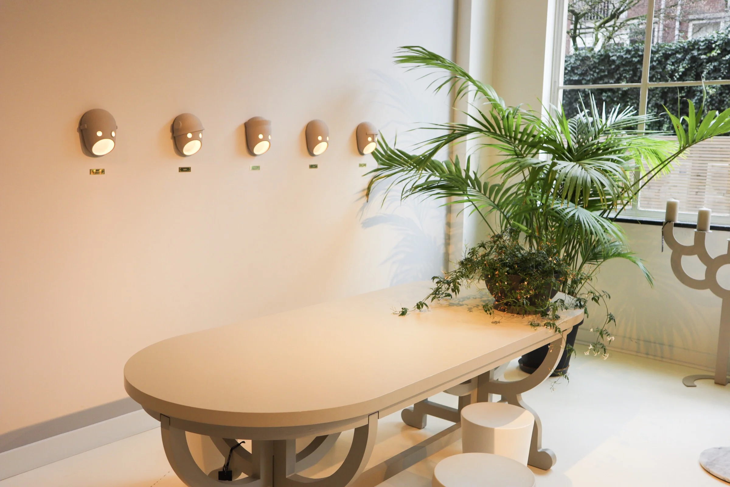
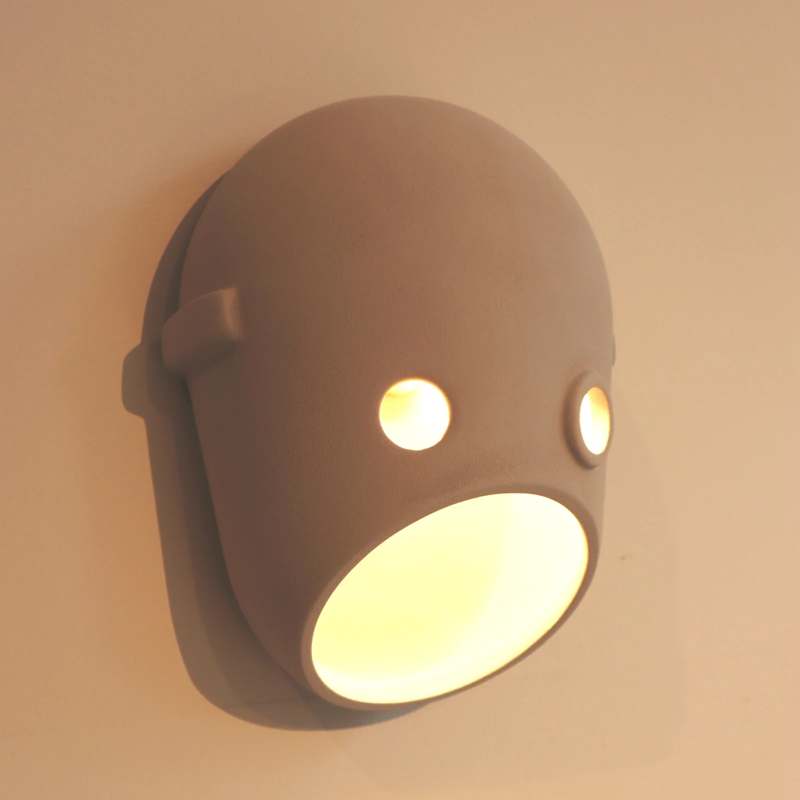
The Paper chandelier is low however on my favourites list when it comes to light fittings at Moooi. The likes of the super cool Meshmatics chandelier with its steel mesh structure edged in brass detail, for a nod to more refined luxe, is right up there. Like I mentioned at the start of this post, you can’t not love the Perch lights by Umut Yamac, seen dotted all over the showroom. But another range that I love, for the sheer fun of it, is the Party. A range of casted ceramic fittings shaped to represent faces. There are a clan of 5 ‘characters’ designed to represent different captivating personalities. The designers say this work is to represent our fascination with secrets, family dynamics and intrigue. The long strip pendant featuring all 5 faces back to back would bring character to any dinner table that’s for sure!
Back to colour and textiles, the various chair styles that dot about the showroom also showcase the continued use of (often) bold colour and with different fabric finishes. The Charles chair a Marcel Wanders design with it’s simple frame base structure is most definitely an iconic piece. It can look strikingly different by the simple change of colour and finish. You will have seen many chairs in companies such as Made.com that have cost definitely been derived from this design. Similar in it’s simplicity is the Golden chair, a simple design based on and reminiscent of a simple school chair but with a fine frame and fab array of finishes. I really love these!!
Area set up - featuring among others - the Charles Chair (in emerald green to the far right), Perch table lamp (on shelving).
They want to be daring but yet timeless, this can perhaps be seen in the most obvious way in pieces like the grandfather clock designed by StudioJob.

Studio Job design Clock.
The whole feel of the showroom is exclusive but without the austerity that that can also harbour. With lots of pattern and colour the space becomes playful and almost poetic, far more inviting than some uber modern show spaces. The brand dictates itself as being position ‘on the edge of commercial reality and cultural interest’ and I think that is about spot on and evident here. Being at the higher end of a retail price point they offer up furnishings that are coveted, yet identifiable at the same time.
In a nutshell, the Moooi style is old meets new in the most modern way, if that doesn’t contradict itself too much?