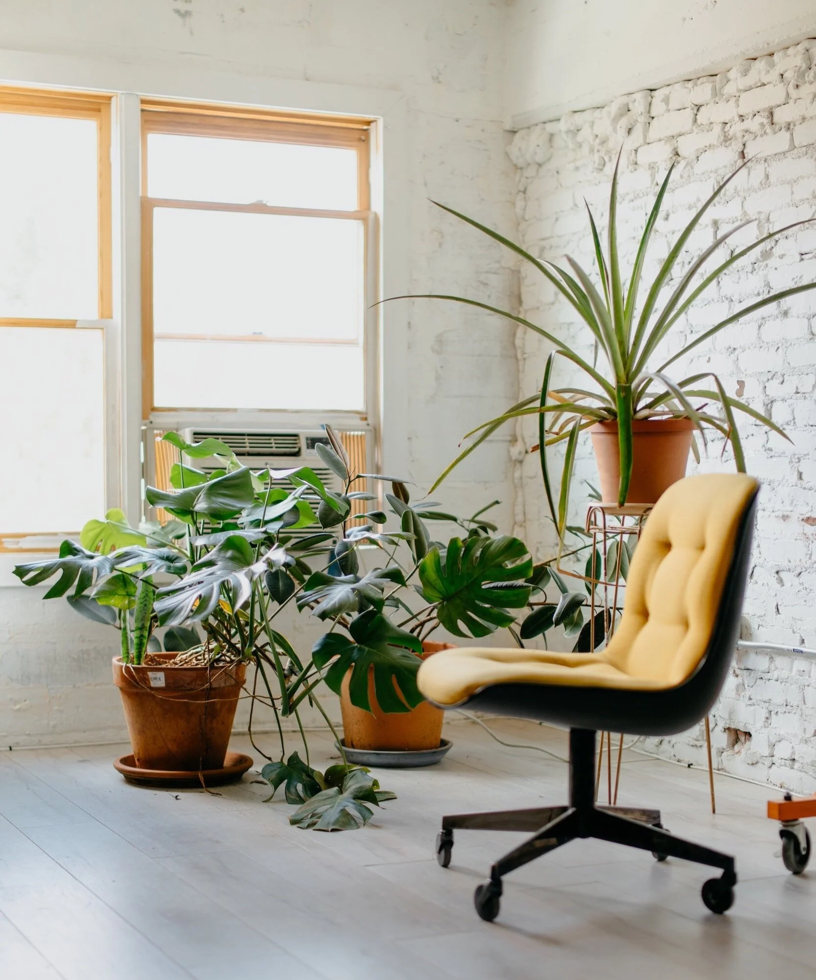
The Rise of the Home Office
In recent years, the home office has experienced an unprecedented rise in popularity. Driven by advancements in technology and changes in work culture, more and more individuals are transitioning from traditional office spaces to the comfort and convenience of their own homes. With this shift, interior design professionals have been challenged to create functional and aesthetically pleasing workspaces within the confines of residential properties.

In recent years, the home office has experienced an unprecedented rise in popularity. Driven by advancements in technology and changes in work culture, more and more individuals are transitioning from traditional office spaces to the comfort and convenience of their own homes. With this shift, interior design professionals have been challenged to create functional and aesthetically pleasing workspaces within the confines of residential properties.
One of the key factors fueling the rise of the home office is the increasing availability of remote work opportunities. As companies recognise the benefits of a flexible work environment and the positive impact it can have on productivity and work-life balance, the concept of the traditional office is evolving. No longer confined to a physical location, employees now have the freedom to work from anywhere, and many are choosing to work from the comfort of their own homes.
The transformation of the home office has also been driven by advancements in technology. High-speed internet connections, sophisticated digital tools, and video platforms have made it easier than ever to communicate and collaborate remotely. This accessibility has made the need for a dedicated workspace within the home even more essential. Which is why designing a functional home office that caters to the specific needs of remote work has become a priority for many homeowners.
When creating a home office, it is crucial to strike a balance between functionality, comfort, and style. Ergonomics plays a vital role as individuals spend long hours seated at their desks. Adjustable chairs, standing desks, and proper lighting are essential elements that contribute to a healthy and productive work environment. Incorporating natural light into the design can uplift the mood and create a calming atmosphere, reducing stress and enhancing creativity.
To maximise productivity and minimise distractions, it is important for a home office to be a separate and dedicated space within the house, where possible and where not possible this can be achieved through thoughtful interior design choices such as using room dividers or transforming an underutilaized room into a productivity hub. By creating physical boundaries, individuals are able to mentally transition into work mode and establish a clear separation between their personal and professional lives.
Furthermore, incorporating personalized elements into the home office design can enhance motivation and inspiration. Artwork, plants, and personal mementos can add a touch of personality to the space, making it feel more inviting and stimulating. Purposeful storage solutions, such as built-in shelves or storage are also key elements.
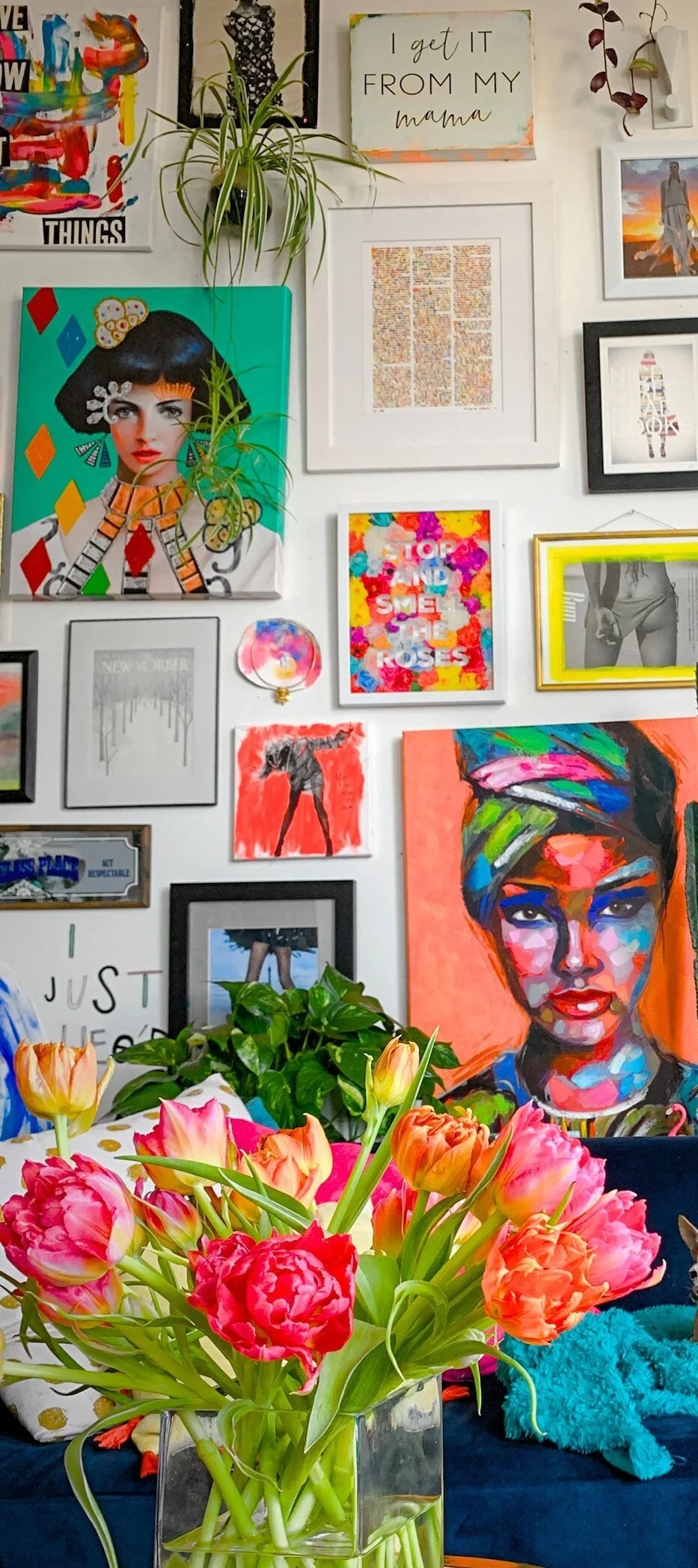
The Transformative Power of Art
In a world filled with ever-evolving technology, it’s tempting to overlook the importance of art in our homes. However, art possesses a profound ability to enrich our lives and create a sense of harmony within our living spaces. Not merely an extravagant luxury, art is
In a world filled with ever-evolving technology, it’s tempting to overlook the importance of art in our homes. However, art possesses a profound ability to enrich our lives and create a sense of harmony within our living spaces. Not merely an extravagant luxury, art is an essential element that can breathe life into the walls of our homes, transforming them into personal sanctuaries of self-expression and inspiration.
First and foremost, art holds the key to unlocking our emotions and igniting our imagination. A carefully chosen piece of art can evoke a range of feelings, from tranquility to excitement or even nostalgia, different to all who view it. Imagine walking into your living room after a long day at work, only to be greeted by a vibrant painting that instantly lifts your spirits and takes you to a place of serenity. Art has an unparalleled ability to awaken our senses, elevate our mood, and infuse our daily lives with a sense of wonder. This is why it is always a pivotal aspect of our interior design process.
Moreover, art possesses the remarkable ability to reflect our individuality and showcase our personal taste. Our homes are extensions of ourselves – they tell our stories, represent our values, and make us feel truly at home. By carefully curating a collection of art, we transform our living spaces into a visual autobiography. It’s an opportunity to display pieces that resonate with our personalities while celebrating the diverse and vibrant world of creative expression.
Art also enhances our cognitive abilities and fosters a sense of intellectual stimulation. Surrounding ourselves with thought-provoking artworks encourages curiosity, critical thinking, and open-mindedness. Art challenges us to interpret, analyze, and appreciate the narratives and symbolism embedded within each piece. Moreover, studies have shown that exposure to art can improve focus, memory, and problem-solving skills, enhancing our overall cognitive well-being. By integrating art into our homes, we create an environment conducive to intellectual growth and creative inspiration.
Furthermore, art can serve as a bridge between generations and cultures, fostering a sense of inclusivity and diversity within our homes, something we love. Art transcends language barriers, cultural differences, and even time itself. By incorporating art from various periods and cultures, we encourage dialogue and an appreciation for the vast array of human experiences. Through art, we can create a unifying space that celebrates our shared humanity, while simultaneously honoring our unique backgrounds and perspectives.
Finally, art enriches our visual environment, making our homes more aesthetically pleasing and nurturing our sense of beauty.

HowTo - Spatial Plan
Our quick and handy Howto guide on spatial plan, helping you to make the most of your room and guide you with furnishing. Part of LitterArty x HowtoHome’s handy HowTo series.

It can be daunting sometimes working out how and where to fit and position furniture in any given space. While there is some level of subjectivity based on personal comfort and requirements, there are a few handy rules to help you establish suitability of furniture and not end up in a situation where things don’t fit or the space isn’t accessible.
How to ensure you have enough free space?
A general rule of thumb is to allow approximately 50cm (minimum) of space from one piece of furniture to the next. There are of course exceptions to this rule such as the distance between a console table and the back of the sofa or next to a bed. In cases where your aim is to have one support the other and be in close contact then obviously this rule does not apply.
In hallways and passing places it’s advisable to up this minimum and allow at least 80-90cm of space so that the area doesn’t feel cramped and walking past objects and items of furniture is a challenge.
Top Tips:
- Consider where fixed obstacles positioned, such as doors, windows, radiators and fireplaces. You need to allow space around and plan furnishings that will fit around these features and balance out the space.
- Think about volume and don’t over fill a space.
- Ergonomics - ensure that there is a circulation passageway through a room. This follows an easy pathway from the door to all the other main areas of activity.
- Edit your clutter, clutter brings in spaces and creates a sense of chaos. By minimising clutter you optimise your space, yes it’s common sense.
Questions to ask:
1) What, is the space used for, what are its functions?
2) Who, uses it? How many people does it need to accommodate etc.
3) How, do you want the room to feel? Spacious, airy, cosy, minimal….
4) Are there focal points? Or do you need to create focal points?
Another question we are regularly asked is; What is the optimal distance between a TV and your seating? Again, a general rule of thumb is to base this on the size of your TV, take that measurement and times it by 1.5 to 2.5 to gauge your most comfortable viewing distance. So for example, a 37 inch TV could be positioned around 6 ft from your sofa for optimal spatial planning. Obviously, this is relative and subjective to personal comfort but it’s not a bad rule to stick by.

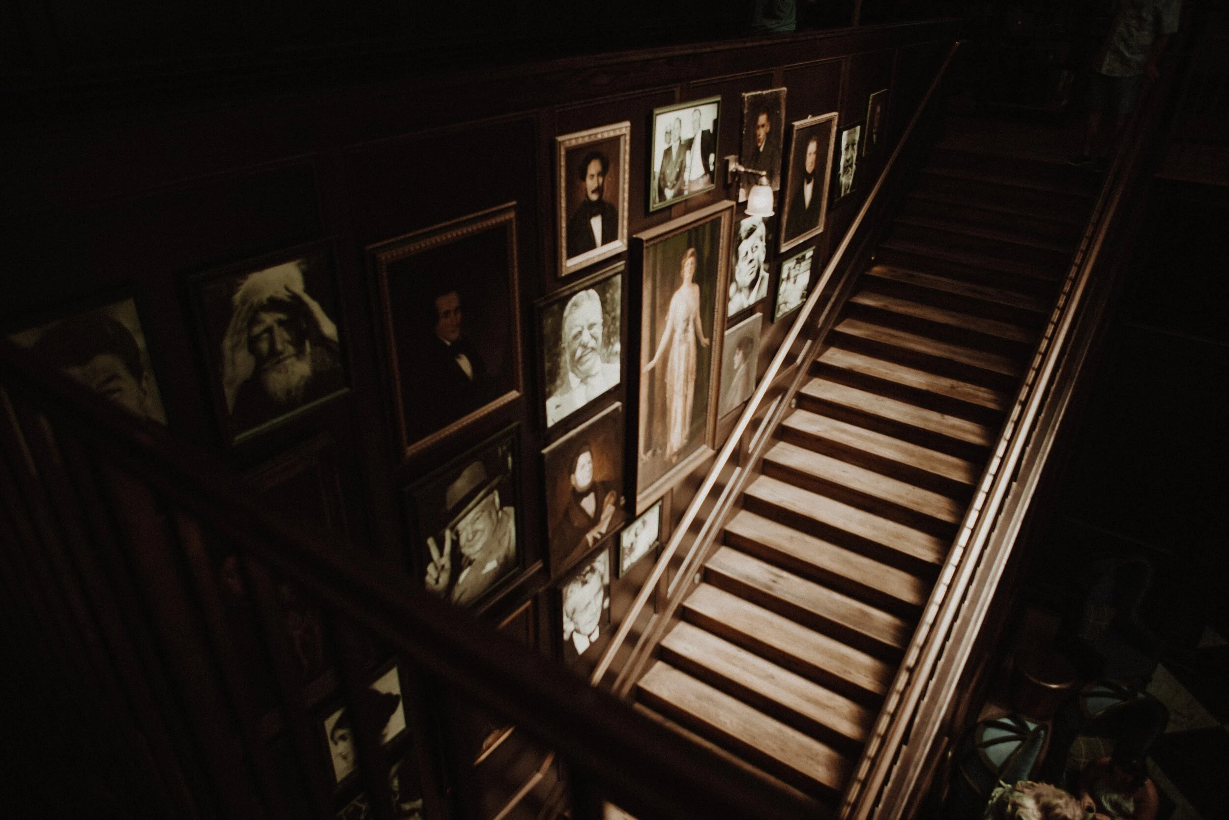
HowTo - Hang Pictures
Our quick and handy Howto guide on picture hanging. Part of LitterArty x HowtoHome’s handy HowTo series.
To get you started, here is a check list of tools and equipment you may need to hang pictures securely, safely and successfully.
- Tape Measure
- Pencil and Rubber
- Spirit Level
- Hammer
- Drill (if hanging heavy work that requires a wall plug and screw)
- Picture hooks and nails
- Wall plugs and screws (if required)
- Cord or wire for hanging.
Before you grab the hammer and start attempting to hang your picture, you need to make a few practical decisions, such as, where you want it hung and is the wall structure suitable. You also need to decide how much support you’ll need to hang your picture securely, whether single or multiple hooks etc. Once you’ve established the location and hanging equipment needed follow there are some basic steps to follow for hanging. Whether you are going for a relaxed or a traditional museum approach this is a great base point. All rooms are different and the museum approach may not be appropriate for your décor.
Step 1 – Measure
Take a width measurement of the wall you are hanging your chosen picture on.
Step 2 – Align with the centre of the wall
Find the centre point of the wall by halving the overall width and place a small pencil mark.
Step 3 – Determine the Height
Most people hang pictures too high; you should not have to strain your neck to see them. There is a bit of a science to picture hanging. That said, this is where your subjective style comes in, whether following the museum approach or not.
Relaxed approach
If you're confident with your artistic abilities, use your eye to judge where to hang your painting. This will allow you to balance your furniture, doors and windows. Just makes sure it's at a comfortable eye level. If not follow the next step:
Technical/Museum approach – a simple equation
1) Measure 145cm from the floor this is the ‘ideal’ middle point of your picture.
2) Measure your picture and half it, this is the centre point. This is A.
3) Measure the tension depth from the top edge – pull the picture cord/wire to full tension as it will be when hanging. This is B.
4) Find the height by doing this simple equation – 145 + A – B = Height to position your nail.
Handy tips
- A lot of plastered walls, particularly in older properties can crumble when a nail is hammered in. To protect your surface from damage or marks place a small piece of masking tape over the point for hanging. This will help to protect the nail point from causing damage.
- If your frame is heavy or slightly rough on the reverse place some small sticky felt pads on the reverse bottom two corners just away from the edge. This will pad and protect from rubbing or movement works on the wall.
- Use a spirit level to double check how level your picture is by placing it on the top and then the bottom of the frame, adjust accordingly.
- 5-7cm between frames is a great rule to apply.
Hanging a Picture Wall or Cluster
Follow the same three steps, measure, find the middle width and determine height, then add the following step:
Additional Step 1 – Line up the centre, making the centre of the cluster/picture wall sit along the 145cm centralised mark.
Hanging Pictures on the Stairs
Dependant on your desired overall look, you can plan this intuitively or structured. If going down the structured route add the following step:
Additional Step 1 – measure 145cm from the floor, this should be the centre of your first picture.
Additional Step 2 – measure 145cm from every second to third step to form a diagonal line. This line should be the centre of each picture and then use the size of your frames to position each picture at an equal distance to space out most effectively.
Hanging a Scattered Display
Choose a piece as a central focal point. This will form the middle of your cluster. Then follow these steps:
Step 1 – Measure up your 145cm point to find the middle point of your central picture.
Step 2 – Build your gallery from the middle out, making sure you balance your pictures as you go. Always ensuring the central line stays at 145cm.
This process is very subjective to what you see as ‘balanced’ so go with what suits you and suits the pictures and artwork you love and are wanting to hang.

Bert and May
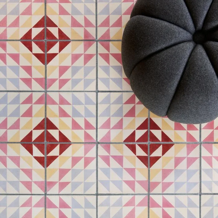
A designer spotlight on the brilliantly stylish Bert&May brand. The UK’s finest encaustic tile supplier and creator of all that is raw yet refined, from sinks to fitted kitchens.

Brand Background
Bert & May, first established officially in September 2013 as the brand we now know (and love). The synonymous style of the brand is one of natural materials and a raw quality. The designs bring the often muted colour palette in to a more sleek and contemporary sphere.
However, the original incarnation by founder Lee Thornley came about in day back in 2004 when he moved from London to Andalusia (now why would anyone do that….hmmm I wonder! Joking), to start up a reclaimed tile company.
It wasn’t actually until 2010 when Thornley met Juanma, the owner of a small artisan tile business that what was to become Bert & May was formed. Juanma’s small family business had created encaustic tiles using the traditional techniques and this collaboration was the ideal meeting of minds and skills. Together they worked to take the business business further. So what had started as an online venture for Thornley soon became a multifaceted brand.
Going back a step or two, while in Andalusia Thornley had designed and opened the stylish boutique hotel Casa la Siesta in Cadiz. It was during the development of this careful restoration that he uncovered his true love of sourcing not only tiles but other fixtures and fittings. He clearly had a an eye for finding rare antiques and fabulous reclaimed items. This is a skill that was to be drawn upon in the development of Bert & May from a tile company, to creating and sourcing an array of fantastic designs from stone sinks, to bathroom fittings, to engineered wood flooring and so much more.


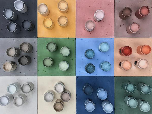
In fact, as of late they have just launched a natural pigment paint range, consisting of sumptuously rich natural tones, we just love it and look forward to trying out many of the fab colours available.
The paint range has developed from a desire to create a range of paints that continue the raw palette of the tiles that they have become so known for.
Prior to this they also launched a bespoke capsule kitchen range, and there’s probably plenty more to come, watch this space I guess.
As for the kitchens, the high end range, much like the rest of Bert & May’s designs, feature a combination of traditional craftsmanship and contemporary practice. Consisting of 4 iconic styles; Library (our fave), Forge, Warehouse and Yard. Each one seems to represent the different edges to what the brand presents, from reclaimed and raw to clean and contemporary, all styles can be found.

The raw meets refined aesthetic can be seen no more than through the range of sinks and fittings that they design. With a range of contemporary and traditional styles, our favourite is the Elm basin (seen blow in crimson, swoon!). A contemporary take on the utilitarian bucket sink with its use of concrete material and the tactile addition of pin stripe textured pattern highlighting the vertical curved design.
The look can be further completed with the addition of the industrial inspired brassware fittings all manufactured in the UK and available in a range of super cool finished such as satin brass and black. If a sink and it’s fittings could be something covetable…this is it!


They’ve had their fair share of chic collaborations too, perhaps our fave is that with super cool brand Darkroom with whom they created a range of tiles and fabrics. The designs celebrate the graphic aesthetic using bold lines and colours.

Other collaborations include; Soho House and Anthropologie. Whether you know it or not, if you are a fan of fantastic design you’ll have seen some of Bert & May’s tiles, as they adorned many a cool bar, cafe and restaurant.
With a real drive towards the importance of wellbeing as a pivotal factor in design and interior practice, this brand sits very well with us and is definitely one to continue to watch. We for one can’t wait to see what they create next!
Images courtesy of Bertandmay.com
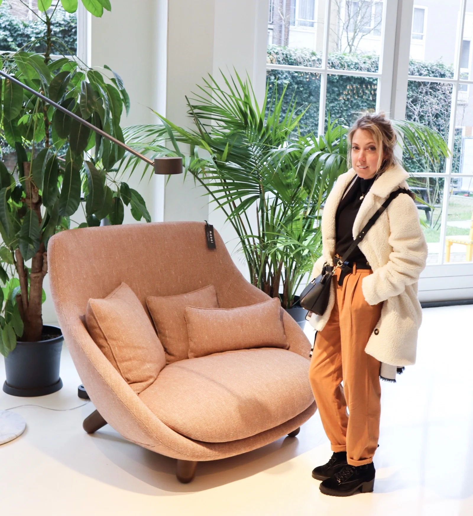
Moooi
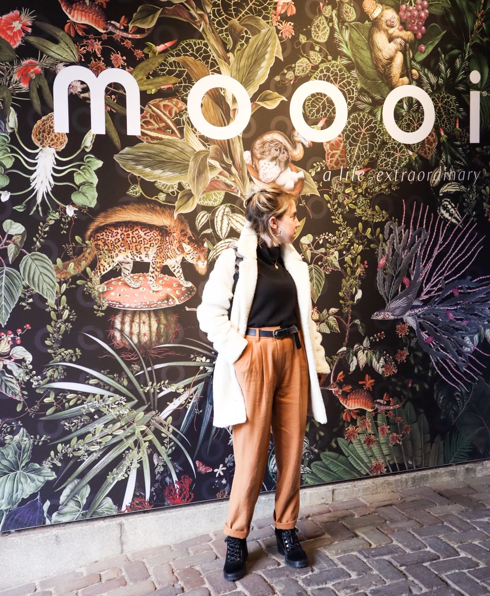
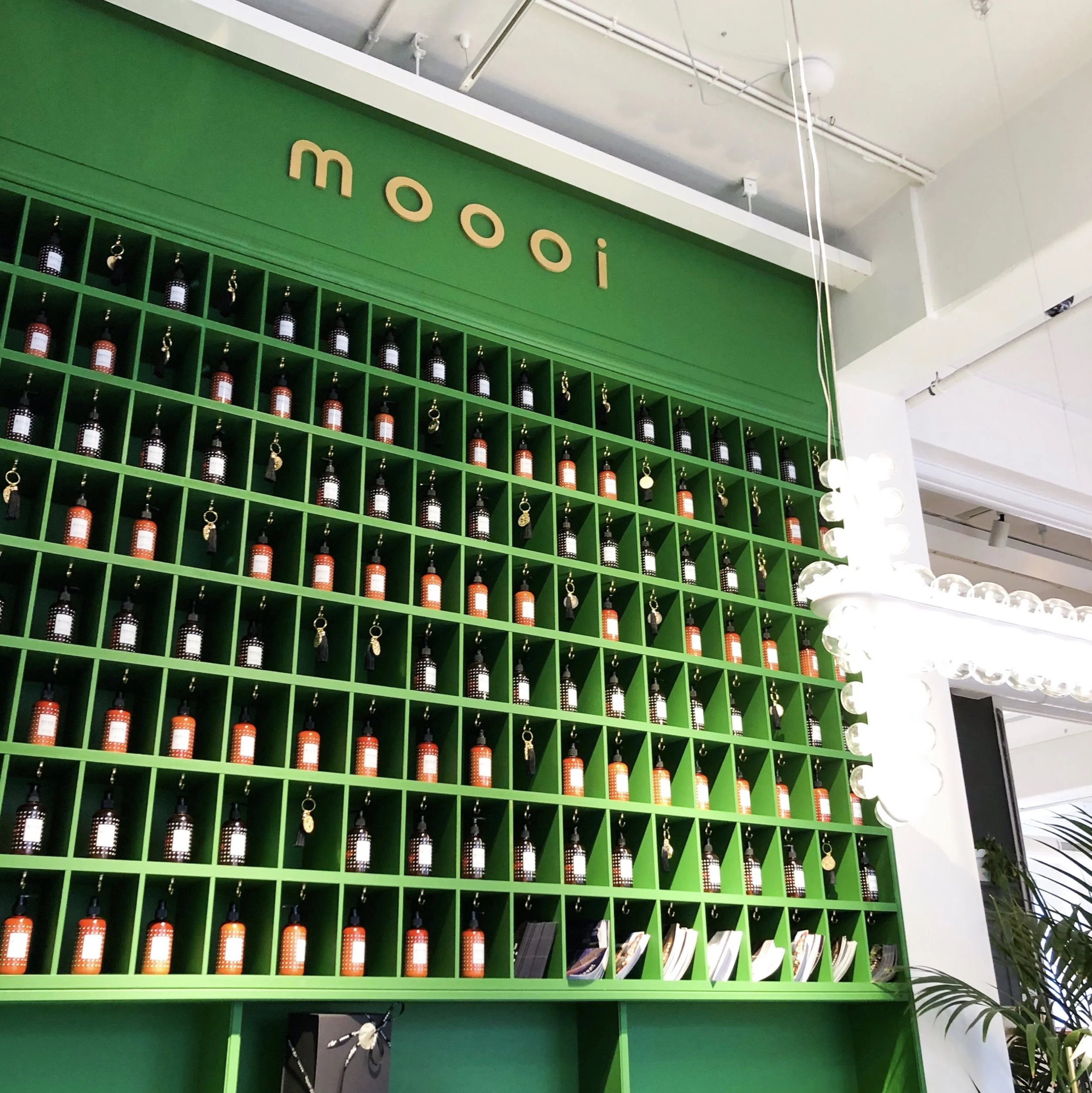
A designer spotlight on Dutch furnishings brand Moooi and their flagship Amsterdam showroom.

Luxury design making playful statements!
So let us start with the basic brand bio to get some background….
Dutch luxury brand Moooi was founded in 2001 by Marcel Wanders & Casper Vissers. The name itself derives from the dutch word for beauty, with extra ‘o’ for uniqueness!
Since it’s original incarnation there have been many management and ownership structures but Marcel Wanders has remained in charge and chief designer all along.
Along with their own unique blend of luxury they showcase pieces by other well established, and equally playful, designers such as Studio Job and Umut Yamac (got to love his Perch lights, seen dotted all over the Moooi showroom).

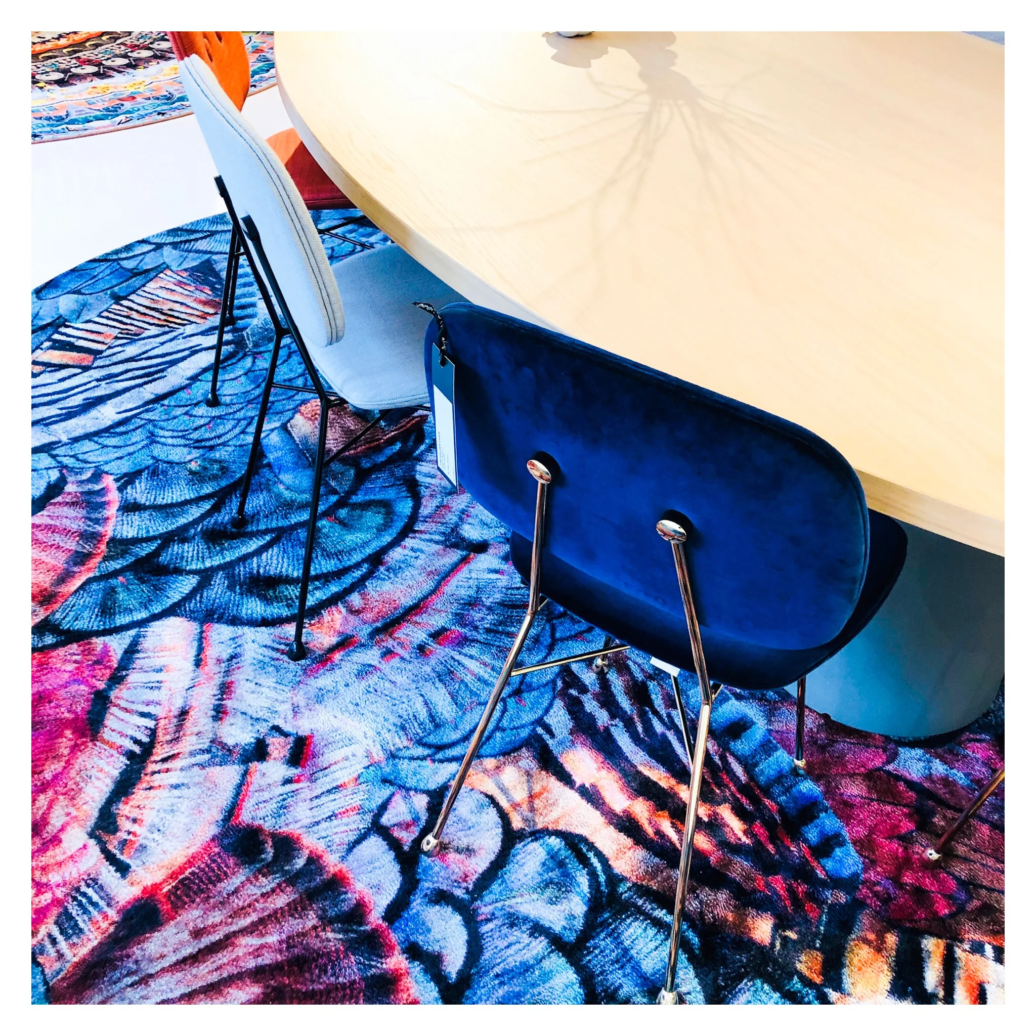
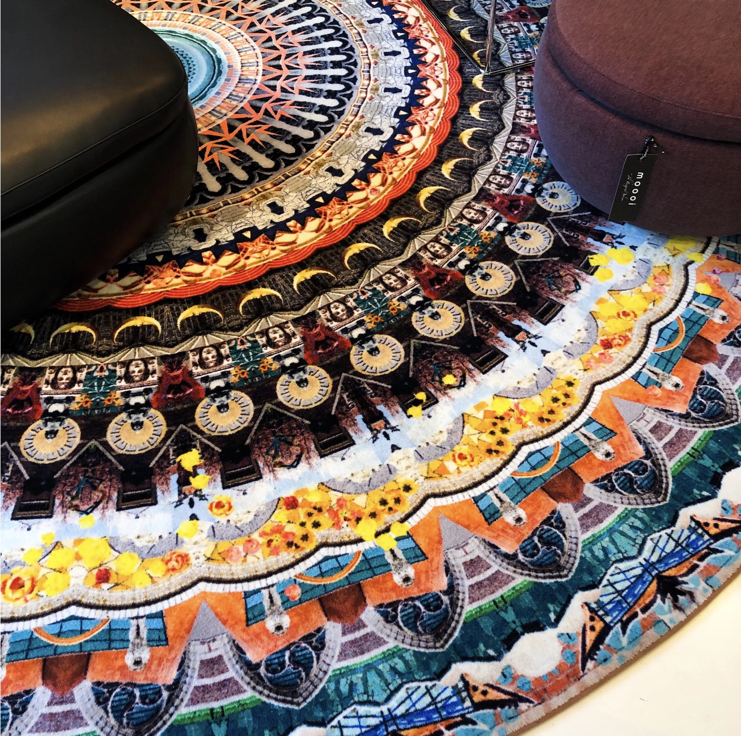
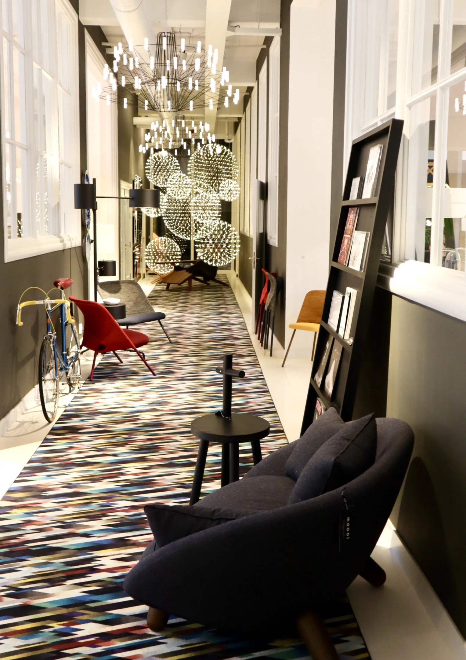
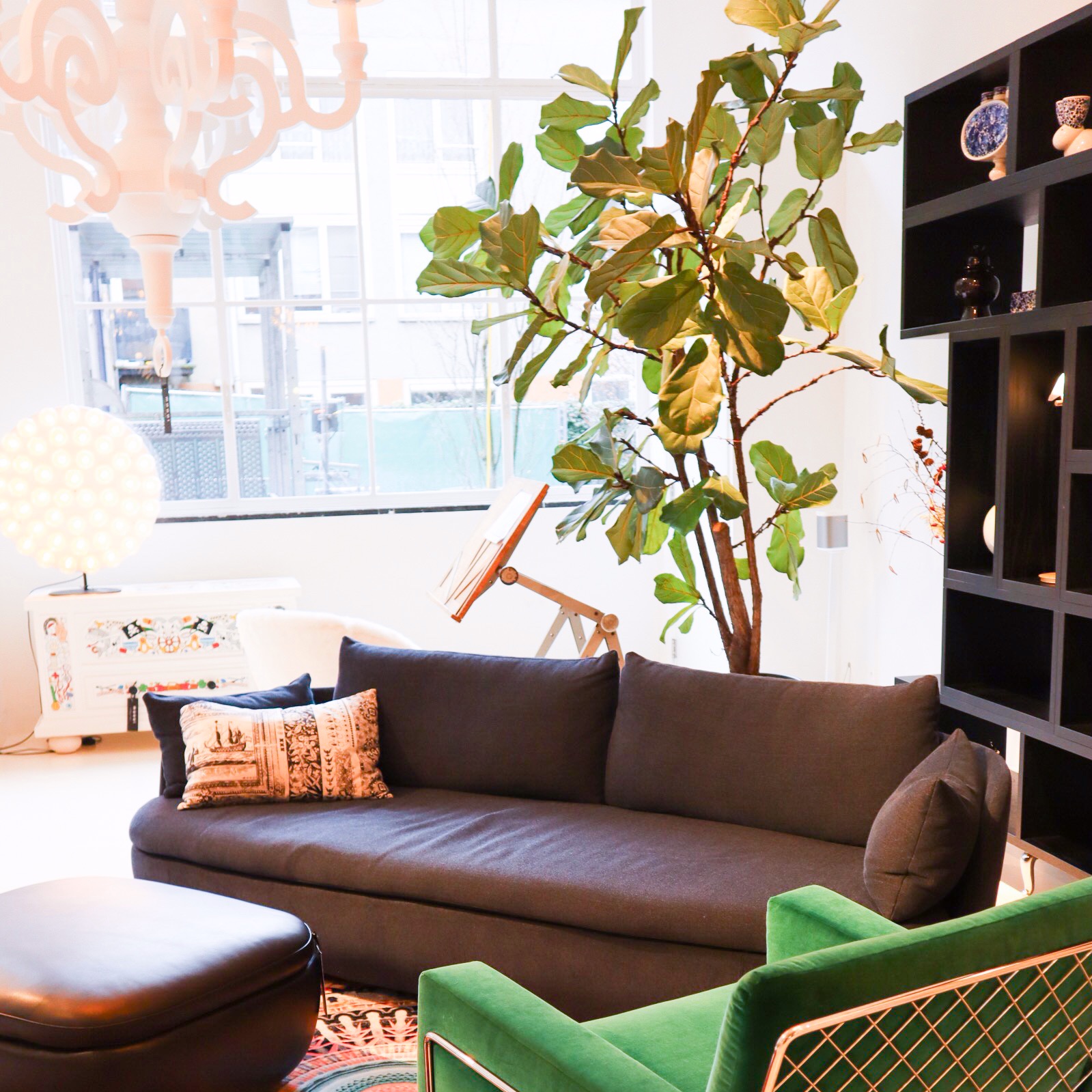
Now let’s talk about how amazing the 700sqft flagship showroom is in Joordan, Amsterdam. It’s a visual grenade from the second you walk in. Even just the carpet that runs from the entrance, leading you in is an explosion of detailed print and bright colour. A common thread that runs throughout the whole showroom, with each intricately staged area featuring some form of bold explosion in the form of a fab rug or carpeted area. I love walking around showrooms like this, they are not only great when you are sourcing for a project but also just for inspiring. It’s so important to keep visually stimulated and to put yourself in to spaces like this as a designer as often as possible. It is so easy to fall into the ‘work’ aspect of the job and get bogged down by specs and the technical areas of a project.
So back to Moooi… the brand is known for quite a few modern iconic pieces. One notable is the Container table with its cylindric pedestal base and simple solid table top. It’s form is simple and modern yet timeless and therefore represents the Moooi ethos perfectly. It comes in an array of sizes and variations on the plain style, such as the New Antiques range that features more curve details reminiscent of old traditional turned table legs. The basic style remains a favourite of mine as it serves as a solid base to allow the accompanying chairs and all other items that occupy the space to shine.

Seen here: a version of the iconic Container table.
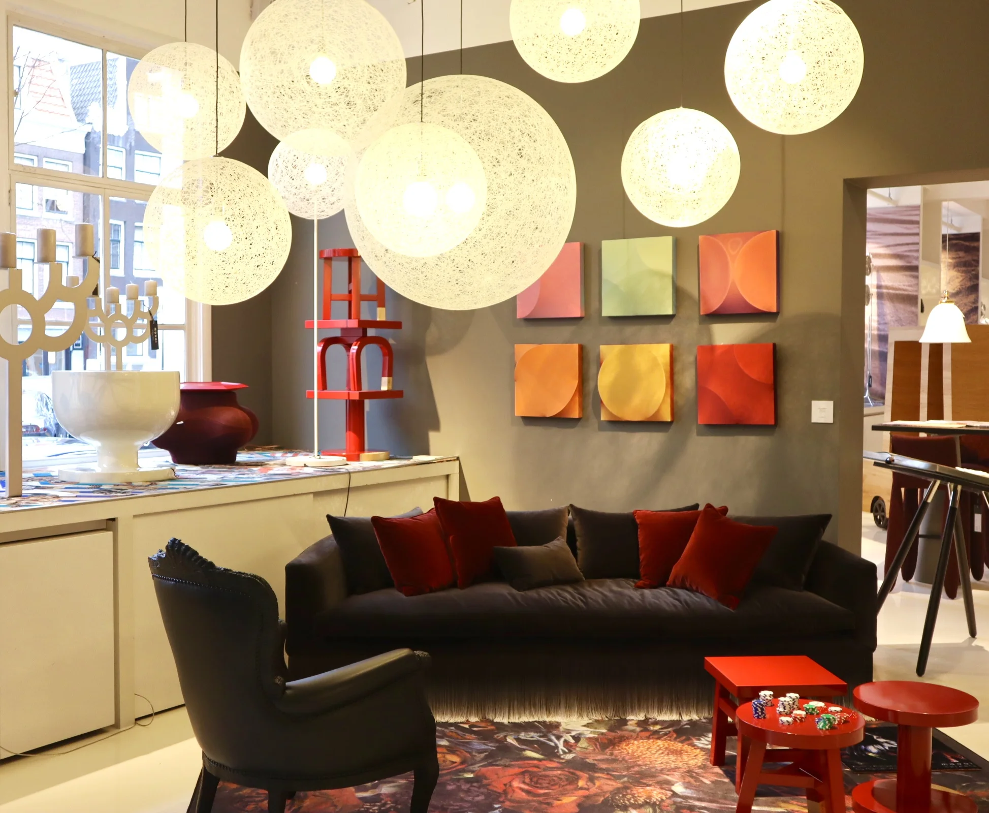
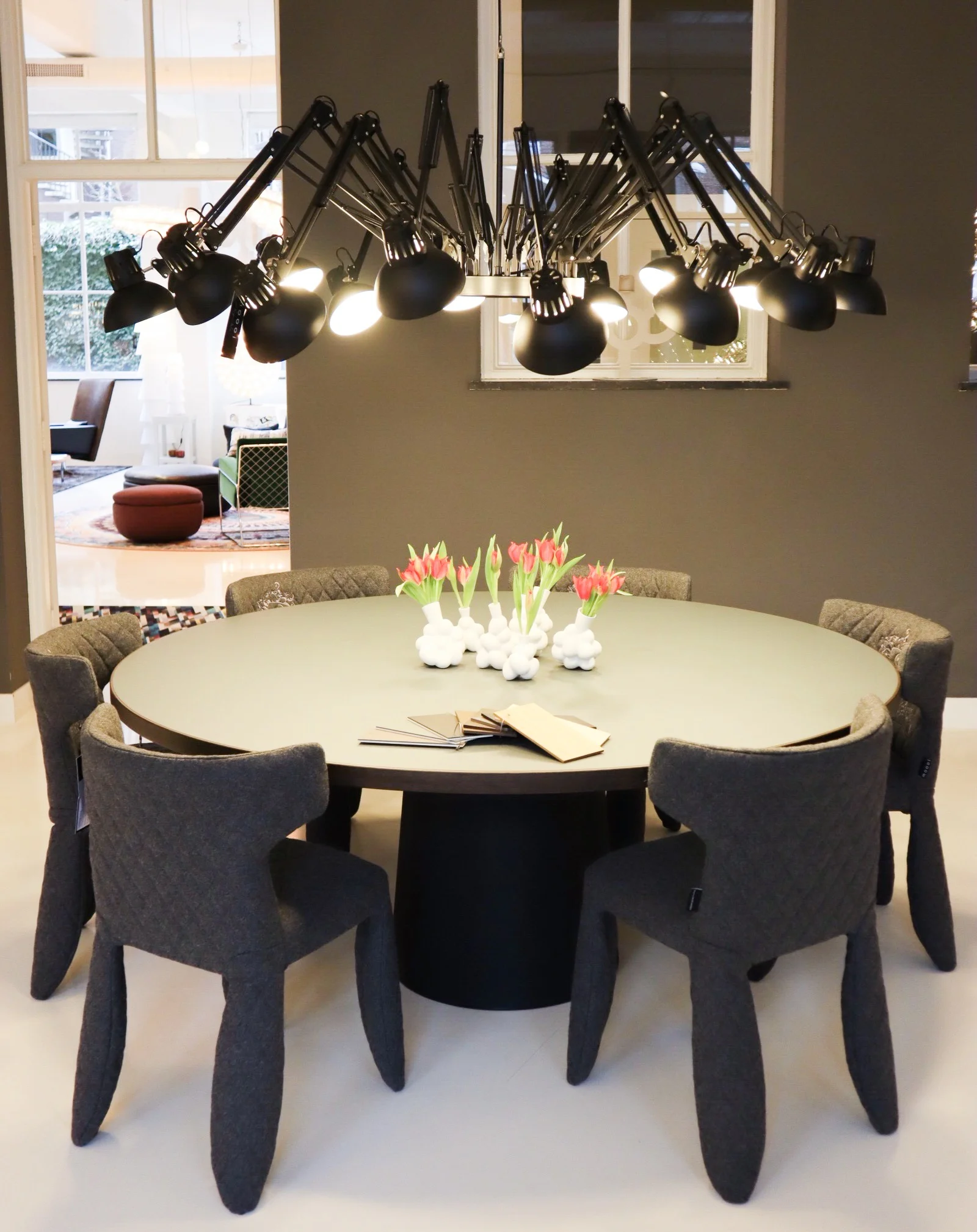
Moooi are also synonymous with bold feature light fittings. One of the most iconic are the strong and dominating Paper Chandelier, a modern twist on the classic metal structured chandelier, this is actually created (as the name would suggest) out of paper. Well, the main structure is actually created out of cardboard and wood that is then wrapped in a lacquered paper shell. I would say this is the most iconic light fitting in that most people will have seen one in a quirky commercial setting somewhere or another. It, like many iconic designs, has been copied (or versions/variations attempted) by other high street brands over time too.
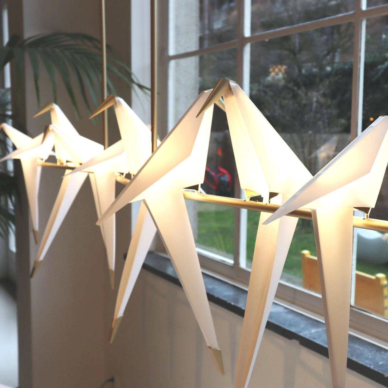
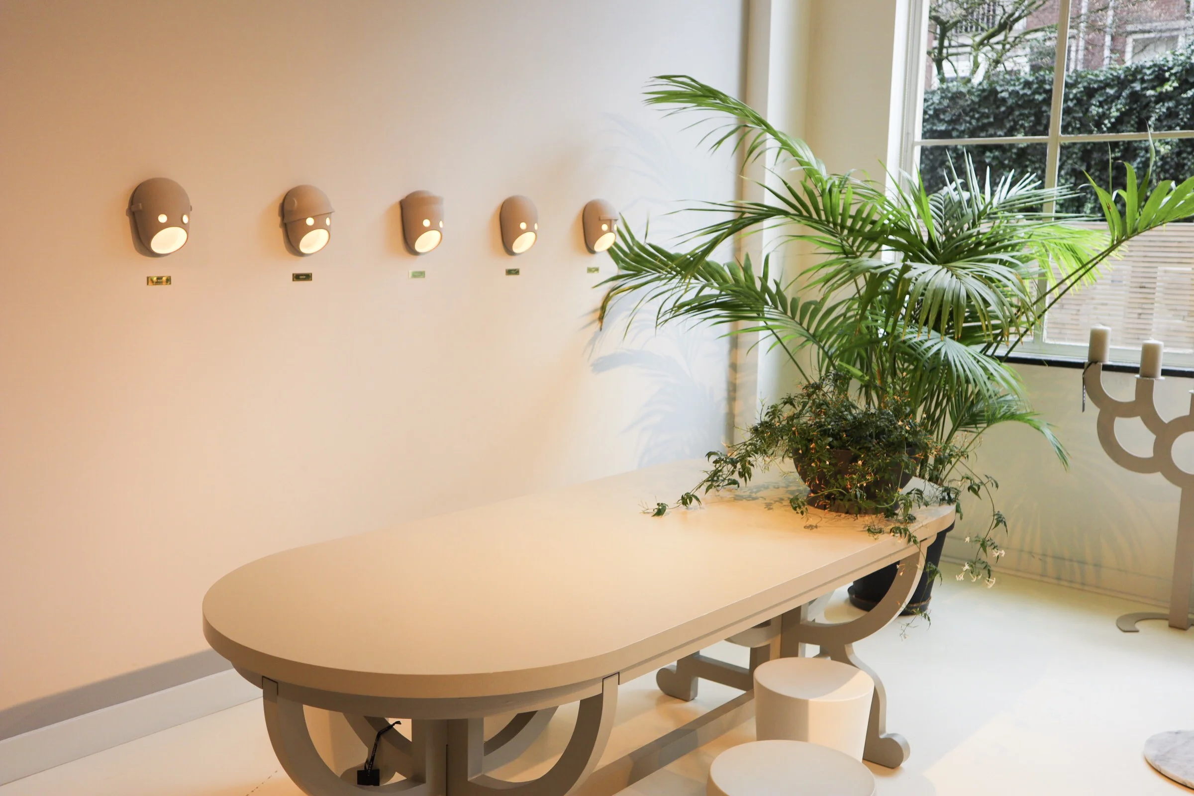
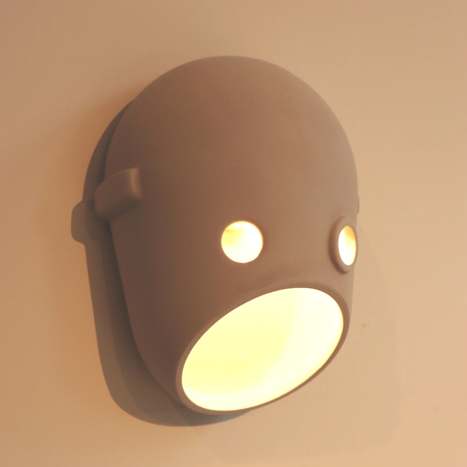
The Paper chandelier is low however on my favourites list when it comes to light fittings at Moooi. The likes of the super cool Meshmatics chandelier with its steel mesh structure edged in brass detail, for a nod to more refined luxe, is right up there. Like I mentioned at the start of this post, you can’t not love the Perch lights by Umut Yamac, seen dotted all over the showroom. But another range that I love, for the sheer fun of it, is the Party. A range of casted ceramic fittings shaped to represent faces. There are a clan of 5 ‘characters’ designed to represent different captivating personalities. The designers say this work is to represent our fascination with secrets, family dynamics and intrigue. The long strip pendant featuring all 5 faces back to back would bring character to any dinner table that’s for sure!
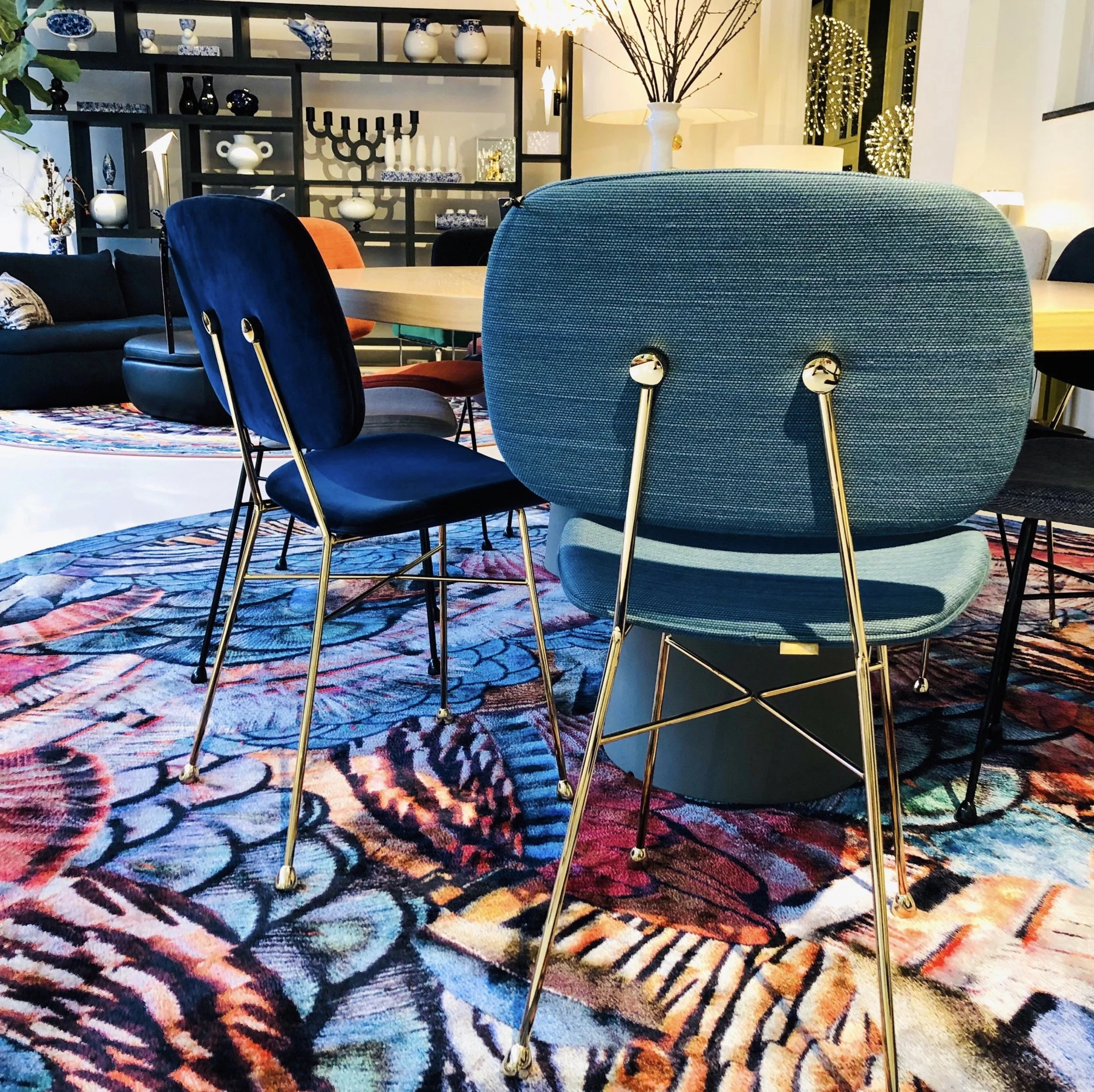
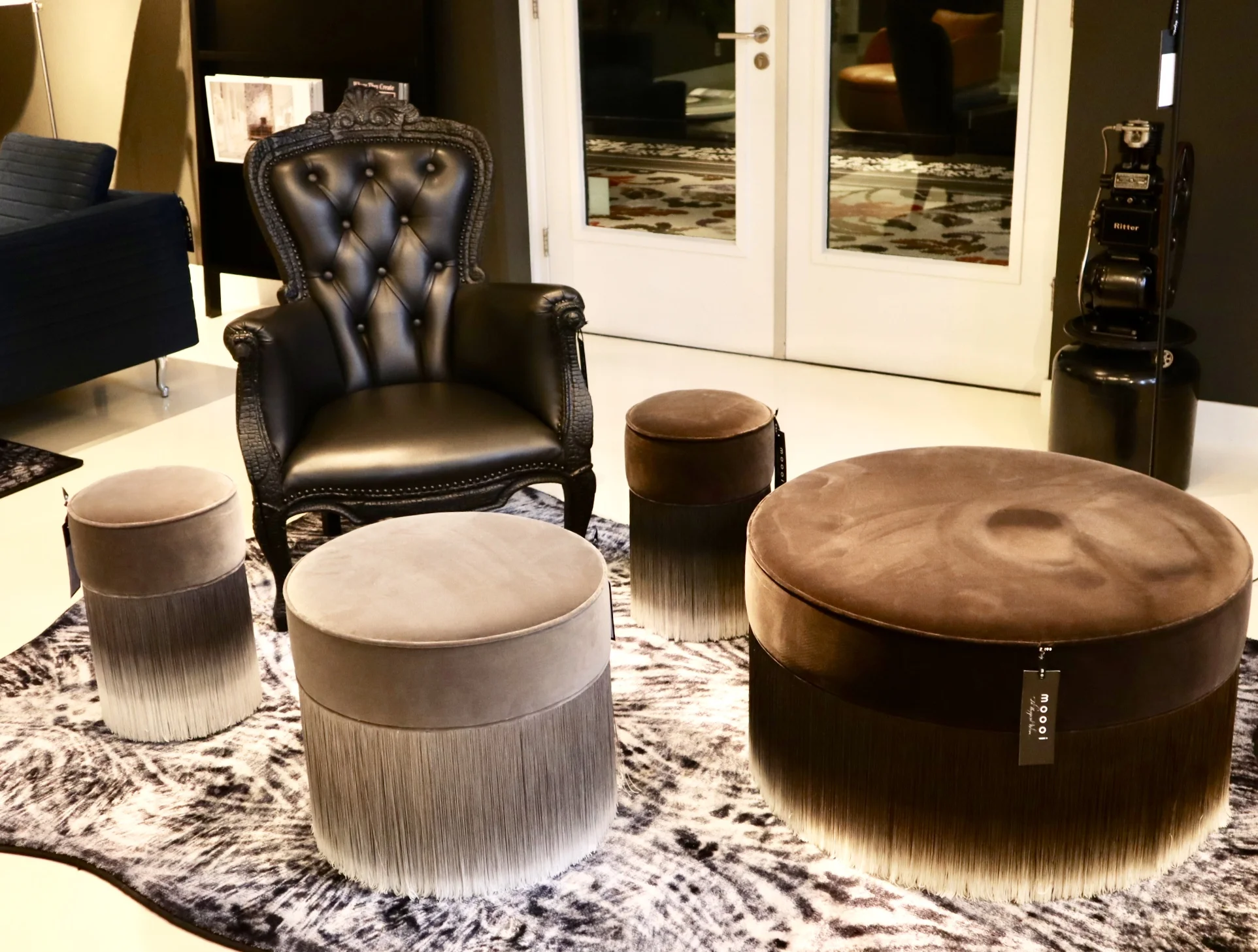
Back to colour and textiles, the various chair styles that dot about the showroom also showcase the continued use of (often) bold colour and with different fabric finishes. The Charles chair a Marcel Wanders design with it’s simple frame base structure is most definitely an iconic piece. It can look strikingly different by the simple change of colour and finish. You will have seen many chairs in companies such as Made.com that have cost definitely been derived from this design. Similar in it’s simplicity is the Golden chair, a simple design based on and reminiscent of a simple school chair but with a fine frame and fab array of finishes. I really love these!!
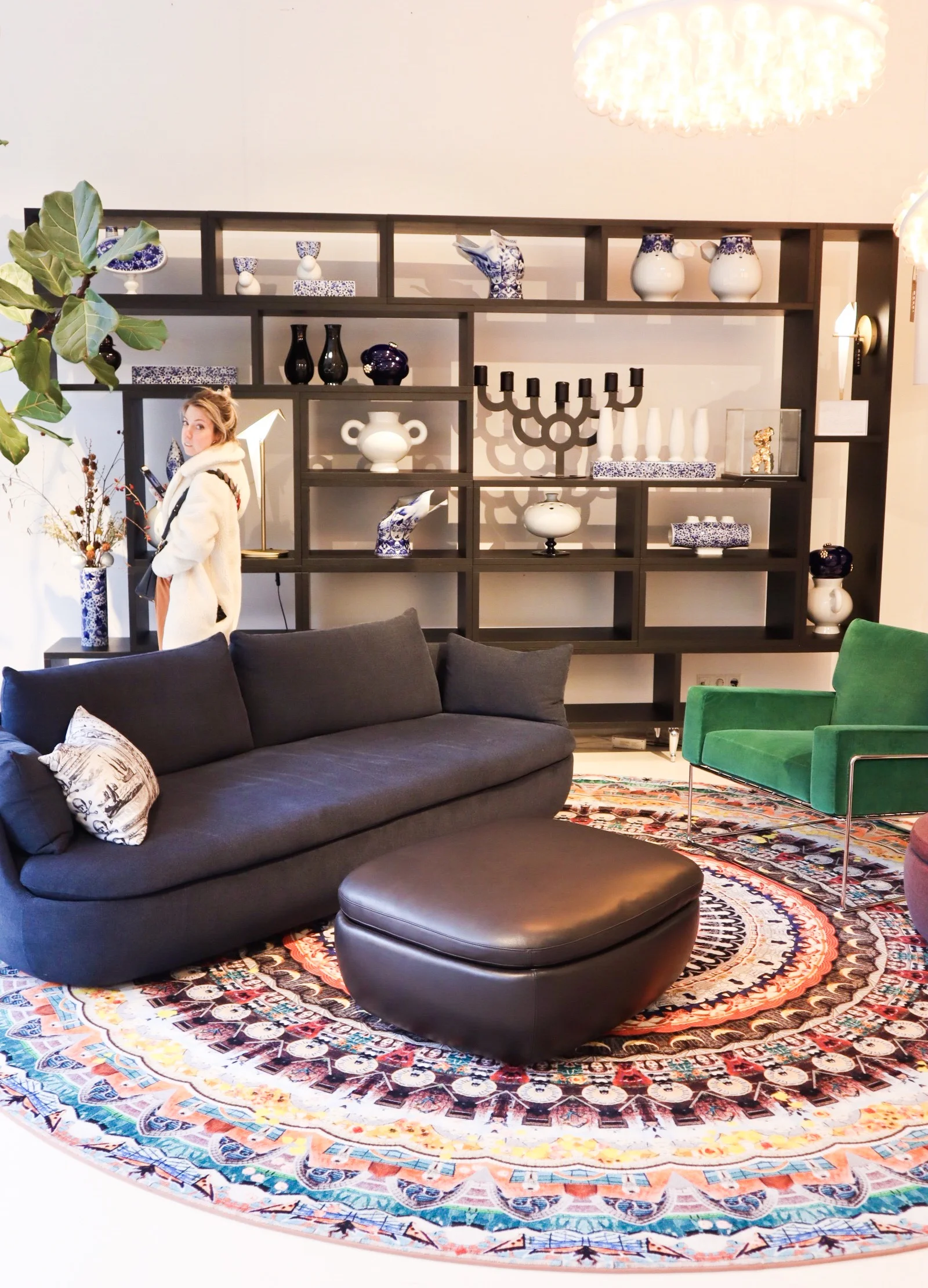
Area set up - featuring among others - the Charles Chair (in emerald green to the far right), Perch table lamp (on shelving).
They want to be daring but yet timeless, this can perhaps be seen in the most obvious way in pieces like the grandfather clock designed by StudioJob.

Studio Job design Clock.
The whole feel of the showroom is exclusive but without the austerity that that can also harbour. With lots of pattern and colour the space becomes playful and almost poetic, far more inviting than some uber modern show spaces. The brand dictates itself as being position ‘on the edge of commercial reality and cultural interest’ and I think that is about spot on and evident here. Being at the higher end of a retail price point they offer up furnishings that are coveted, yet identifiable at the same time.
In a nutshell, the Moooi style is old meets new in the most modern way, if that doesn’t contradict itself too much?