HowTo - Photograph Your Space
In our series of Handy HowTo’s this article covers tops tips on how to best photograph your interiors without hiring a professional. Whether it is pre-project photos showing the space at it’s most basic or finished project images capturing the interiors at their best.

Do you often find that you look at a room, say you’re visiting a beautiful hotel, or you’ve just revamped your home, and you’re blown away (or at least pretty chuffed), by the interior you are faced with. So you lift your camera and snap away, only to be rather deflated by how small, unimpressive or totally different in colour the photo of this space looks once held motionlessly in a snapshot?
This is a very common issue, in capturing many aspects of life but one that is particularly problematic when capturing interiors specifically. It’s relevant to estate agency images (you know how often house details can be misconceiving), or when trying to share a piece of great interior design.
Simply, getting good photos that truly capture your interiors is not always as easy as it looks. There is a reason there are professional photographers that specialise in Interiors as it takes a certain skill and specific approach.
Yes of course there is also a lot of emphasis on editing and the pictures you see of beautiful and inspiring interiors in household magazines are all professionally shot (a professional photographer I am most definitely not). However, there are a few tips that don’t involve an expensive camera or photographic education, when applied can seriously improve your interior photography.
These tips aren’t only for capturing finished projects but are highly useful for obtaining the best photos for showing the space to be worked on when kicking off a design project. Whether this is simply for your own records, like a before and after, or you are using our HowtoHome service, and need to provide some images of the space you are wanting designed. The better the images, the more accurate the finished design will be to your individual space and the more impressive the comparison will be.
Top Tips:
Natural light is pivotal. Light bulbs cast bad shadows and the camera does not have the capability to interpret the artificial light for what it is (as our eyes see it).
Overcast days are actually the best for capturing interiors. Woohoo! that’s a relief in the UK.
Straight lines are king. Basically keep your verticals (i.e. door frames etc) vertical and your horizontals exactly that, horizontal.
Use a tripod if you can so that your images are level and not blurred (more important for images of finished projects).
For capturing: ‘Pre-project’ spaces to be designed - de-clutter and keep the area as open as possible, removing as many items you no longer want included in the new design as possible.
For capturing: 'Completed-project’ spaces - staging is key! Remove all items that aren’t purposeful to your overall aesthetic, making sure there are no used cups and plates lying around for example. Remove and out out of sight any hanging or trailing electrical cables etc.
Creating space - this is the second most pivotal aspect of interiors photography and often one of the hardest. Don’t be afraid to move furniture to suit the composition of the photograph. Even if it wouldn’t work in reality it may look better on the image. Take shots from outside of the space in through the door, at that perfect point where the doorframe isn’t in view. This helps give aspect.
Wide angle - if you have access to a wide angle setting on your phone (0.5 setting on the iPhone 11 Pro) or on your camera, then great, but DON’T abuse it! If you push too wide an angle to capture a room you also risk distorting the actual space and presenting an unrealistic snapshot. Keep it mid range and take multiples instead of trying to get a whole room in one image.
Get up close - it’s all in the detail. While it is important to have an overview of the room don’t forget to get close-ups of notable, well designed or aesthetically important details. These images can work wonderfully to show depth of field, especially if you are able to use settings that blur the background and focus on the detail you are wanting to highlight.
On a camera shoot on RAW setting.
Finally, edit, edit, edit - a seemingly dull picture can be effectively edited to brighten, increase exposure and up the contrast. The main aspects to tweak aside the above are; highlights, shadows and noise reduction.
Most mobile phones have fantastic cameras and editing tools, so go forth and experiment!
Let’s be honest most of us are not taking interior magazine quality images, but that’s no reason not to achieve the best results you can with little effort.
Good luck and have fun.

The Most Inspiring Subscriptions - Our Must have Mags
A short guide to our must read magazines. The publication we pick up on a monthly, bi-monthly or bi-annually basis. Inspiring all we do and enriching our lives.

Asked recently what inspires LitterArty’s work one of my answers was research and reading. I am a huge fan of a good magazine in particular and subscribe to several. Being a strong advocate for sustainable living, some may argue paper magazines are not the way forward and rather contradict the notion. However, I beg to differ, as many magazines (at least the bulk of what I read) are actually processed with sustainability at the heart of their creation. This is done through many avenues, including the use of innovative paper types that use various recycled pulps. If handled correctly these magazines are recyclable too. So there are ways to read physical magazines guilt free!
With the majority of us spending so much of our time looking at a screen, whether computer, phone, tablet or tv, it’s so unbelievably important to have time away from that blue light. Personally I really look forward to spending a little down time kicking back and flicking through a great magazines or book, it feels quite indulgent giving myself that time, pure luxury!
So here are some of our favourite reads for you’re consideration. Any of these would be a great addition to your current reading list. And shock horror, they’re not all Interiors or design driven, but this doesn't mean they’re not equally as inspiring to our work.

Be Kind
I absolutely love this magazine, it is a great read. The articles are fantastically detailed and informative.
A publication more about articles and content than adverts and all those ‘space savers’ used in so many contemporary magazines. The content is broken into easy to navigate sections ranging from creativity, to mindfulness, environmental issues and more.
You can still find lots of great home and interior inspiration, all accompanied by lots of guidance on living sustainably in your home. So while this is a lifestyle magazine and not focused on interiors it is a great tool for living with integrity and brining harmony into your life and therefore your home.
It really is a great one and long may it continue. You’ll find a pile of them in the bathroom and downstairs WC in the LitterArty house, guest love it!
You can subscribe to the monthly editions or pick one up in your local shop.

Happy News
Now this one is a bit different, less of a magazine and more of a newspaper replacement. If you, like us, are sick of negative crappy headlines and bad news, this is your salvation. Page after page filled with nothing but happy (the title gives that away) positive news.
The stories covered shine light on positive happenings across the world, many of the stories you would be none the wiser about if you hadn't perused the pages of this lovely publication.
Each edition is broken in news from each month (you see the only shame is it is quarterly so they can save up all the great things that have happened over the last few months), the pages are crammed with great and uplifting facts and figures. There is also a section on dedications where you can nominate someone you know who has done something great. These personal shout outs are so uplifting in a time when it can be hard to believe in good, there are still lots of us out there!
It’s got a great big thumbs up from us and we look forward to the next edition landing on our doorstep. Ideally consumed accompanied by a good brew and naughty sweet treat.
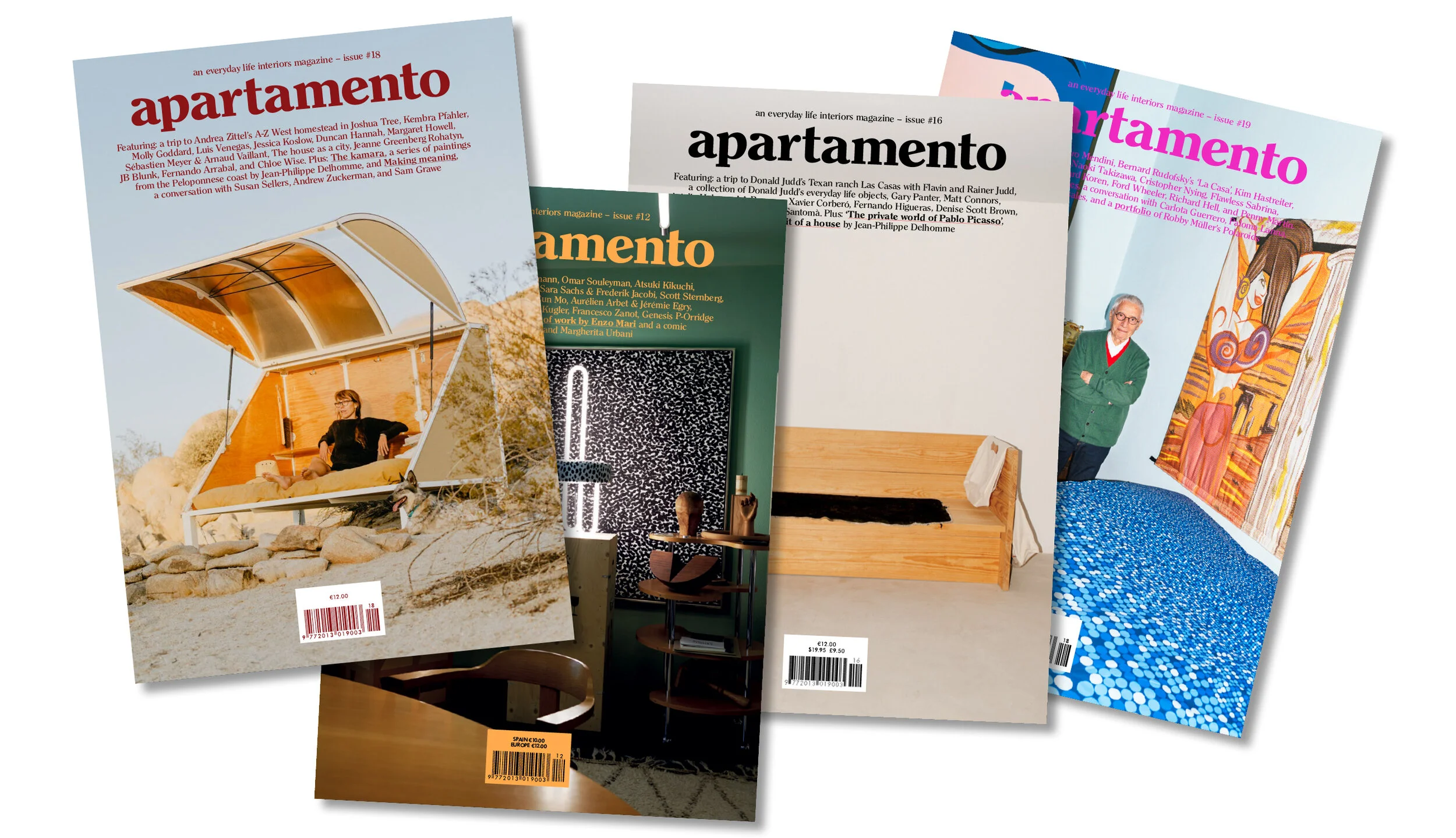
Apartamento
One of my favourite interior driven magazines, pure aesthetic joy!
Published biannually, this visual delight and informative read gives insight in to people, their homes and how they live in them. A through the keyhole style approach. Often selling out in days this magazine became a real cult publication from its inception back in 2008.
Each page presents real ‘lived-in’ interiors, this honest representation is hugely influential and more to the point identifiable and achievable, especially in comparison to the often stark and overly stages interiors featured in many high end magazines across the sector.
That all said there is a definite ‘retro’ aesthetic to the interiors featured and the style of the photography used, so this style of publication may not suit all. For us it’s a spot on edition to our inspiring magazine list and a real staple.

Hole & Corner
A great design source, dedicated to the real craftsmanship and skills behind design, some of which take years or decades to master. It believes in the process and development needed to produce inspiring great design, in the doing not the talking, the pages are therefore filled with articles on such matters.
Contributors include world renowned photographers and authors, which about confirms this publication as a hard hitter in the sector. It’s as thoughtfully put together as the subject matters it covers. A real chunky coffee table style magazine that needs time to devour, which is fine as issued biannually you’ll have plenty of time to enjoy each and every article.
The content leaves you inspired and in awe of some amazing craftspeople who have dedicated their lives to the development of their skills and craft.It is therefore only fair that we dedicate some of our time to reading about it. In doing so, opening our eyes to amazing people all over the world that would otherwise go under the radar.
A really great, worthwhile read, especially if you appreciate authenticity and heritage!

91 Magazine
Independent magazines are my kryptonite and 91 doesn’t disappoint.
Focused on more affordable and attainable interiors and lifestyle (right up our street). This publication offers up a smorgasbord of beautiful visuals and accessible lifestyle tips, with a sustainable focus (double thumbs up).
Content is broken in to sections each with a theme, this runs in each magazine with each section focusing on a specific place or person, changing each edition. From news, to shopping, to restaurant and home tours. The articles cover lots of interesting aspects of lifestyle. I actually love the home tours sections in particular, they are dotted through out and feature interesting people in their (as the title would suggest) homes. The restaurant tours are also really great as they discuss the atmosphere, decor and ethos of a place rather than the style of most restaurant reviews that predominately focus on food critique. Along with these tours, there’s a cool section called 3 ways with, and each magazine features a different subject matter.
Finally, there is a very current cultural focus on social media and instagram in particular. Love it or hate it, it’s part of most of our lives and a real source of visual inspiration. They therefore feature an instagram edit showcasing chosen accounts again based on a chosen theme, i.e. Handmade or Craftsmanship.
Just an enjoyable read featuring real people for real people, with the added advantage of being visually pleasing and calming.

Oh Comely
Recently reimagined simply as Oh! this is another independent magazine with oodles of creativity and female empowerment. Already sold?…Well let me tell you a little more.
The ethos behind the magazine is about looking at the way you view the world and yourself. Jam packed with full pages of colourful images and text, featuring articles on a vast array of subject matters such as; fashion, music, food and culture.
It’s essentially offering up a different approach to a wellbeing magazine, all the articles have the end goal to encourage mindful actions and in doing so a the creation of a less stressed more balanced lifestyle.
Published bi-monthly you can subscribe or pick it up at some supermarkets. I great one for those looking for a female driven read.

Breathe
I think we all need to take time to breathe and with magazines like this you can have a helping hand. Full of great tips and articles on ways to self care, something all too many of us neglect.
This monthly mag breaks down in to healthy chunks on wellbeing, living, mindfulness, creativity and escape. Each section packed with its own content ranging from sleep tips and exercise routines, to ways to be more creative or guides on how to make something. Each article is informative without being preachy, which I love, there’s a fine line between the two as we all know.
They also do special editions and journals that enable you to doodle, list write and contemplate.
I have picked up several varieties of mindful and wellbeing magazine and this is by far my favourite. Just the way it flows and the style of the illustrations and articles. Available at most shops and supermarkets where you’ll find the magazines, go check it out!
other faves include: Disegno, Frieze, Frame and Resurgence & Ecologist.

HowTo - Spatial Plan
Our quick and handy Howto guide on spatial plan, helping you to make the most of your room and guide you with furnishing. Part of LitterArty x HowtoHome’s handy HowTo series.

It can be daunting sometimes working out how and where to fit and position furniture in any given space. While there is some level of subjectivity based on personal comfort and requirements, there are a few handy rules to help you establish suitability of furniture and not end up in a situation where things don’t fit or the space isn’t accessible.
How to ensure you have enough free space?
A general rule of thumb is to allow approximately 50cm (minimum) of space from one piece of furniture to the next. There are of course exceptions to this rule such as the distance between a console table and the back of the sofa or next to a bed. In cases where your aim is to have one support the other and be in close contact then obviously this rule does not apply.
In hallways and passing places it’s advisable to up this minimum and allow at least 80-90cm of space so that the area doesn’t feel cramped and walking past objects and items of furniture is a challenge.
Top Tips:
- Consider where fixed obstacles positioned, such as doors, windows, radiators and fireplaces. You need to allow space around and plan furnishings that will fit around these features and balance out the space.
- Think about volume and don’t over fill a space.
- Ergonomics - ensure that there is a circulation passageway through a room. This follows an easy pathway from the door to all the other main areas of activity.
- Edit your clutter, clutter brings in spaces and creates a sense of chaos. By minimising clutter you optimise your space, yes it’s common sense.
Questions to ask:
1) What, is the space used for, what are its functions?
2) Who, uses it? How many people does it need to accommodate etc.
3) How, do you want the room to feel? Spacious, airy, cosy, minimal….
4) Are there focal points? Or do you need to create focal points?
Another question we are regularly asked is; What is the optimal distance between a TV and your seating? Again, a general rule of thumb is to base this on the size of your TV, take that measurement and times it by 1.5 to 2.5 to gauge your most comfortable viewing distance. So for example, a 37 inch TV could be positioned around 6 ft from your sofa for optimal spatial planning. Obviously, this is relative and subjective to personal comfort but it’s not a bad rule to stick by.

HowTo - Measure a Room
Our quick and handy Howto guide on measuring a space. Part of LitterArty x HowtoHome’s handy HowTo series.
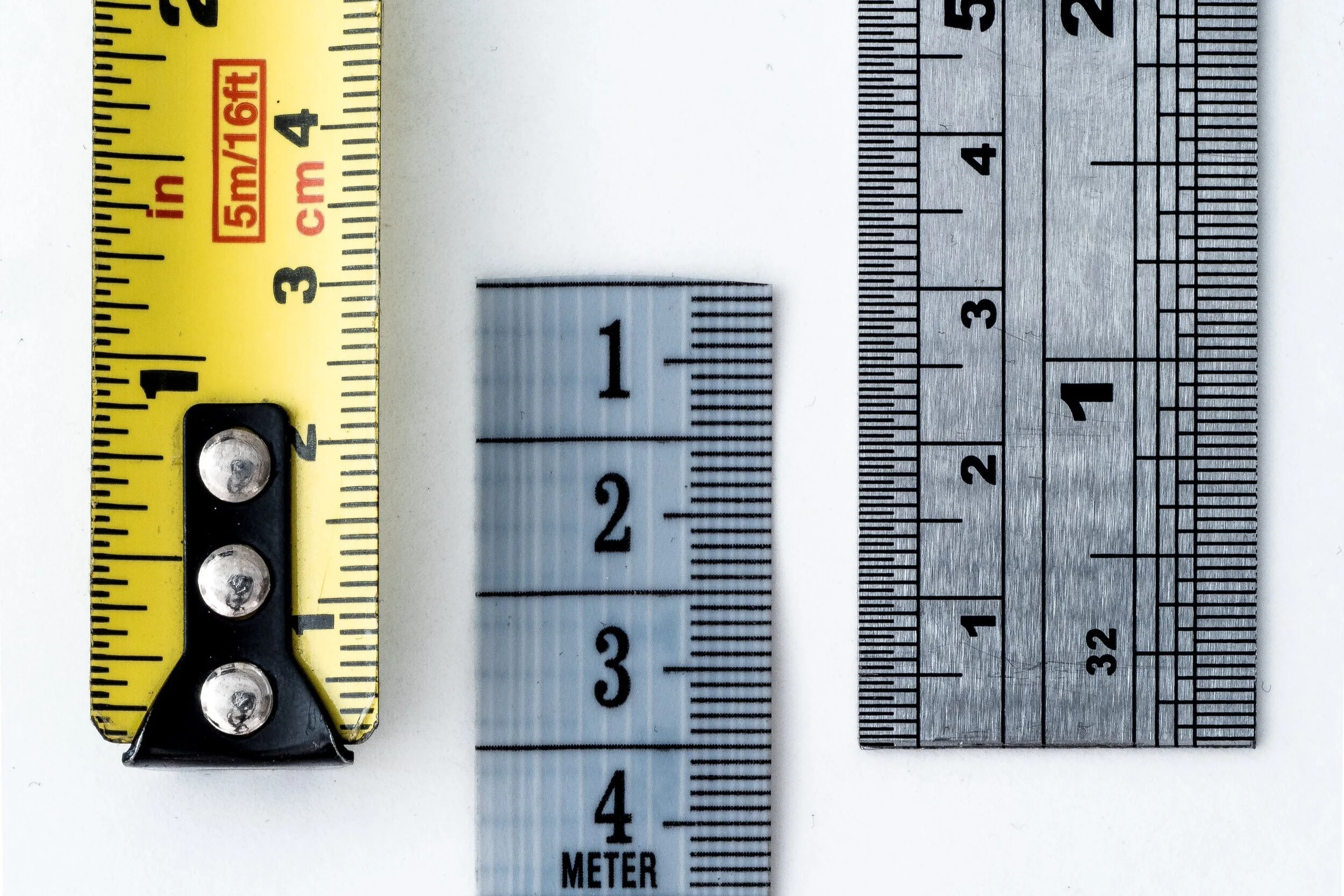
1. Make sure you have a sturdy and decent length tape measure. This simply makes life easier and means you can measure quickly.
2. Have a paper and pen to hand for notes and to quickly sketch out the outline of your room. All you need is the general shape, no need for accuracy as long as it makes sense to you.
3. Mark window and door locations.
4. Start by measuring the width at the longest point of the room, the same with the depth and then the height.
5. Then take at least the same measurements at around 5 points across the room. This helps with accuracy, as most rooms are nor 100% even. 6. Next measure all large elements such as alcoves and other nooks. Do this by following the same principle as above (width, depth and height). Note these measurements in the correct locations on your room outline.
7. Measure all the windows and doors. You want to know the width and height of the opening and then also the height of the window base from the floor. Again mark this on the outline.
8. Make notes of all utility and socket locations i.e. radiators, sockets, aerial points. To measure their exact location, measure from the nearest fixed point (i.e. edge of the wall in a corner) to the middle of the fixture. This is particularly useful for radiator location.
Tips
- When measuring the height of your room, make sure you allow for picture rail and cornice height. This is relevant for walls where you are wanting to feature wither freestanding or built in units such as shelving that require to sit within these parameters. Make notes where relevant.
- Doorway measurements are pivotal for planning furniture as well as the layout design, it’s all well and good picking great furniture but what if the space to get it in to the room is limited?! All these details help.
- Not location of any architectural features that are relevant or limit design decisions.
- Clear detail is key!

HowTo - Hang Pictures
Our quick and handy Howto guide on picture hanging. Part of LitterArty x HowtoHome’s handy HowTo series.

To get you started, here is a check list of tools and equipment you may need to hang pictures securely, safely and successfully.
- Tape Measure
- Pencil and Rubber
- Spirit Level
- Hammer
- Drill (if hanging heavy work that requires a wall plug and screw)
- Picture hooks and nails
- Wall plugs and screws (if required)
- Cord or wire for hanging.
Before you grab the hammer and start attempting to hang your picture, you need to make a few practical decisions, such as, where you want it hung and is the wall structure suitable. You also need to decide how much support you’ll need to hang your picture securely, whether single or multiple hooks etc. Once you’ve established the location and hanging equipment needed follow there are some basic steps to follow for hanging. Whether you are going for a relaxed or a traditional museum approach this is a great base point. All rooms are different and the museum approach may not be appropriate for your décor.
Step 1 – Measure
Take a width measurement of the wall you are hanging your chosen picture on.
Step 2 – Align with the centre of the wall
Find the centre point of the wall by halving the overall width and place a small pencil mark.
Step 3 – Determine the Height
Most people hang pictures too high; you should not have to strain your neck to see them. There is a bit of a science to picture hanging. That said, this is where your subjective style comes in, whether following the museum approach or not.
Relaxed approach
If you're confident with your artistic abilities, use your eye to judge where to hang your painting. This will allow you to balance your furniture, doors and windows. Just makes sure it's at a comfortable eye level. If not follow the next step:
Technical/Museum approach – a simple equation
1) Measure 145cm from the floor this is the ‘ideal’ middle point of your picture.
2) Measure your picture and half it, this is the centre point. This is A.
3) Measure the tension depth from the top edge – pull the picture cord/wire to full tension as it will be when hanging. This is B.
4) Find the height by doing this simple equation – 145 + A – B = Height to position your nail.
Handy tips
- A lot of plastered walls, particularly in older properties can crumble when a nail is hammered in. To protect your surface from damage or marks place a small piece of masking tape over the point for hanging. This will help to protect the nail point from causing damage.
- If your frame is heavy or slightly rough on the reverse place some small sticky felt pads on the reverse bottom two corners just away from the edge. This will pad and protect from rubbing or movement works on the wall.
- Use a spirit level to double check how level your picture is by placing it on the top and then the bottom of the frame, adjust accordingly.
- 5-7cm between frames is a great rule to apply.
Hanging a Picture Wall or Cluster
Follow the same three steps, measure, find the middle width and determine height, then add the following step:
Additional Step 1 – Line up the centre, making the centre of the cluster/picture wall sit along the 145cm centralised mark.
Hanging Pictures on the Stairs
Dependant on your desired overall look, you can plan this intuitively or structured. If going down the structured route add the following step:
Additional Step 1 – measure 145cm from the floor, this should be the centre of your first picture.
Additional Step 2 – measure 145cm from every second to third step to form a diagonal line. This line should be the centre of each picture and then use the size of your frames to position each picture at an equal distance to space out most effectively.
Hanging a Scattered Display
Choose a piece as a central focal point. This will form the middle of your cluster. Then follow these steps:
Step 1 – Measure up your 145cm point to find the middle point of your central picture.
Step 2 – Build your gallery from the middle out, making sure you balance your pictures as you go. Always ensuring the central line stays at 145cm.
This process is very subjective to what you see as ‘balanced’ so go with what suits you and suits the pictures and artwork you love and are wanting to hang.

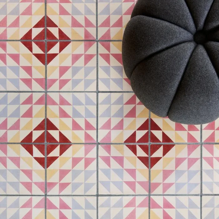
Bert and May
A designer spotlight on the brilliantly stylish Bert&May brand. The UK’s finest encaustic tile supplier and creator of all that is raw yet refined, from sinks to fitted kitchens.

Brand Background
Bert & May, first established officially in September 2013 as the brand we now know (and love). The synonymous style of the brand is one of natural materials and a raw quality. The designs bring the often muted colour palette in to a more sleek and contemporary sphere.
However, the original incarnation by founder Lee Thornley came about in day back in 2004 when he moved from London to Andalusia (now why would anyone do that….hmmm I wonder! Joking), to start up a reclaimed tile company.
It wasn’t actually until 2010 when Thornley met Juanma, the owner of a small artisan tile business that what was to become Bert & May was formed. Juanma’s small family business had created encaustic tiles using the traditional techniques and this collaboration was the ideal meeting of minds and skills. Together they worked to take the business business further. So what had started as an online venture for Thornley soon became a multifaceted brand.
Going back a step or two, while in Andalusia Thornley had designed and opened the stylish boutique hotel Casa la Siesta in Cadiz. It was during the development of this careful restoration that he uncovered his true love of sourcing not only tiles but other fixtures and fittings. He clearly had a an eye for finding rare antiques and fabulous reclaimed items. This is a skill that was to be drawn upon in the development of Bert & May from a tile company, to creating and sourcing an array of fantastic designs from stone sinks, to bathroom fittings, to engineered wood flooring and so much more.


In fact, as of late they have just launched a natural pigment paint range, consisting of sumptuously rich natural tones, we just love it and look forward to trying out many of the fab colours available.
The paint range has developed from a desire to create a range of paints that continue the raw palette of the tiles that they have become so known for.
Prior to this they also launched a bespoke capsule kitchen range, and there’s probably plenty more to come, watch this space I guess.
As for the kitchens, the high end range, much like the rest of Bert & May’s designs, feature a combination of traditional craftsmanship and contemporary practice. Consisting of 4 iconic styles; Library (our fave), Forge, Warehouse and Yard. Each one seems to represent the different edges to what the brand presents, from reclaimed and raw to clean and contemporary, all styles can be found.

The raw meets refined aesthetic can be seen no more than through the range of sinks and fittings that they design. With a range of contemporary and traditional styles, our favourite is the Elm basin (seen blow in crimson, swoon!). A contemporary take on the utilitarian bucket sink with its use of concrete material and the tactile addition of pin stripe textured pattern highlighting the vertical curved design.
The look can be further completed with the addition of the industrial inspired brassware fittings all manufactured in the UK and available in a range of super cool finished such as satin brass and black. If a sink and it’s fittings could be something covetable…this is it!


They’ve had their fair share of chic collaborations too, perhaps our fave is that with super cool brand Darkroom with whom they created a range of tiles and fabrics. The designs celebrate the graphic aesthetic using bold lines and colours.

Other collaborations include; Soho House and Anthropologie. Whether you know it or not, if you are a fan of fantastic design you’ll have seen some of Bert & May’s tiles, as they adorned many a cool bar, cafe and restaurant.
With a real drive towards the importance of wellbeing as a pivotal factor in design and interior practice, this brand sits very well with us and is definitely one to continue to watch. We for one can’t wait to see what they create next!
Images courtesy of Bertandmay.com
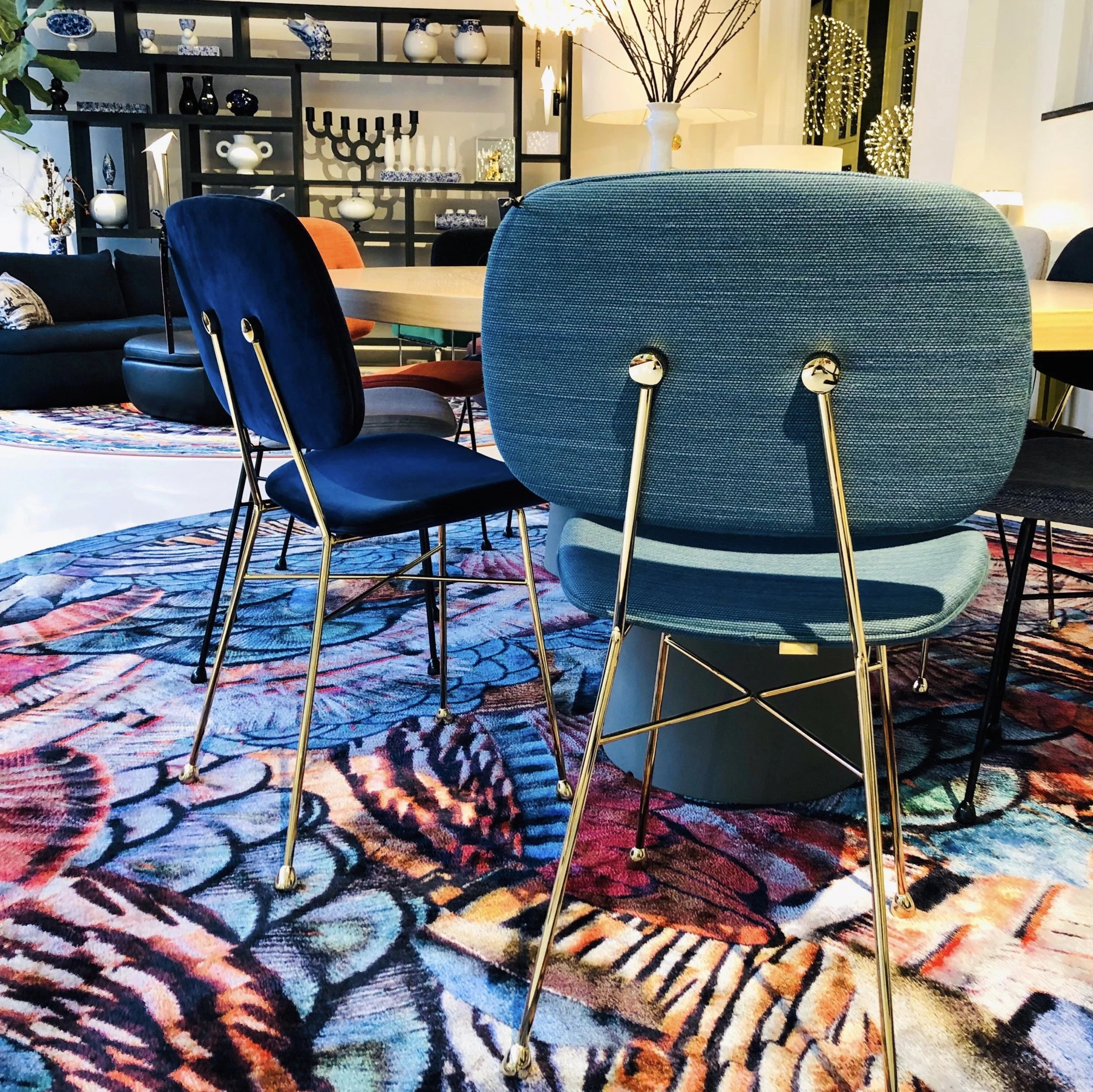
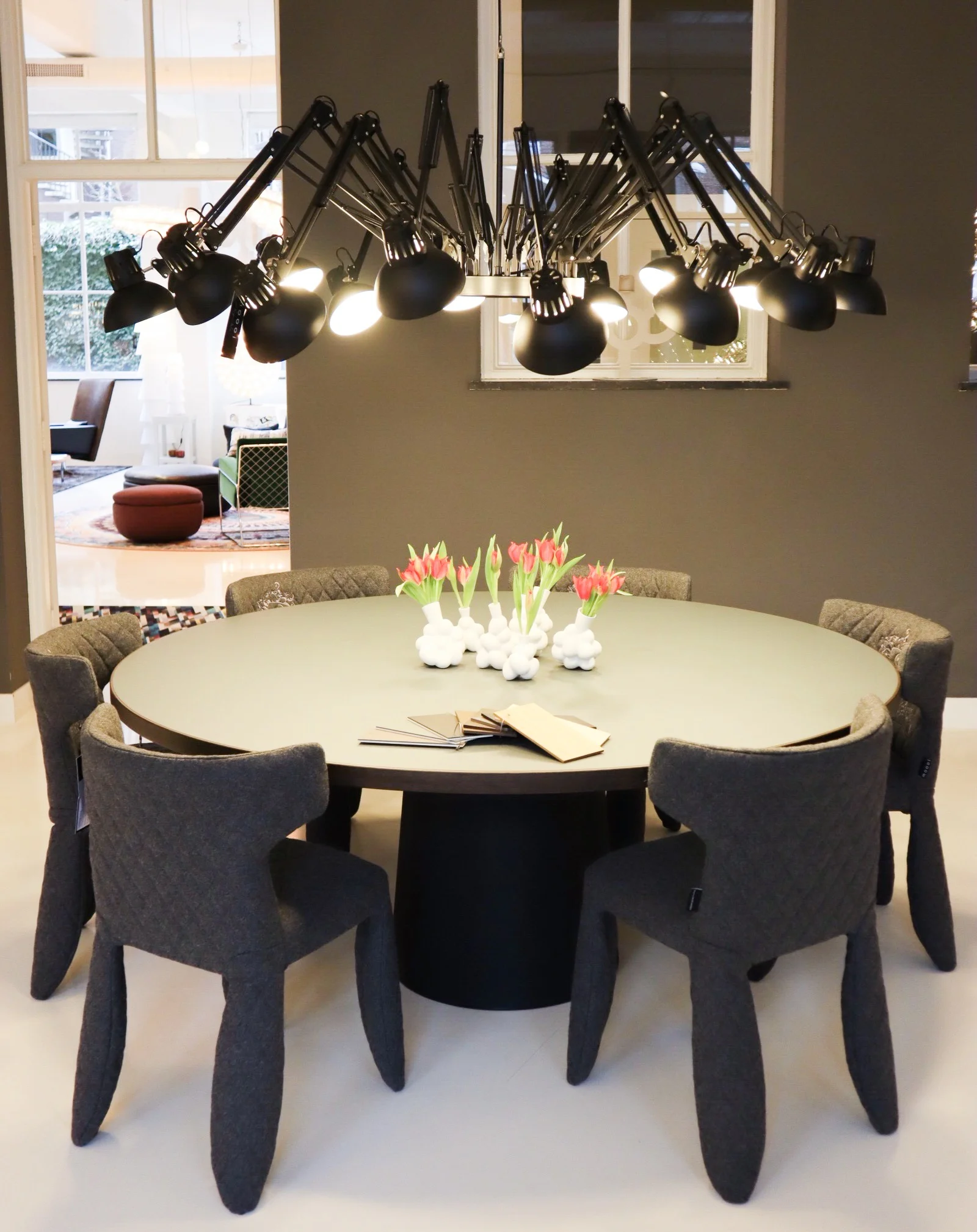
Moooi
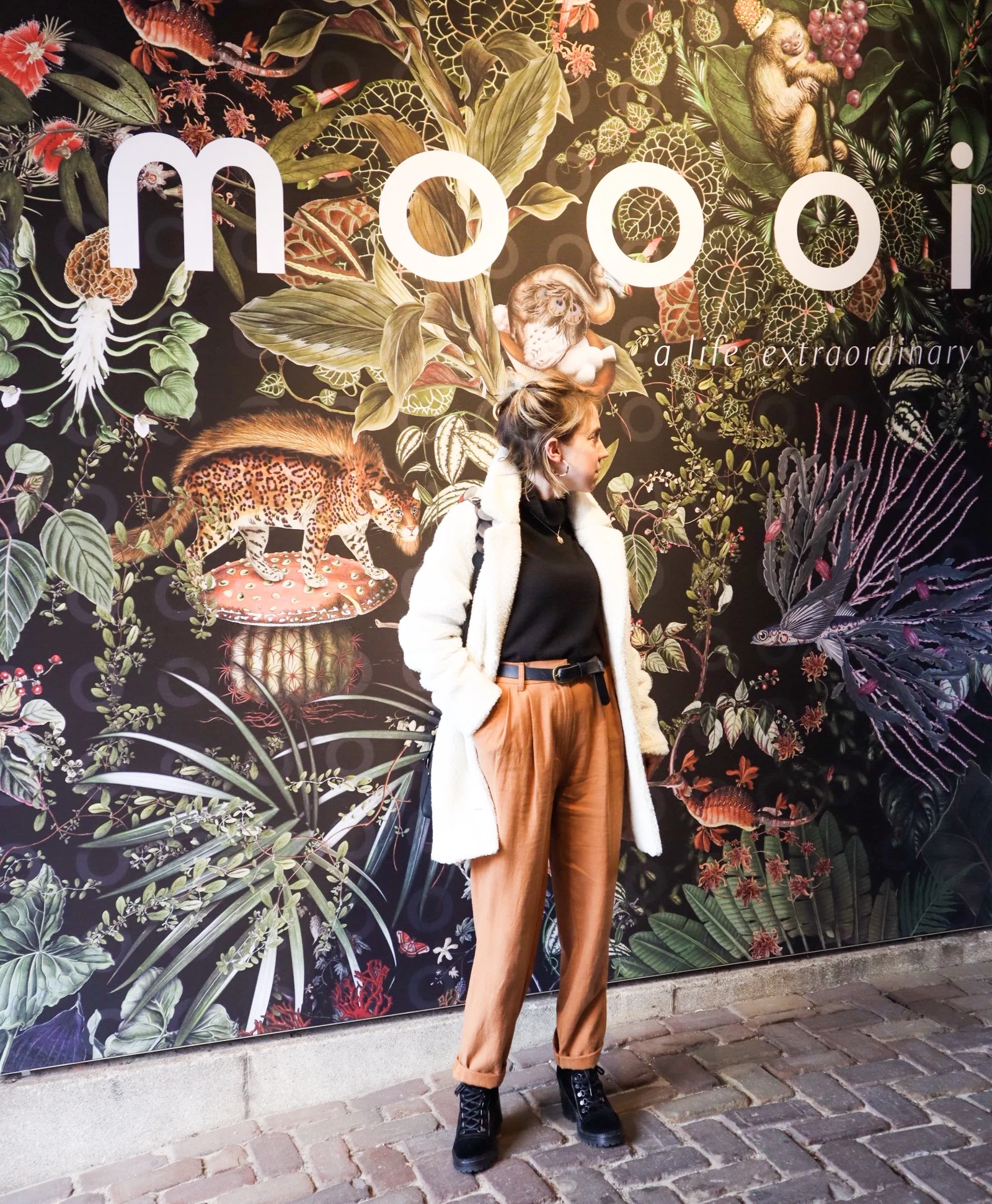
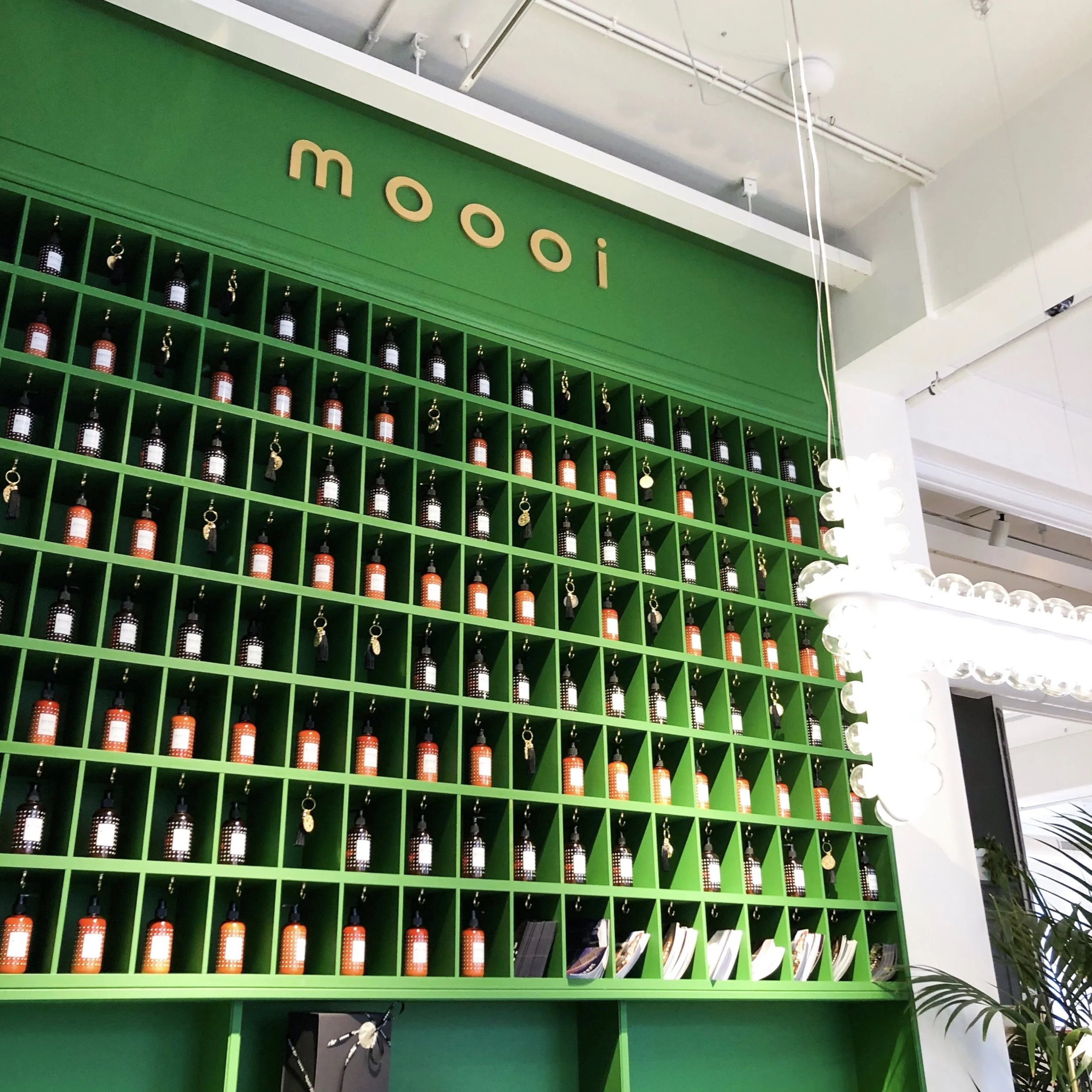
A designer spotlight on Dutch furnishings brand Moooi and their flagship Amsterdam showroom.

Luxury design making playful statements!
So let us start with the basic brand bio to get some background….
Dutch luxury brand Moooi was founded in 2001 by Marcel Wanders & Casper Vissers. The name itself derives from the dutch word for beauty, with extra ‘o’ for uniqueness!
Since it’s original incarnation there have been many management and ownership structures but Marcel Wanders has remained in charge and chief designer all along.
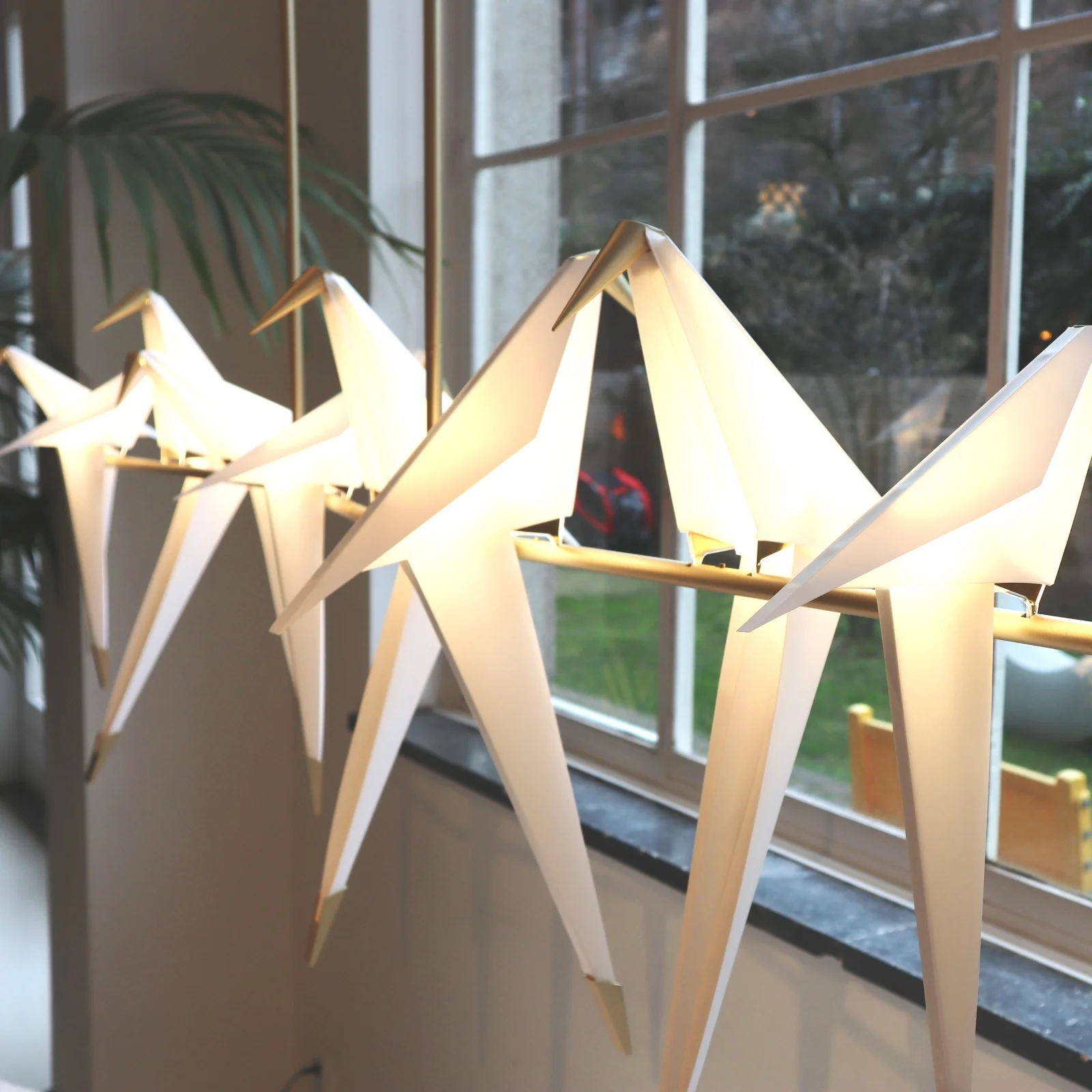
Along with their own unique blend of luxury they showcase pieces by other well established, and equally playful, designers such as Studio Job and Umut Yamac (got to love his Perch lights, seen dotted all over the Moooi showroom).

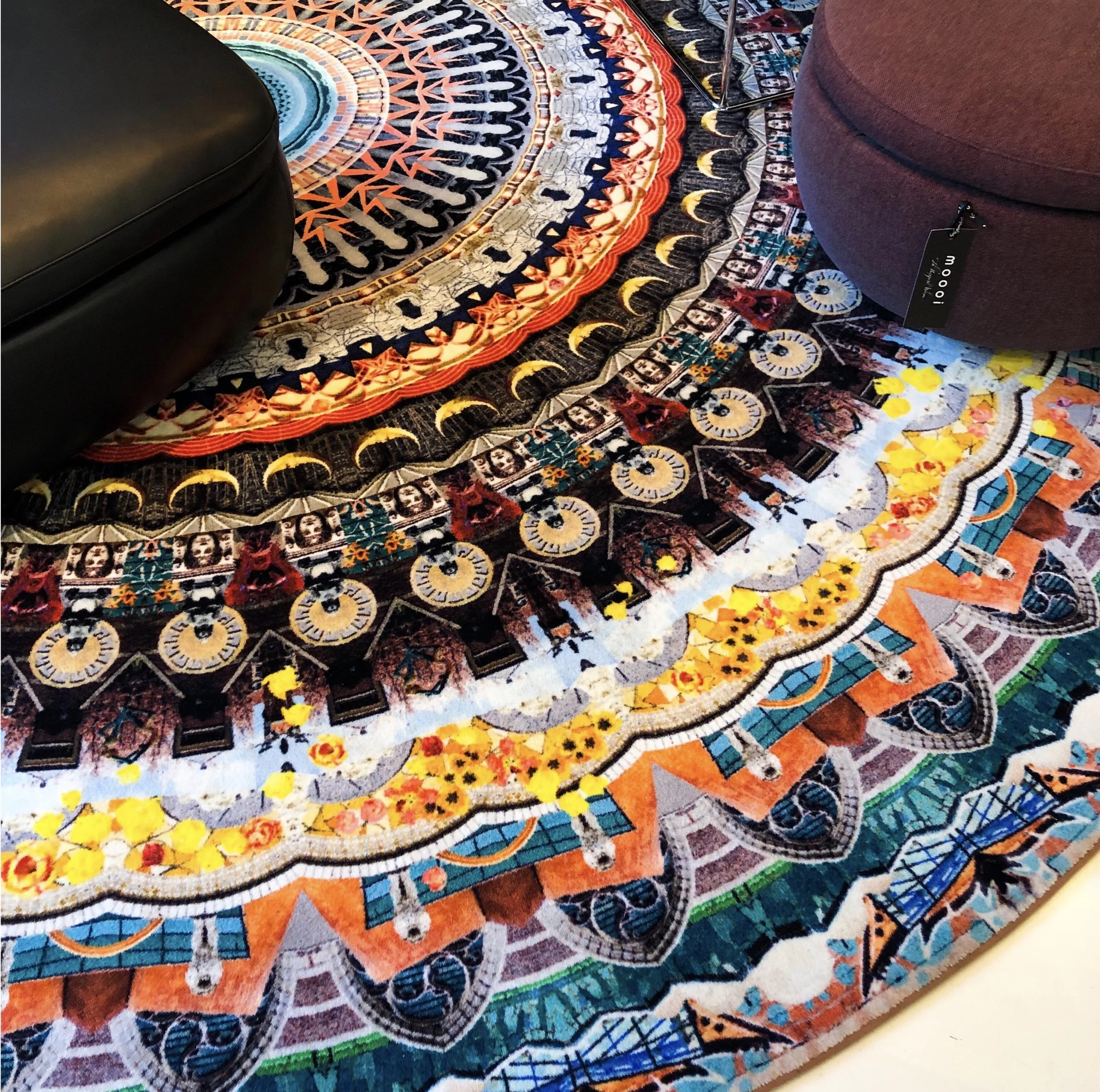
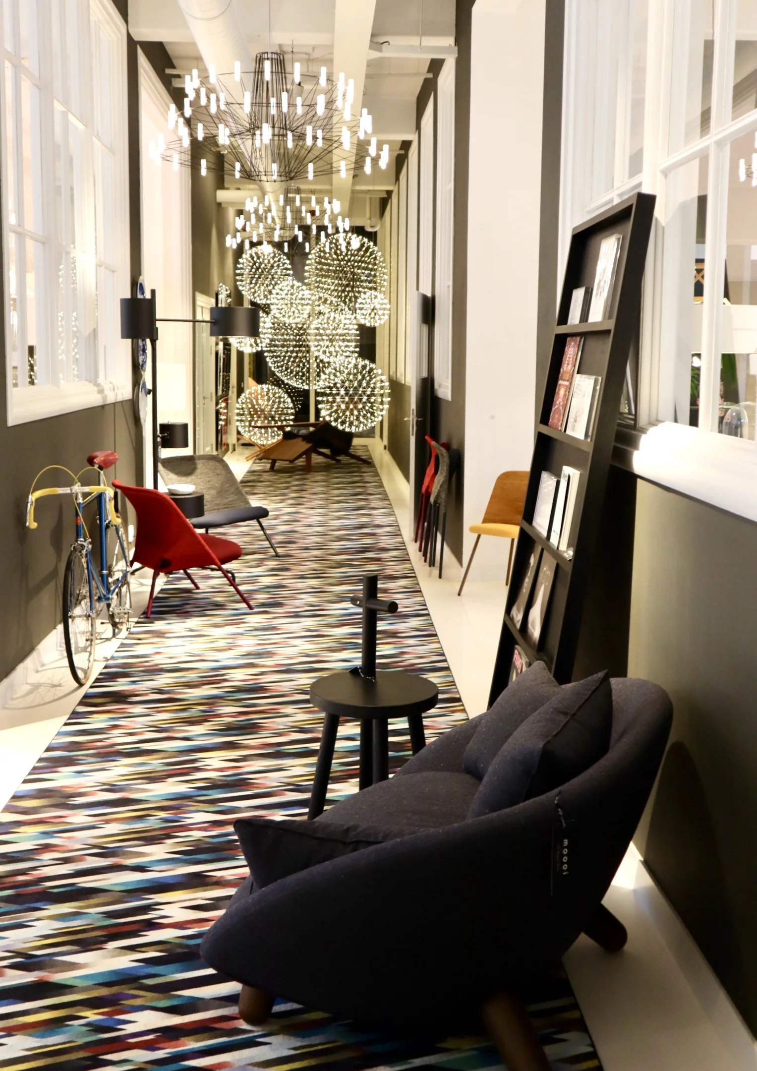
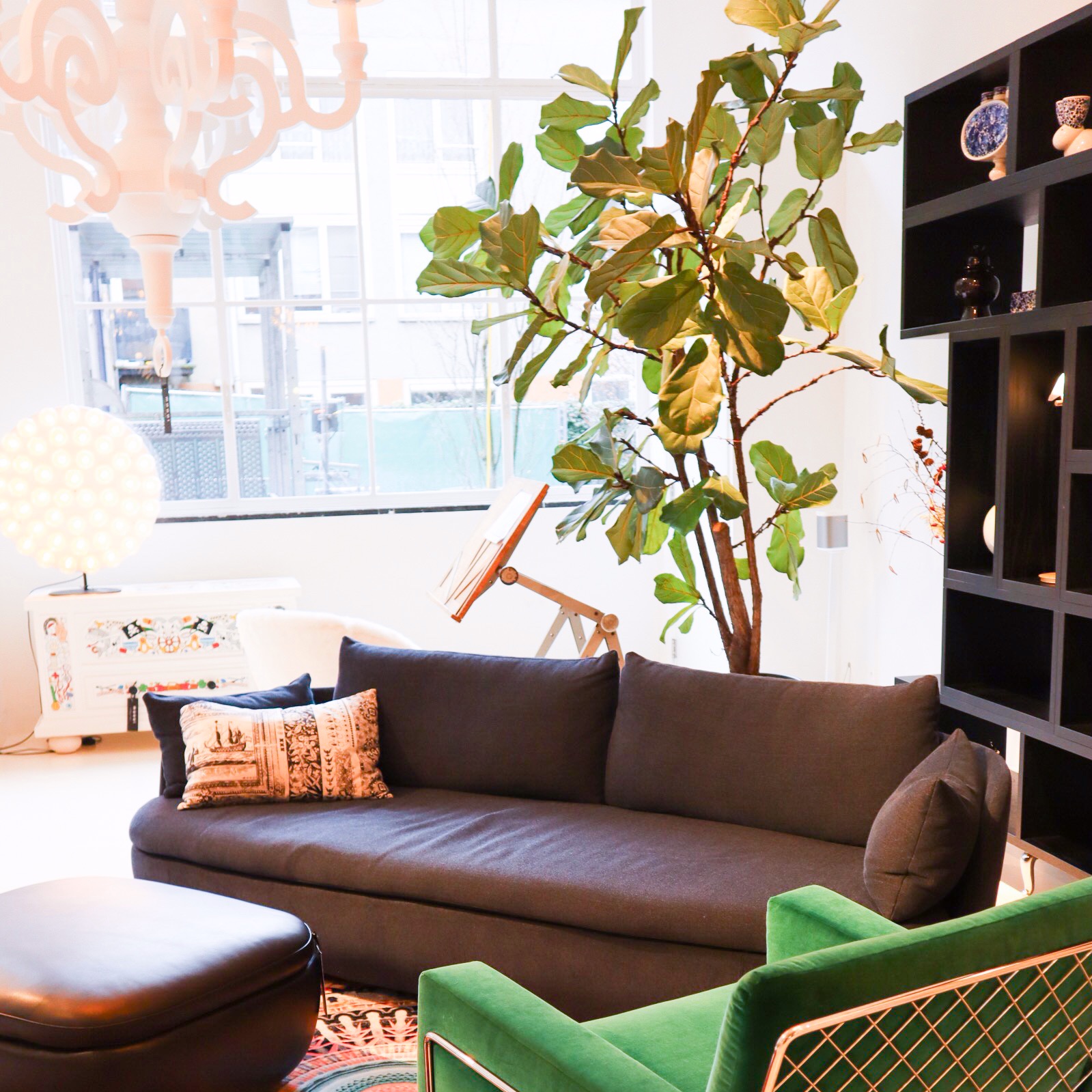
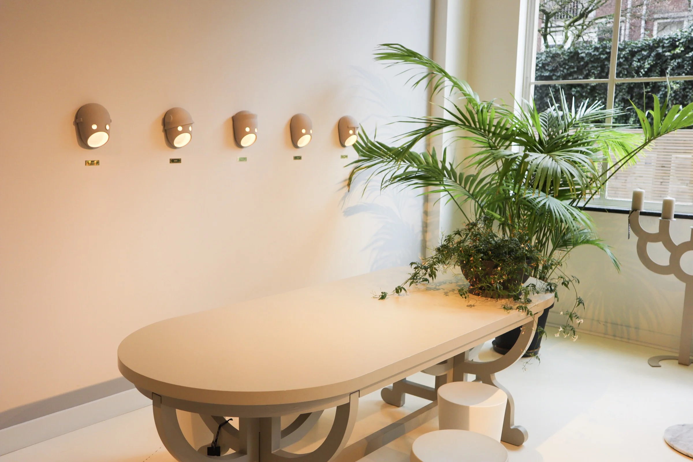
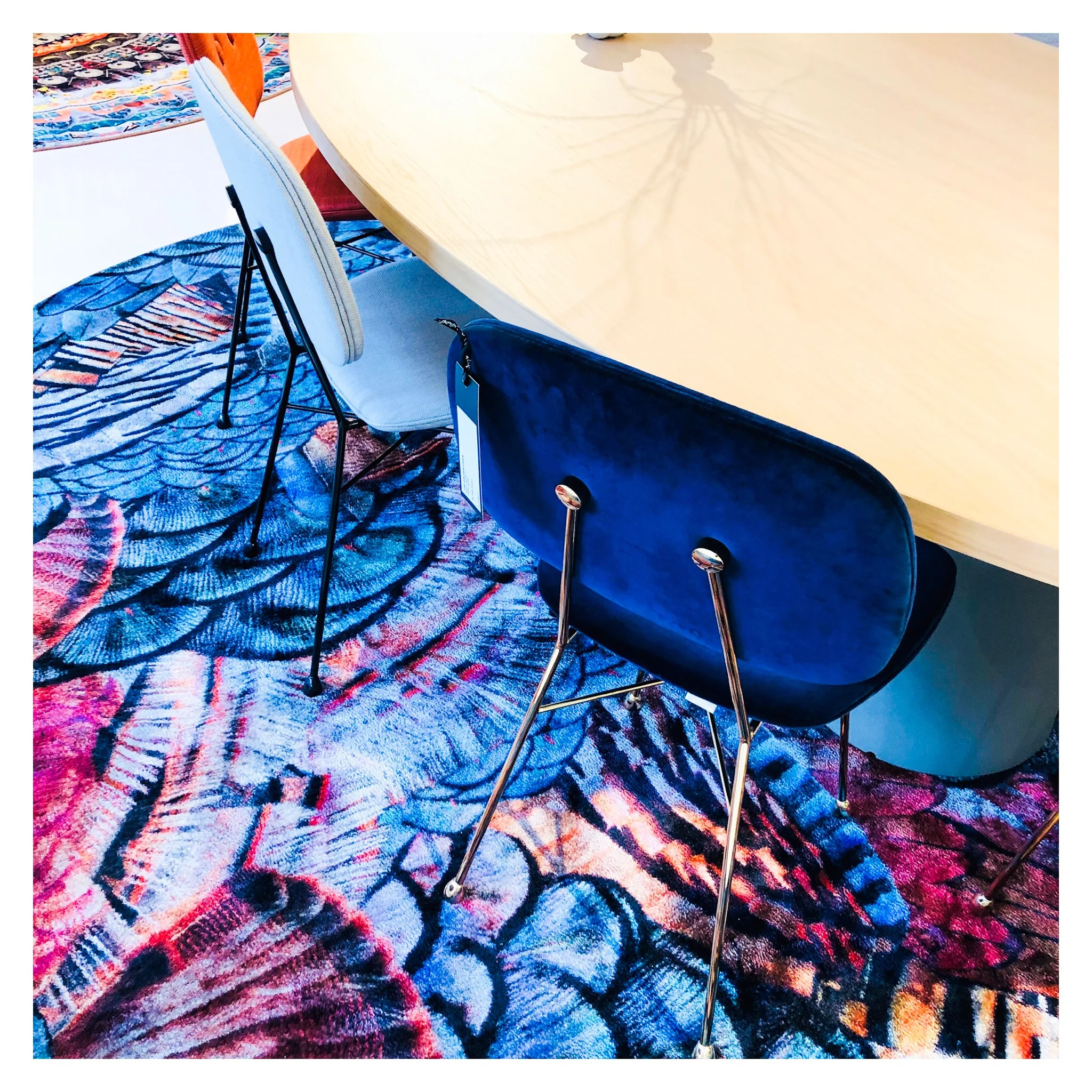
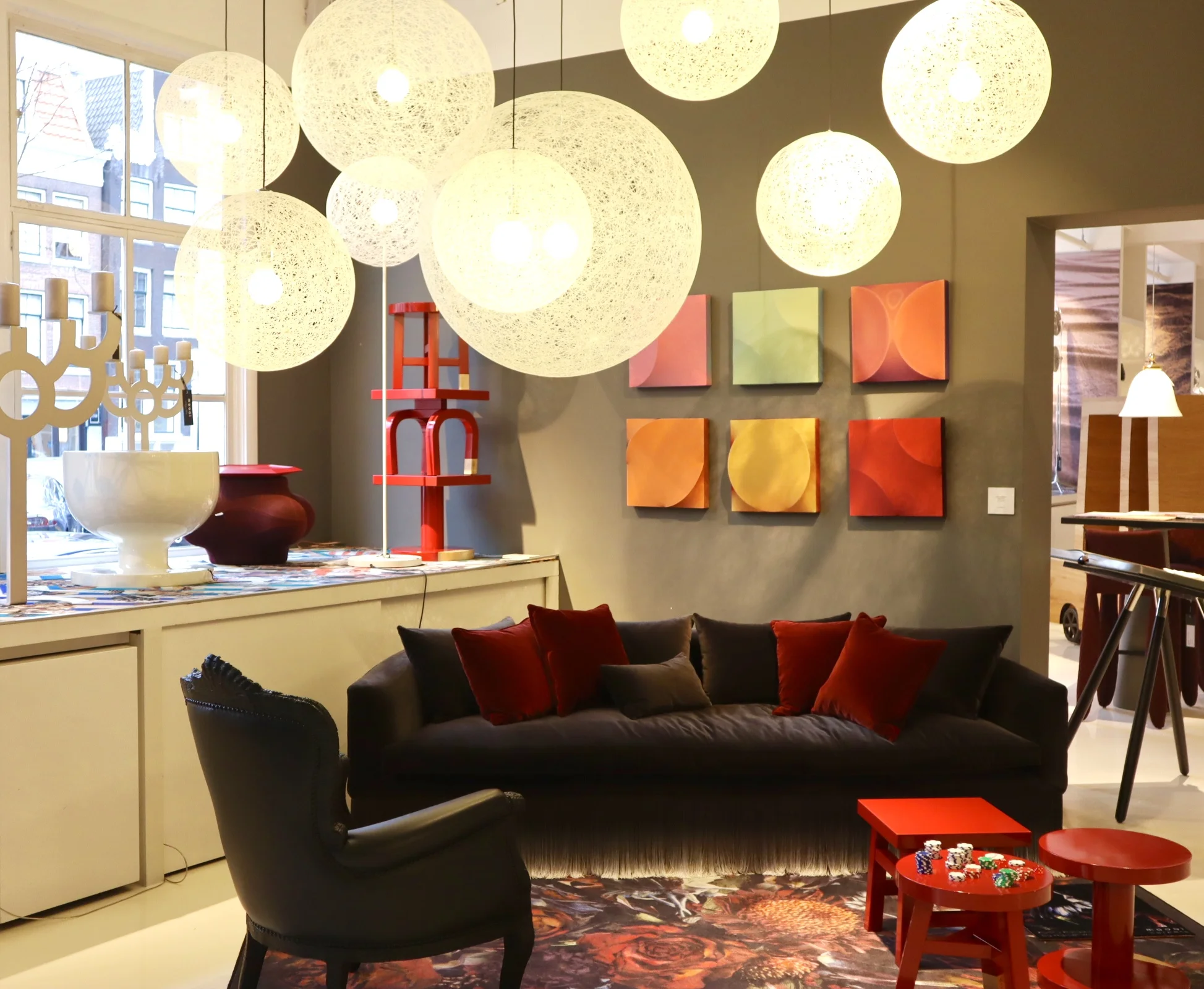
Now let’s talk about how amazing the 700sqft flagship showroom is in Joordan, Amsterdam. It’s a visual grenade from the second you walk in. Even just the carpet that runs from the entrance, leading you in is an explosion of detailed print and bright colour. A common thread that runs throughout the whole showroom, with each intricately staged area featuring some form of bold explosion in the form of a fab rug or carpeted area. I love walking around showrooms like this, they are not only great when you are sourcing for a project but also just for inspiring. It’s so important to keep visually stimulated and to put yourself in to spaces like this as a designer as often as possible. It is so easy to fall into the ‘work’ aspect of the job and get bogged down by specs and the technical areas of a project.
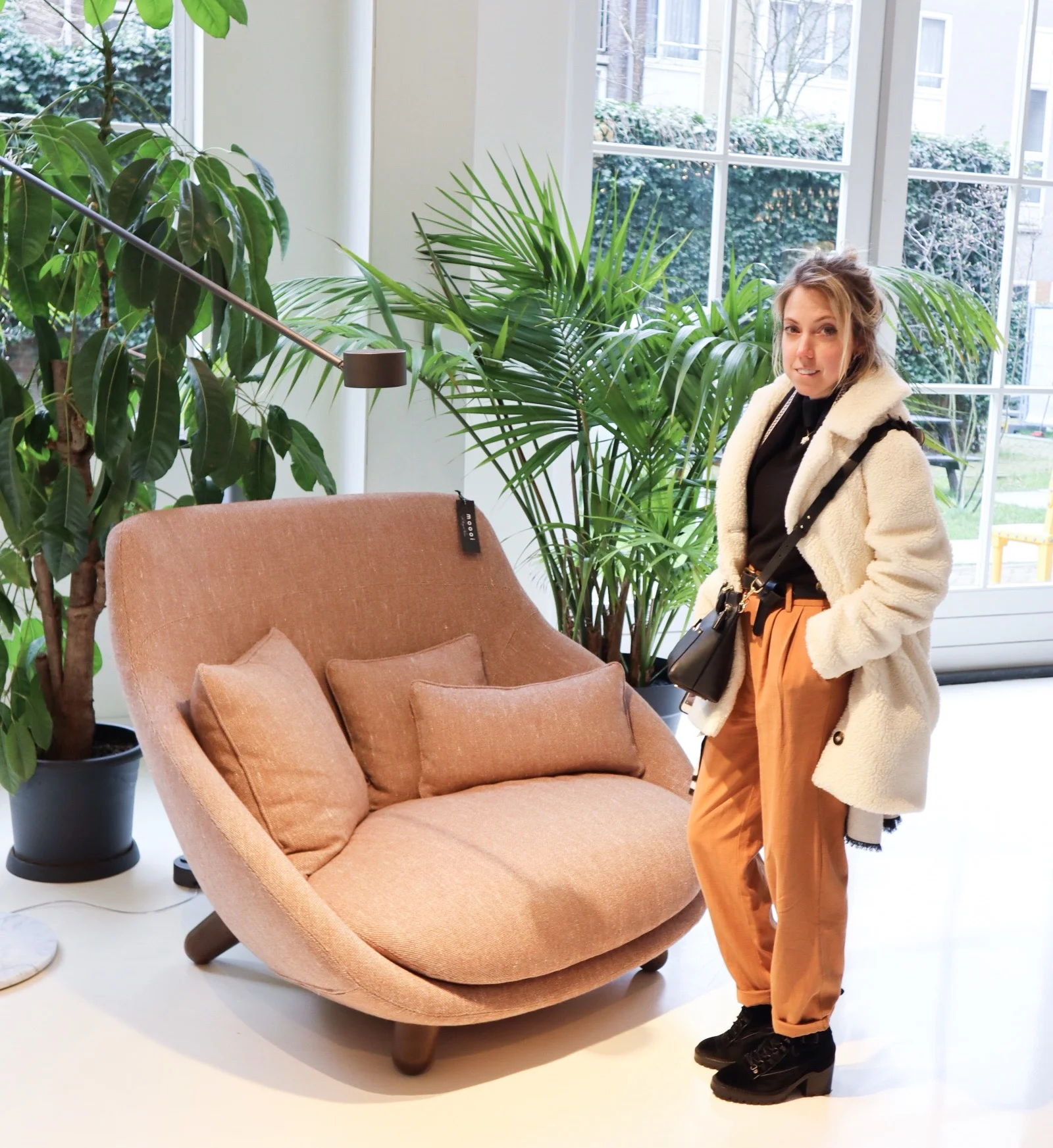
So back to Moooi… the brand is known for quite a few modern iconic pieces. One notable is the Container table with its cylindric pedestal base and simple solid table top. It’s form is simple and modern yet timeless and therefore represents the Moooi ethos perfectly. It comes in an array of sizes and variations on the plain style, such as the New Antiques range that features more curve details reminiscent of old traditional turned table legs. The basic style remains a favourite of mine as it serves as a solid base to allow the accompanying chairs and all other items that occupy the space to shine.

Seen here: a version of the iconic Container table.
Moooi are also synonymous with bold feature light fittings. One of the most iconic are the strong and dominating Paper Chandelier, a modern twist on the classic metal structured chandelier, this is actually created (as the name would suggest) out of paper. Well, the main structure is actually created out of cardboard and wood that is then wrapped in a lacquered paper shell. I would say this is the most iconic light fitting in that most people will have seen one in a quirky commercial setting somewhere or another. It, like many iconic designs, has been copied (or versions/variations attempted) by other high street brands over time too.
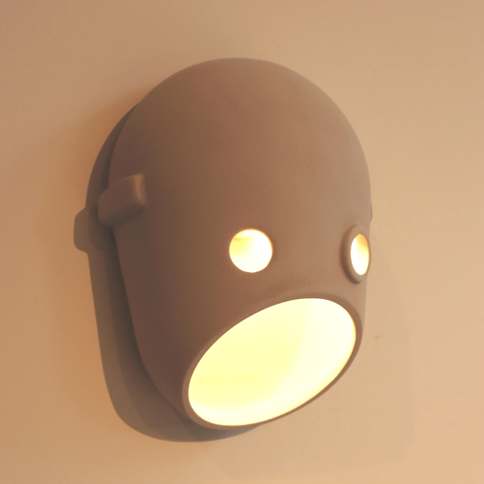
The Paper chandelier is low however on my favourites list when it comes to light fittings at Moooi. The likes of the super cool Meshmatics chandelier with its steel mesh structure edged in brass detail, for a nod to more refined luxe, is right up there. Like I mentioned at the start of this post, you can’t not love the Perch lights by Umut Yamac, seen dotted all over the showroom. But another range that I love, for the sheer fun of it, is the Party. A range of casted ceramic fittings shaped to represent faces. There are a clan of 5 ‘characters’ designed to represent different captivating personalities. The designers say this work is to represent our fascination with secrets, family dynamics and intrigue. The long strip pendant featuring all 5 faces back to back would bring character to any dinner table that’s for sure!
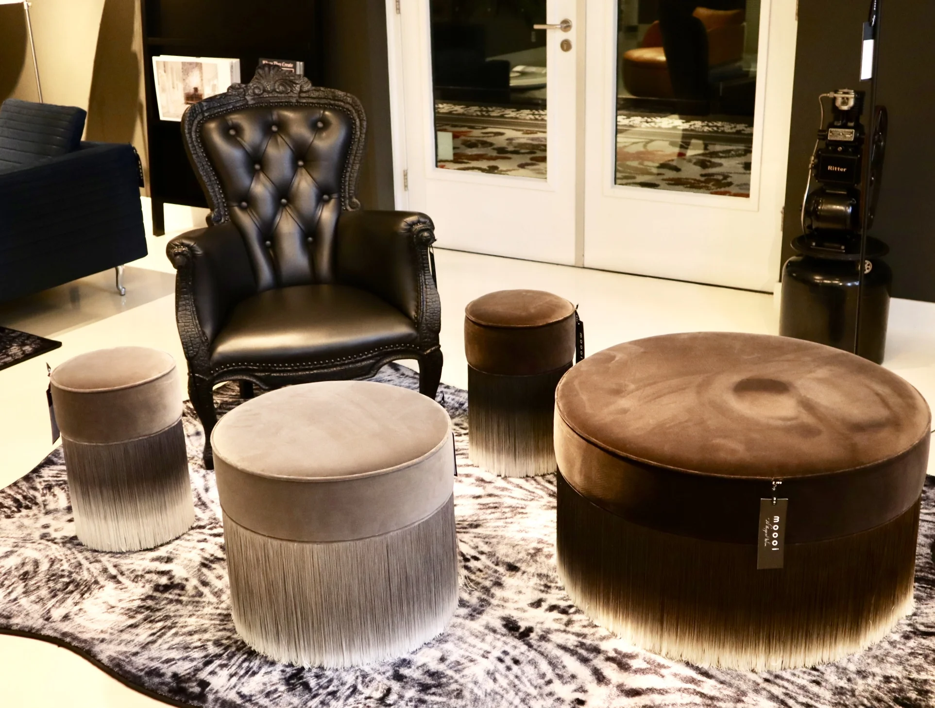
Back to colour and textiles, the various chair styles that dot about the showroom also showcase the continued use of (often) bold colour and with different fabric finishes. The Charles chair a Marcel Wanders design with it’s simple frame base structure is most definitely an iconic piece. It can look strikingly different by the simple change of colour and finish. You will have seen many chairs in companies such as Made.com that have cost definitely been derived from this design. Similar in it’s simplicity is the Golden chair, a simple design based on and reminiscent of a simple school chair but with a fine frame and fab array of finishes. I really love these!!
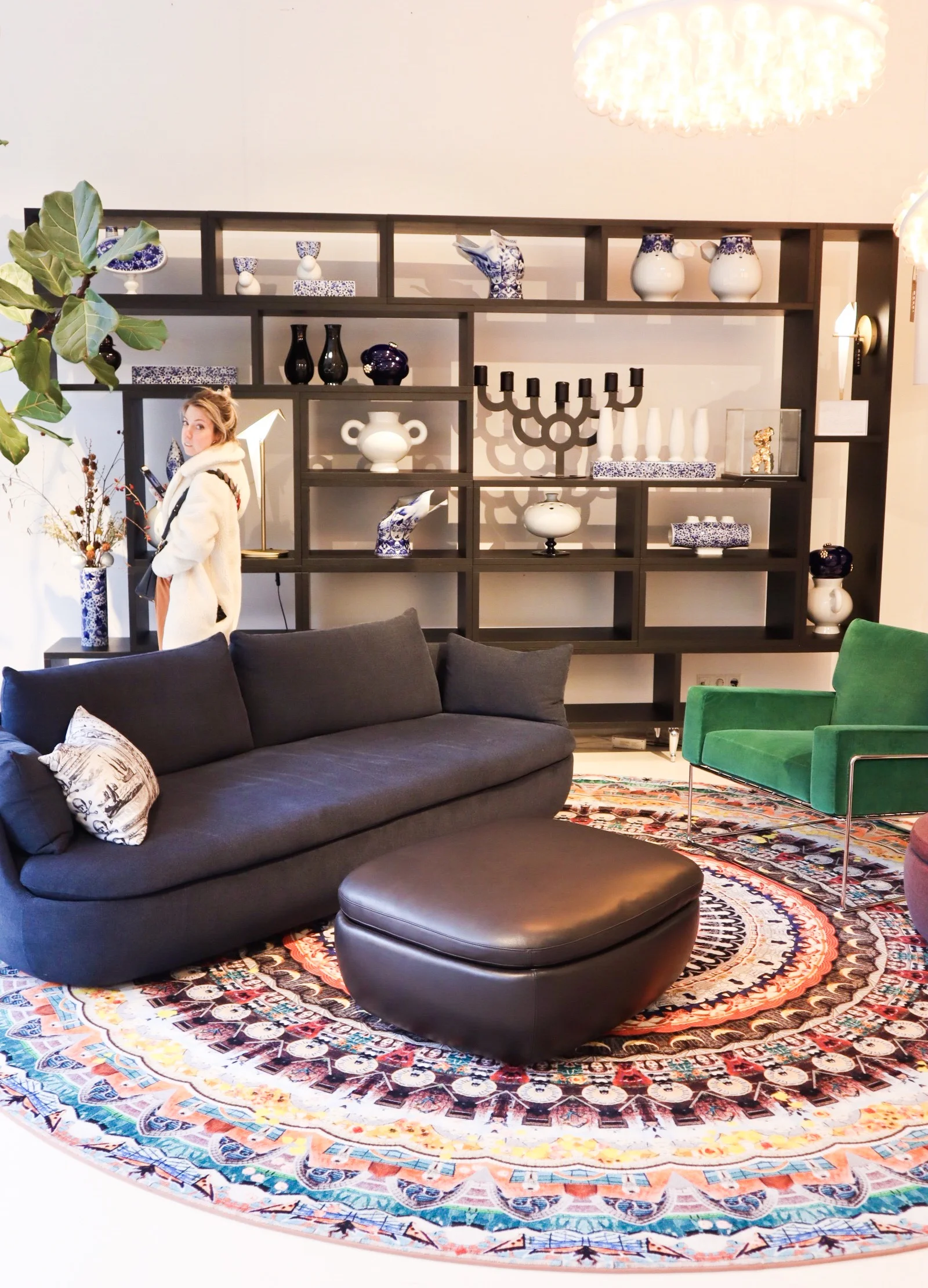
Area set up - featuring among others - the Charles Chair (in emerald green to the far right), Perch table lamp (on shelving).
They want to be daring but yet timeless, this can perhaps be seen in the most obvious way in pieces like the grandfather clock designed by StudioJob.

Studio Job design Clock.
The whole feel of the showroom is exclusive but without the austerity that that can also harbour. With lots of pattern and colour the space becomes playful and almost poetic, far more inviting than some uber modern show spaces. The brand dictates itself as being position ‘on the edge of commercial reality and cultural interest’ and I think that is about spot on and evident here. Being at the higher end of a retail price point they offer up furnishings that are coveted, yet identifiable at the same time.
In a nutshell, the Moooi style is old meets new in the most modern way, if that doesn’t contradict itself too much?

48hrs in Seville - sun drenched streets with style
A 48hr design driven city guide to Seville.

What do you do with only 48hrs in an amazing city with so much to see?
Here’s our 48hr low down on Seville for design and culture seekers.
When we visited Seville it was the beginning of September and baking hot at about 35 degrees on average, which isn’t bad for a city that regularly peaks at 40 in the summer months. Despite the temperature being better suited to lounging about we didn’t stop!…Standard.
We also drove into the city, which was an experience in itself with the sat nav directing us around every little back street, lane and alleyway. A great way to see the city though.
Get yourself a base in one of the cool places in and around the little streets that surround the main Cathedral, this position in the heart of the old town works for seeing everything this beaut city has to offer without travelling too far. We stayed at the awesome boutique Hotel Casa del Poeta and totally recommend it with bells on!
Set in a large 17th century house with central open courtyard and topped with a rooftop terrace. The view over Seville does little for this city because you’ll find all the detail and design on street level but it’s great for an end of day drink!


Start your day with a quick coffee and bite on the go, pick this up from one of the cafes that line the central streets of Seville. As you walk you’ll see the orange trees that line loads of the streets and all the detail in every paved area. They love their detail here and many of the (equivalent) cobbled streets are paved in a chevron style brick tile that just looks pretty cool. The fact is, this detail was more likely a practicality but I like to believe it was for the love of design…

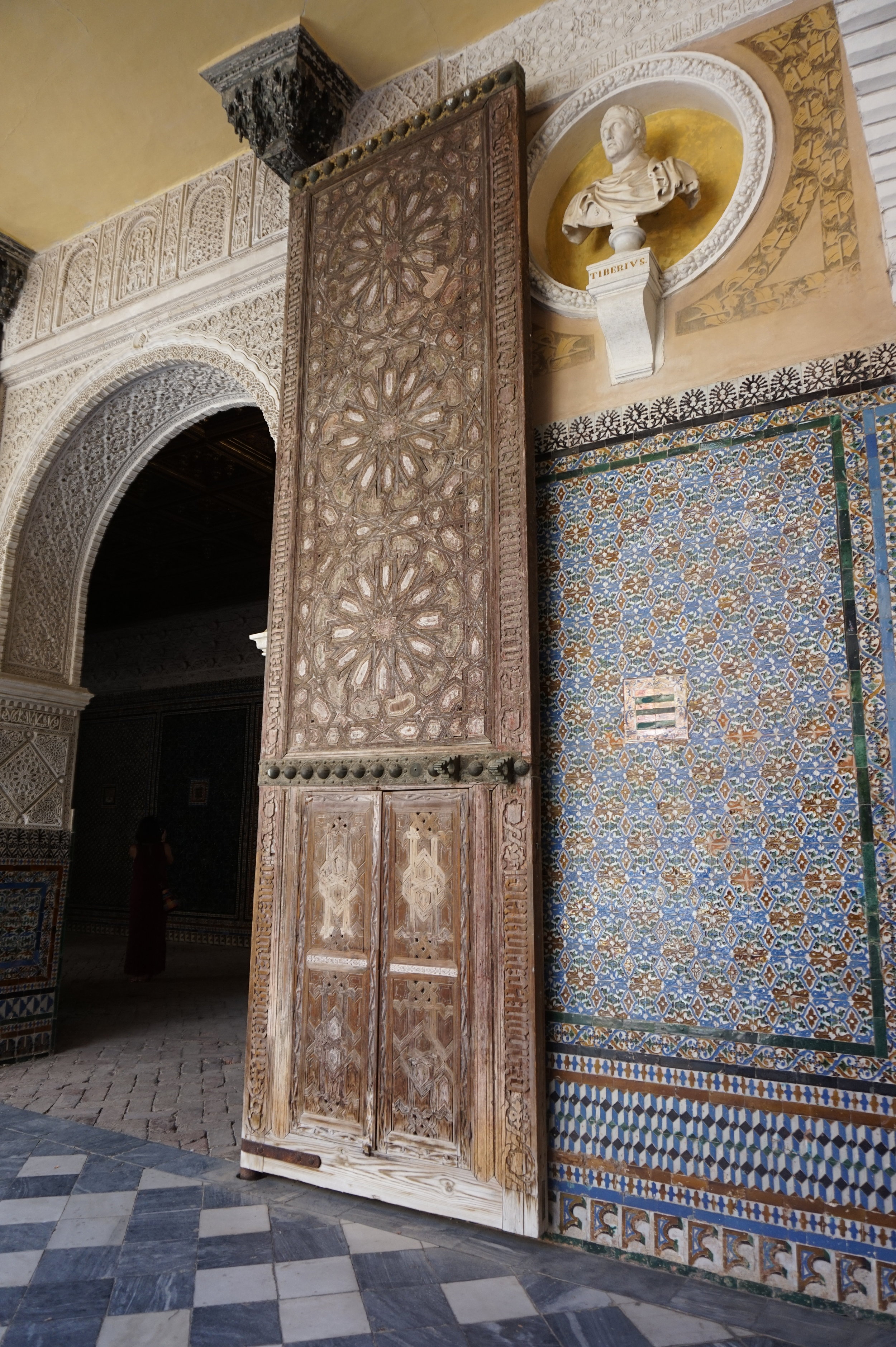
There are a handful of well known tourist spots to hit up. Unlike in some cities where I would say skip most of these for the more unusual spots, in this case, I would say see as many as possible. The buildings here are so beautiful and the significant sights are worth it. However, do try to stop at Casa de Pilatos, a less known ‘great’ house, in comparison to the uber touristy Royal Alcazar of Seville.

The tiles at this place are unreal, (see above image of me, just hanging out in a window…as you do). It’s much quieter here and no queues making it a total winner for us.

Once you’ve enjoyed all that is on offer here now head out to get walking, (buses/trams and metros available) to head to Plaza de Espana. Probably the most photographed place in Seville, when you get there it’s easy to see why with all it’s blue, white and bright yellow tiles.


Walking through the streets, start slightly towards the main river that runs through the city, there are tons of local churches big and small, pop your head in to one or two they are beautiful. I’m not a church person but I appreciate the look and feel of these historic and meaningful structures. We looked in to Parroquia de Santa Cruz, one of the Catholic churches with it’s ornate interior and gilded…everything.
Try to walk by Plaza del Cabildo on your way towards the banks of the Canal de Alfonso XIII, just a great looking crescent like plaza where you can get more pictures of the typical Seville style.
When you hit the canal spy the Torre del Oro, there are quite a few fortress style buildings along the banks but this is the best known. It has a museum, if you like military history I’d suggest going but but for us it was just good to look at and move on.
If you can walk more, head over the Puenta San Telmo (bridge next to the Torre del Oro). Crossing the canal you’ll head in to Triana. This area used to be very poor and ghetto like back in the day, now it is a bustling wealthy area full of cool tapas bars, shops and a big marketplace. Before checking out the market grab some lunch at the likes of DeO, a small but fab tapas cafe. You’ll need the food after the amount of walking!
Now head to the market and while there why not watch one of the live Flamenco shows that go on in the little theatre there and grab a drink.
Now head back over to a tourist spot worth a trip and end the day by viewing the picture perfect sights of the Plaza de Espana. Along with the photogenic building and all it’s tiled surfaces there’s a moat-like river that runs around the curves of the building. You can take a boat out and row your way around. We didn't have time, or to be honest the desire, to do that….but whatever floats your boat! (cheap pun there).

After getting all the sun drenched pictures in and walking along the bridges that line the plaza start making your way back to your hotel.
We slowly walked back and then went straight on to the rooftop terrace for a strong drink before a quick freshen up and change for dinner.
We booked a local restaurant, Mechela Arenal, off a recommendation. This was about a 10 minute walk, past the Cathedral and through a busy restaurant/bar area. It was well worth the walk and pre-booking, amazing tapas style dining in a cool setting.
(It’s worth noting there are two restaurants under the Mechela name, the original smaller Mechela Bailen and the Arenal venue).
After dinner if you’ve got the energy hit some bars, alternatively hit the sack and get well rested for the next day!


Kick off day two with a good breakfast, we ate in our hotel, which was pretty awesome. We dedicated this whole day to checking out Royal Alcazar of Seville, with the main palace and all the gardens it’s worth giving it plenty of time. It’s smack bang in the centre so not as much walking, but expect queues and crowds, pre-book!

Take your time walking around and get an audio tour to get the most out of it, the Spanish aristocracy and royal history is complex and very interesting. The gardens are vast, with plenty of spots to chill and enjoy the surroundings.

This is where our trip ended (so not a true 48hrs) and we followed this with a quick last minute tapas treat and then off in the car back towards the coast near Malaga. But, if you have the full day and the energy just keep wandering and visit some more of the fab (and free) spots, or take in some of the galleries that occupy some of the old manor houses around the cit centre.
Most of all, eat, drink and enjoy!
Trip Tips
Lots of suncream and a hat…seriously!
Pre-book any major sights that you want to go in to avoid queues as much as possible.
Do research on places for food, it’s worth it to know where you’re heading, lots of places need booking to guarantee a seat.
Stay central!