
Transformative Power of Colour
Colour has an incredible ability to uplift, inspire, and transform the atmosphere of a space. From the soothing hues of blue to the vibrancy of red, the careful selection and application of colour can have a profound impact on the overall aesthetic and mood of an interior. Whether it's a residential abode, a commercial space, or even a public area, the transformative power of colour can create a truly immersive and captivating experience.
Colour has an incredible ability to uplift, inspire, and transform the atmosphere of a space. From the soothing hues of blue to the vibrancy of red, the careful selection and application of colour can have a profound impact on the overall aesthetic and mood of an interior. Whether it's a residential abode, a commercial space, or even a public area, the transformative power of colour can create a truly immersive and captivating experience.
One of the most noticeable effects of colour in interiors is its ability to influence emotions. Certain colours can evoke a sense of calm and tranquility, while others can ignite passion and energy. For instance, a light and airy room painted in soothing pastel tones can instantly create a serene and peaceful sanctuary. On the other hand, a vibrant red accent wall in a dining area can stimulate appetite and create a lively and stimulating atmosphere. Colour has the power to communicate messages and evoke specific emotional responses, allowing designers to curate desired experiences for those who occupy the space.
Furthermore, the strategic use of colour can also enhance the perceived size and functionality of a room. Lighter colours tend to make a space feel more spacious and open, while darker shades can create a sense of intimacy and coziness. In small rooms, the use of pale hues on walls and furniture can visually expand the boundaries and make the area feel more expansive. Contrarily, in larger spaces, the clever application of darker colours on select walls or features can create a sense of depth and comfort. By understanding the principles of colour psychology and spatial perception, designers can manipulate the visual aspects of a room, transforming its dimensions to suit intended purposes.
Additionally, colour has the power to showcase individuality and personal style. A well-chosen and thoughtfully executed colour palette can be a reflection of the occupant's taste and personality, making a space feel truly unique and customized. Whether it's a bold and dramatic combination or a harmonious blend of complementary shades, the right use of colour can impart a distinct character and make a space feel authentic and welcoming. By carefully considering the desires and preferences of the client, designers can select colours that resonate with their personality and create an environment that truly feels like home.
Essentially, the transformative power of colour in interiors is undeniable. From influencing emotions to altering perceptions and showcasing individuality, colour plays a pivotal role in crafting a memorable and impactful interior design. By harnessing the communicative and sensory properties of colour, designers can create truly effective and beautiful design that does good.

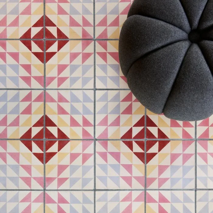
Bert and May
A designer spotlight on the brilliantly stylish Bert&May brand. The UK’s finest encaustic tile supplier and creator of all that is raw yet refined, from sinks to fitted kitchens.

Brand Background
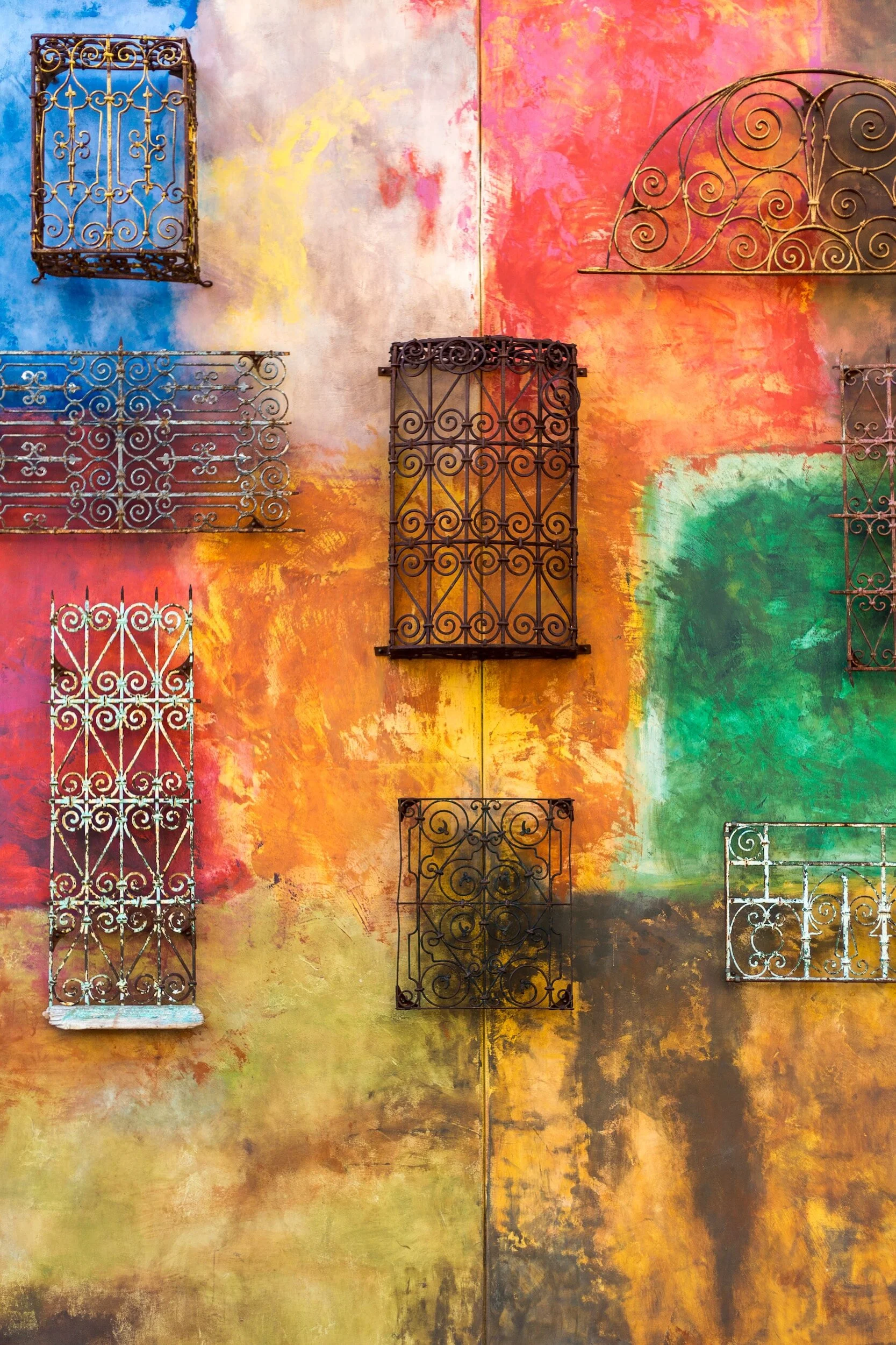
Bert & May, first established officially in September 2013 as the brand we now know (and love). The synonymous style of the brand is one of natural materials and a raw quality. The designs bring the often muted colour palette in to a more sleek and contemporary sphere.
However, the original incarnation by founder Lee Thornley came about in day back in 2004 when he moved from London to Andalusia (now why would anyone do that….hmmm I wonder! Joking), to start up a reclaimed tile company.
It wasn’t actually until 2010 when Thornley met Juanma, the owner of a small artisan tile business that what was to become Bert & May was formed. Juanma’s small family business had created encaustic tiles using the traditional techniques and this collaboration was the ideal meeting of minds and skills. Together they worked to take the business business further. So what had started as an online venture for Thornley soon became a multifaceted brand.
Going back a step or two, while in Andalusia Thornley had designed and opened the stylish boutique hotel Casa la Siesta in Cadiz. It was during the development of this careful restoration that he uncovered his true love of sourcing not only tiles but other fixtures and fittings. He clearly had a an eye for finding rare antiques and fabulous reclaimed items. This is a skill that was to be drawn upon in the development of Bert & May from a tile company, to creating and sourcing an array of fantastic designs from stone sinks, to bathroom fittings, to engineered wood flooring and so much more.


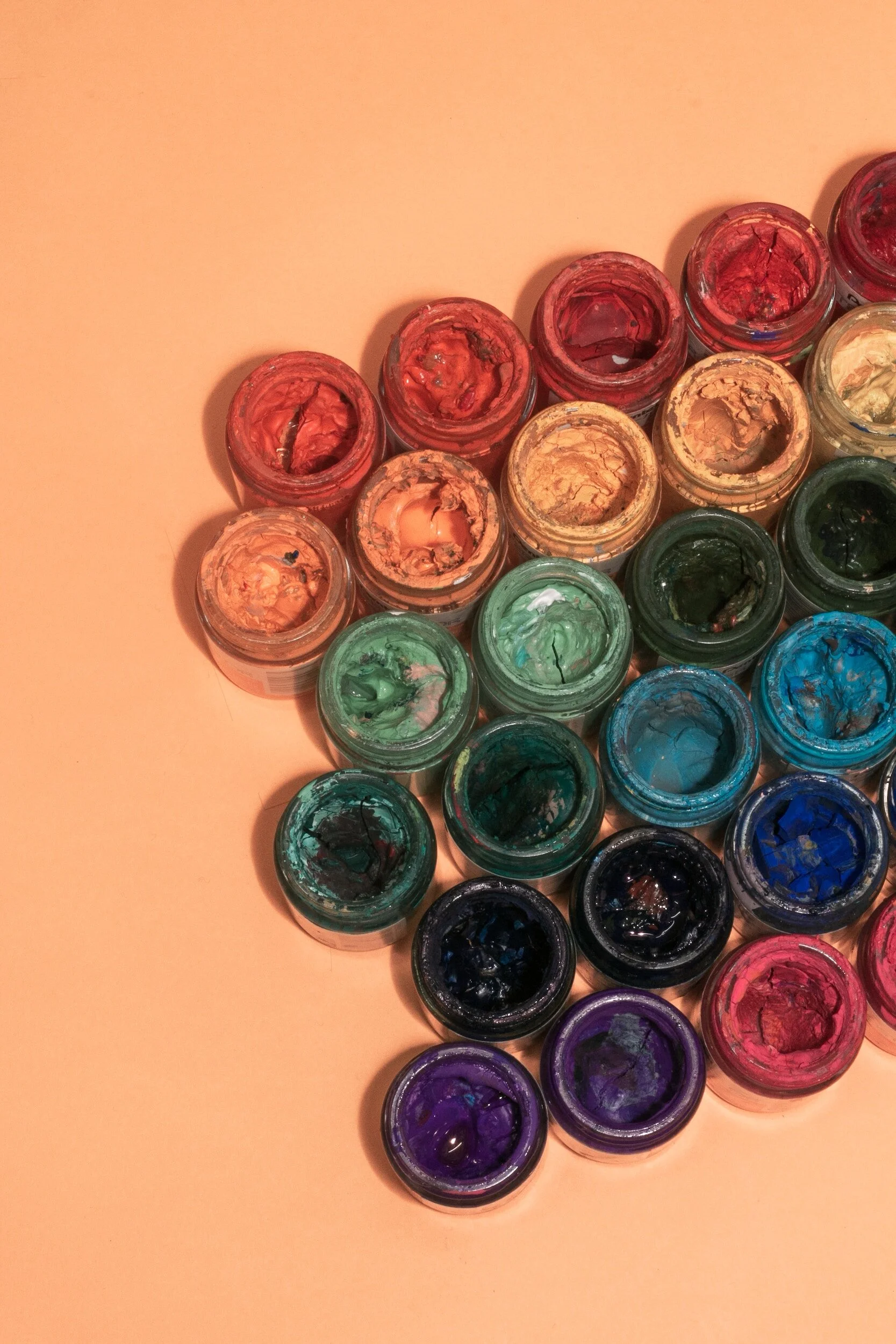
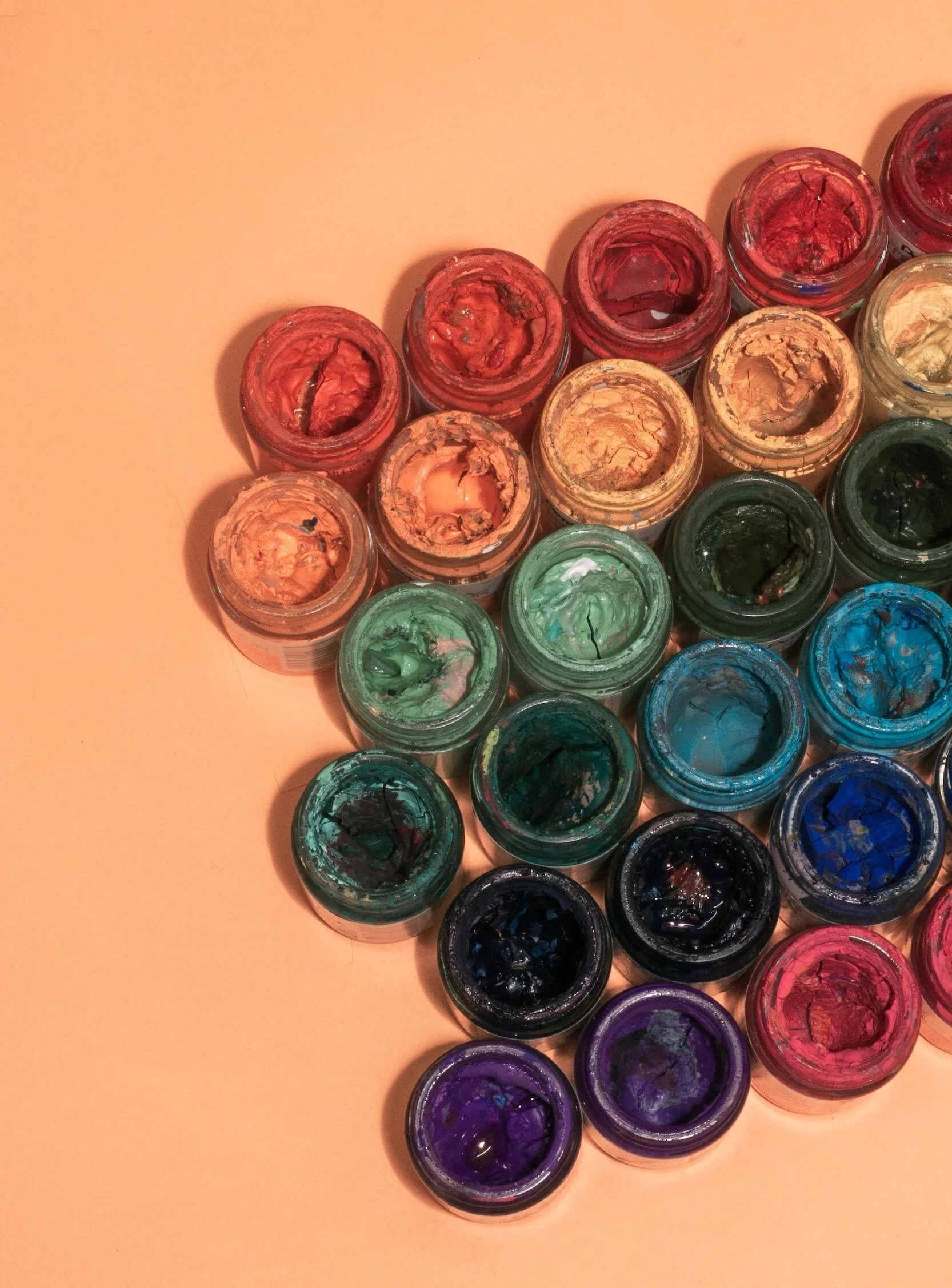
In fact, as of late they have just launched a natural pigment paint range, consisting of sumptuously rich natural tones, we just love it and look forward to trying out many of the fab colours available.
The paint range has developed from a desire to create a range of paints that continue the raw palette of the tiles that they have become so known for.
Prior to this they also launched a bespoke capsule kitchen range, and there’s probably plenty more to come, watch this space I guess.
As for the kitchens, the high end range, much like the rest of Bert & May’s designs, feature a combination of traditional craftsmanship and contemporary practice. Consisting of 4 iconic styles; Library (our fave), Forge, Warehouse and Yard. Each one seems to represent the different edges to what the brand presents, from reclaimed and raw to clean and contemporary, all styles can be found.

The raw meets refined aesthetic can be seen no more than through the range of sinks and fittings that they design. With a range of contemporary and traditional styles, our favourite is the Elm basin (seen blow in crimson, swoon!). A contemporary take on the utilitarian bucket sink with its use of concrete material and the tactile addition of pin stripe textured pattern highlighting the vertical curved design.
The look can be further completed with the addition of the industrial inspired brassware fittings all manufactured in the UK and available in a range of super cool finished such as satin brass and black. If a sink and it’s fittings could be something covetable…this is it!


They’ve had their fair share of chic collaborations too, perhaps our fave is that with super cool brand Darkroom with whom they created a range of tiles and fabrics. The designs celebrate the graphic aesthetic using bold lines and colours.

Other collaborations include; Soho House and Anthropologie. Whether you know it or not, if you are a fan of fantastic design you’ll have seen some of Bert & May’s tiles, as they adorned many a cool bar, cafe and restaurant.
With a real drive towards the importance of wellbeing as a pivotal factor in design and interior practice, this brand sits very well with us and is definitely one to continue to watch. We for one can’t wait to see what they create next!
Images courtesy of Bertandmay.com